Details about Starwind UI
Open-source UI component library tailored specifically for Astro projects.
Inspired by shadcn/ui but built purely with Astro components and vanilla JavaScript—no React required.
CLI-driven installation adds components directly to your codebase for full ownership.
Styled with Tailwind CSS v4+, emphasizing accessibility, customizability, and animations.
Currently at v1.15 with 42+ components, including recent additions like prose, sidebar, collapsible, input-otp, and theme-toggle.
#What is Starwind UI?
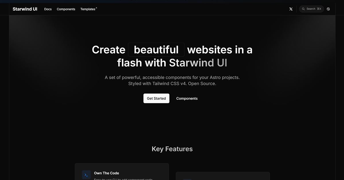
Starwind UI is a beautiful, accessible, and animated component collection designed exclusively for Astro developers who want shadcn/ui-style simplicity and ownership without React dependencies. It's for Astro users—indie devs, performance-focused teams, content sites, marketing pages, or full apps—who prioritize pure Astro + vanilla JS, Tailwind-powered styling, keyboard navigation, and complete code control. By adding components via an easy CLI directly into your project, you avoid black-box libraries and gain full customization of styling, behavior, and functionality. Ideal for high-performance, SEO-friendly sites where you want modern UI patterns (buttons, dialogs, accordions, sidebars, etc.) with seamless theming and accessibility baked in—delivering the "copy-paste but better" DX of shadcn/ui adapted perfectly to Astro's island architecture.
#Features ⚡
Own The Code: CLI command adds component source files straight to your project—no external packages or runtime overhead.
Fully Customizable: Modify every aspect—Tailwind classes, logic, animations, or structure—to match your brand or needs.
Accessible by Design: Keyboard-navigable, screen-reader friendly components with proper ARIA and focus management.
Pure Astro + Vanilla JS: No React or heavy frameworks; leverages Astro's native components for optimal performance.
Tailwind CSS v4+ Theming: CSS variables mirror shadcn/ui closely for easy migration or co-existence; light/dark/system modes supported.
Animated & Modern: Built-in smooth transitions and interactions that feel premium without extra libs.
CLI-Powered Workflow: Seamless installation similar to shadcn/ui—run the CLI to scaffold and integrate components.
Open Source & MIT Licensed: Free to use, fork, modify, or contribute with full transparency.
#Pros ✅
Perfect Astro-native alternative to shadcn/ui—solves the "React in Astro" friction for pure Astro fans.
Full code ownership means no vendor lock-in or hidden dependencies.
Strong accessibility and customization focus rivals or exceeds many libraries.
Excellent theming compatibility with shadcn/ui CSS vars for hybrid or migration projects.
Actively updated (v1.15 recently) with community-requested components like sidebar and theme-toggle.
Zero-cost, MIT open source—ideal for indie devs and production apps.
#Cons ⚠️
Astro-only: Not suitable if your stack is React/Next.js-heavy (use shadcn/ui instead).
Requires Tailwind CSS setup first for full styling power.
Component count (42+) is solid but still growing compared to mature libraries.
Pure vanilla JS means you handle more interactivity logic yourself (no Radix-like primitives out of the box).
#Included Components - Templates
Core Interactions: Button, Accordion, Collapsible, Dialog, Tooltip, Dropdown Menu.
Forms & Inputs: Input OTP, various form elements with accessible patterns.
Layout & Navigation: Sidebar, Prose (rich text/content styling), Theme Toggle.
Data Display: Cards, Tables, Avatars, and flexible Item blocks.
Overlays & Feedback: Modals, Toasts, Alerts, Progress indicators.
Utilities: cn helper equivalents, global styles, and theming setup.
More: 42+ total, with docs for each including usage, props, and customization examples.
#Pricing 💸
100% free and open-source under the MIT license.
No tiers, subscriptions, pro versions, or paid features—all components, CLI, and docs are fully accessible at no cost.
Optional: Contribute or sponsor via GitHub if you love it.
#Integrations 🧰
Astro: Native components built for Astro's islands and partial hydration.
Tailwind CSS v4+: Primary styling engine with shadcn/ui-like CSS variables.
Vanilla JavaScript: All interactivity handled without frameworks.
CLI: Custom easy-to-use installer (similar to npx shadcn@latest add).
GitHub: Source at github.com/starwind-ui/starwind-ui for forking or contributions.
Compatible with Astro ecosystems: Content collections, islands, SSR/SSG.
Frequently Asked Questions
Is Starwind UI free?
Yes, completely free, open-source, and MIT licensed—no hidden costs.
How is it different from shadcn/ui?
It's shadcn-inspired but built purely for Astro with Astro components and vanilla JS—no React involved.
Do I need React or Next.js?
No—it's Astro-first; perfect if you want to avoid React in your Astro project.
Starwind UI
Set of powerful, accessible components for your Astro projects.
Resource Types:
- Loading Spinner
- Modals & Dialogs
- Tables
- Cards
- Tooltip
- Forms & Inputs
- Avatar
- Checkbox
- Buttons
- Accordion
- Sidebar
UI Kits :
Tailwind UITechnology Stack :


Have a product?
Submit your Shadcn product to AllShadcn, get featured, and drive genuine traffic while showcasing your work to the world. Turn your creativity into revenue and begin selling today! 🚀