
Featured Shadcn Products
Add Featured Product


10+ Shadcn Header
Submit Resource
Bolt Stack
Launch your startup faster with our battle-tested Next.js boilerplate.

Unshift - The Website Builder for Developers
Transform your ideas into modern, Next.js applications


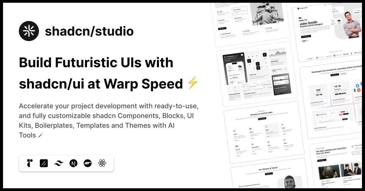
shadcn/studio
Open-source Shadcn registry with copy-paste components.


TWBlocks - SaaS website blocks
Free SaaS website blocks based on React with shadcn & Tailwind

Blocks.so: Tailwind CSS UI Blocks
Library of UI blocks built with React, Tailwind and shadcn/ui

Collection of The Best Shadcn Components:
The header is a critical section of any website or application, as it is typically the first thing users see when they land on a page. A well-designed header can significantly enhance user experience, providing easy navigation, quick access to key information, and establishing a visually appealing starting point for the content below. In this collection, we’ll explore the best Shadcn Header components.
What is a Shadcn Header Component?
A Shadcn Header component refers to the navigation section at the top of a webpage designed using Shadcn UI. This component can include elements such as:
Logo: Your brand or website logo.
Navigation Menu: Links to different sections or pages.
Search Bar: A search input field for quick content discovery.
CTA Buttons: Call-to-action buttons to drive user engagement (e.g., "Sign Up," "Login").
Icons: Social media icons or other visual elements.
Why Use Shadcn for Headers?
Utility-First Approach: Shadcn components allows you to build headers without the need for custom CSS by using utility classes. This approach simplifies the design and ensures consistency across your project.
Customizable: Shadcn headers are fully customizable, allowing you to adjust padding, margin, colors, font sizes, and more using utility classes.
Responsive: Shadcn's built-in responsive design utilities ensure your header adapts smoothly to any screen size, from mobile devices to large desktop displays.
Speed: Shadcn's utility-based system speeds up the development process, allowing you to quickly build headers with minimal code.
Creating a Basic Shadcn Header
Let’s dive into building a basic header using Shadcn UI Component. We will create a simple header with a logo, navigation links, and a call-to-action button.
HTML Structure:
<header class="bg-blue-600 p-4">
  <div class="max-w-7xl mx-auto flex justify-between items-center">
    <!-- Logo -->
    <div>
      <a href="#" class="text-white text-2xl font-semibold">MySite</a>
    </div>
    <!-- Navigation Menu -->
    <nav>
      <ul class="flex space-x-6">
        <li><a href="#" class="text-white hover:text-gray-300">Home</a></li>
        <li><a href="#" class="text-white hover:text-gray-300">About</a></li>
        <li><a href="#" class="text-white hover:text-gray-300">Services</a></li>
        <li><a href="#" class="text-white hover:text-gray-300">Contact</a></li>
      </ul>
    </nav>
    <!-- CTA Button -->
    <div>
      <a href="#" class="bg-yellow-500 text-white px-4 py-2 rounded-lg hover:bg-yellow-400">Get Started</a>
    </div>
  </div>
</header>Explanation:
Container (
div): The header is wrapped in adivwith amax-w-7xl mx-autoclass to center it and limit its width.Logo: The logo is represented as a simple text link (
<a>) styled with Tailwind’s typography utilities.Navigation: A horizontal list of navigation links (
<ul>) withflexlayout and spacing utilities (space-x-6) for equal space between each item.CTA Button: A button styled with Tailwind’s background, padding, and hover utilities for interaction.
Conclusion:
Shadcn UI makes building headers simple, fast, and flexible. With utility classes, you can create headers that are easy to customize, mobile-friendly, and aligned with your brand’s style. Whether you’re building a basic navigation bar or a complex header with dropdowns and search bars, Tailwind CSS provides all the tools you need to get the job done efficiently. Tailwind headers are not only visually appealing but also responsive, ensuring your website or application looks great across all devices.
By using Shadcn UI for your header component, you can save time on styling and focus more on creating a smooth, user-friendly experience. Try building your own header with Shadcn today and see how easy it is to create beautiful designs.
Frequently Asked Questions
Explore frequently asked questions about Header
A Shadcn Header is a prebuilt or customizable UI component used at the top of a web page, typically including navigation, branding, and utility actions (like a theme toggle or user menu).
Use NavigationMenu, Sheet, or Popover components in combination with Tailwind CSS utilities to create mobile-friendly headers.
Have a product?
Submit your Shadcn product to AllShadcn, get featured, and drive genuine traffic while showcasing your work to the world. Turn your creativity into revenue and begin selling today! 🚀