Details about Shadcn UI Blocks: Components for React & Tailwind
Open-source and free to use
Built with Tailwind CSS and shadcn/ui
Copy-paste ready components
AI-focused UI blocks for React
Compatible with all React frameworks
#What is Shadcn UI Blocks?
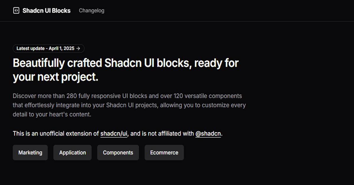
Shadcn UI Blocks offers a curated collection of trending, copy-paste-ready UI components designed for React applications. Built with Tailwind CSS and shadcn/ui, these components are optimized for modern web development, providing developers with high-quality, responsive UI elements that can be seamlessly integrated into their projects.
#Features ⚡️
Trending Components: Access the most popular and frequently used blocks in the community.
Fully Responsive: Each block is optimized for perfect display on any device.
Easily Preview and Copy: Quickly view how blocks look and grab the code in one click.
Absolutely Free to Use: Use all blocks without any restrictions or fees.
Built with Tailwind CSS: Ensures utility-first styling and easy customization.
#Pros and Cons
#Pros ✅
Rapid Development: Accelerates the creation of web applications with ready-to-use components.
Consistent Design: Maintains uniform aesthetics across the application.
Easy Integration: Simplifies the process of adding components to React projects.
Open Source: Free to use and modify under the MIT license.
#Cons ⚠️
Limited Component Variety: Currently offers a fixed set of components; may require additional customization for unique needs.
Dependency on shadcn/ui: Optimal usage requires integrating shadcn/ui, which may add complexity for some developers.
#Included Components - Templates
Shadcn UI Blocks provides a range of trending components suitable for building modern web applications:
Pricing Sections: Cards
Hero Sections: Simple Centered
Feature Sections: Simple
FAQ Sections: Center Aligned
User Profiles: Billing
Hero Forms: Center Aligned Search With Tags
Footers: Simple
Contact Sections: Center Aligned
Category Preview: Carousel Preview
About Sections: Company Values
Blog Sections: Carousel
AI Prompt: Welcome Page
Shopping Cart: Modern Cart
CTA Sections: Video CTA
Category Filters: Horizontal Filters
Gallery: Carousel Gallery
Promo Sections: Centered Image Grid
Product Features: Simple Feature Grid
Form Layouts: Stacked
Product List: Compact List
#Pricing 💵
Shadcn UI Blocks is entirely free and open-source under the MIT license. There are no paid plans or subscriptions.
#Integrations 🧰
React: Designed specifically for React applications.
Tailwind CSS: Utilizes Tailwind CSS for styling.
shadcn/ui: Enhances theming and customization.
Frequently Asked Questions
What is Shadcn UI Blocks?
Shadcn UI Blocks is an open-source library of pre-designed UI components for React applications, optimized for modern web development.
How do I use Shadcn UI Blocks in my project?
Simply browse the Shadcn UI Blocks website, preview the desired component, and copy the provided code into your React project.
Are the components responsive?
Yes, all components are fully responsive and optimized for display on various devices.
Do I need to install shadcn/ui to use these blocks?
While not strictly required, integrating shadcn/ui enhances the customization and theming capabilities of the components.
Can I modify the components to fit my design needs?
Absolutely! The components are built with Tailwind CSS, allowing for easy customization to match your project's design requirements.
Shadcn UI Blocks: Components for React & Tailwind
Discover more than 420 fully responsive UI blocks
Resource Types:
UI Kits :
Shadcn UITechnology Stack :


Have a product?
Submit your Shadcn product to AllShadcn, get featured, and drive genuine traffic while showcasing your work to the world. Turn your creativity into revenue and begin selling today! 🚀