Details about UI - X
Modern UI Component Library: A comprehensive toolkit for building user interfaces with ease.
Customizable and Flexible: Fully customizable components that can be adapted to any design.
Responsive Design: Ensures seamless performance across devices, including mobile and desktop.
Developer-Centric: Optimized for quick integration into React or other JavaScript frameworks.
User-Friendly: Easy-to-use and well-documented for rapid development.
#What is UI-X?
UI-X is a powerful and versatile UI component library designed for developers who want to create modern, responsive web applications without the need to build components from scratch. With a wide range of pre-designed UI components and design patterns, UI-X helps streamline development by offering a flexible, easy-to-use solution for building sophisticated user interfaces.
Built with performance in mind, UI-X ensures that your applications are lightweight and fast, making it a perfect fit for both small projects and large-scale enterprise applications. The library supports easy customization and integration into modern JavaScript frameworks like React, allowing developers to quickly adapt it to suit their project’s needs.
#Features ⚡️
Pre-designed Components: Access a wide variety of pre-designed UI components, such as buttons, modals, cards, forms, and more, making it easy to get started with your project.
Customizable Styles: Easily customize the appearance of components to match your brand’s style and design guidelines.
Responsive Layouts: Ensure your website or app is fully responsive with components designed to adapt seamlessly to different screen sizes, from mobile phones to desktops.
Dark and Light Mode: Built-in support for dark and light mode, allowing your users to toggle between them effortlessly.
Optimized for Performance: All components are designed to be lightweight, ensuring fast loading times and smooth interactions.
Accessibility Features: Built with accessibility in mind, making it easier to create inclusive applications.
Developer-Friendly: Easy-to-integrate components with minimal setup, complete with thorough documentation and examples to speed up development.
#Pros and Cons
#Pros ✅
Speed and Efficiency: With pre-designed components, you can speed up development and focus more on your app’s unique functionality.
Highly Customizable: Components can be easily customized to suit your app's branding and design needs.
Responsive by Default: No need to worry about making your app mobile-friendly—UI-X components are responsive out of the box.
Well-Documented: Comprehensive documentation and examples to help developers get up and running quickly.
Performance-Oriented: The library is optimized for performance, ensuring your apps run smoothly.
#Cons ⚠️
Limited Advanced Features: While UI-X is great for most UI elements, you might need to extend it with additional libraries for more advanced UI features.
Learning Curve for Customization: Customizing complex components may take some time, especially for beginners who are new to JavaScript frameworks or component libraries.
Dependence on JavaScript Frameworks: Designed primarily for modern JavaScript frameworks like React, so integrating with other frameworks may require additional effort.
#Included Components - Templates
UI-X comes with a variety of useful components, including:
Buttons: A selection of customizable buttons, including primary, secondary, and icon buttons.
Forms: Input fields, checkboxes, radio buttons, and dropdowns, all pre-designed for easy use.
Navigation Bars: Pre-built, responsive top bars, sidebars, and menus for intuitive navigation.
Modals and Alerts: Ready-to-use modals and alerts for displaying messages, confirmations, and more.
Cards: Modular cards for displaying content, such as images, text, and actions.
Tooltips: Elegant tooltips for additional information and guidance on hover.
Tables: Pre-designed tables with sorting and filtering options for displaying data.
Pagination: Pagination components for navigating large datasets or lists.
#Pricing 💵
UI-X is free and open-source, meaning anyone can use, modify, and contribute to it. Since it’s open-source, it’s completely free to integrate into your projects. However, you may incur additional costs if you choose to host your app or use premium services for backend or cloud infrastructure.
#Integrations 🧰
UI-X works seamlessly with popular JavaScript frameworks, such as:
React: Easily integrate with React applications, taking advantage of React’s component-based architecture.
Vue: The toolkit can also be used within Vue.js applications with minimal adjustments.
Angular: Developers using Angular can integrate UI-X components with their Angular apps.
Tailwind CSS: Perfectly compatible with Tailwind CSS for utility-first design customization.
Frequently Asked Questions
What is UI-X?
UI-X is a component library designed to help developers create modern, responsive web applications quickly using pre-built, customizable UI components.
Is UI-X free to use?
Yes, UI-X is open-source and free to use, with no licensing fees or restrictions.
Can I customize the components in UI-X?
Yes, UI-X components are highly customizable. You can adjust the design and functionality to fit your needs, from colors and fonts to sizes and spacing.
Does UI-X support dark mode?
Yes, UI-X comes with built-in dark mode support, allowing users to toggle between light and dark themes.
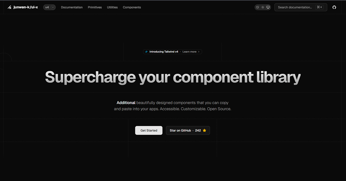
UI - X
Beautifully designed components you can copy and paste into your apps.
Resource Types:
UI Kits :
Shadcn UITechnology Stack :


Have a product?
Submit your Shadcn product to AllShadcn, get featured, and drive genuine traffic while showcasing your work to the world. Turn your creativity into revenue and begin selling today! 🚀