Details about Animated Tabs
Tech Stack: Built with Next.js, Tailwind CSS, Shadcn/UI, and Framer Motion
Design Inspiration: Inspired by Vercel's navigation tabs
Features: Smooth tab transitions, hover effects, and responsive design
#What is Animated Tabs?
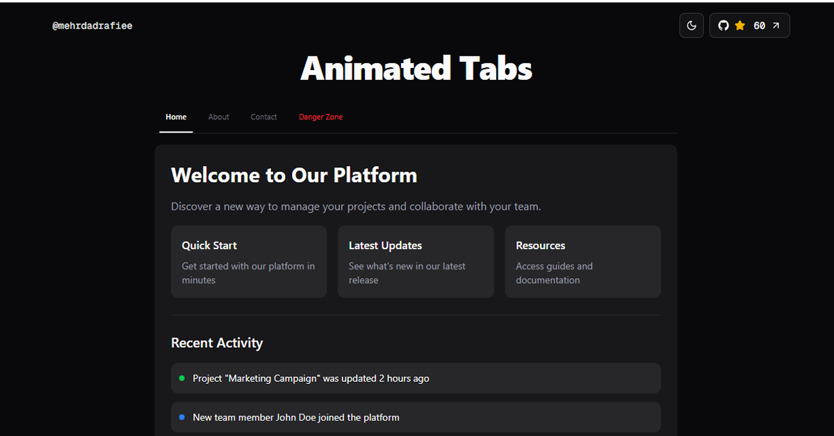
The Animated Tabs component is a modern, interactive tab interface designed to enhance user experience with smooth animations and responsive design. Developed using Next.js, Tailwind CSS, Shadcn/UI, and Framer Motion, this component offers a visually appealing way to navigate between different sections of a web application.
#Features ⚡️
Smooth Tab Transitions: Utilizes Framer Motion's layoutId prop for seamless tab transitions.
Hover Effects: Interactive hover states to highlight active tabs.
Responsive Design: Adapts to various screen sizes for optimal user experience.
Customizable: Easily adjustable styles using Tailwind CSS classes.
Accessible: Built with accessibility in mind, ensuring compatibility with screen readers and keyboard navigation.
#Pros and Cons
#Pros ✅
Visually Appealing: Smooth animations enhance the user interface.
Responsive: Adapts well to different screen sizes.
Easy Integration: Simple to implement in Next.js projects.
Customizable: Tailwind CSS allows for easy styling adjustments.
Open Source: Free to use and modify.
#Cons ⚠️
React Specific: Designed primarily for React applications.
Dependency on Framer Motion: Requires Framer Motion for animations, adding to the bundle size.
Limited Documentation: Basic documentation may require additional exploration for customization.
#Included Components – Templates
The Animated Tabs component includes:
Tab Navigation: Clickable tabs to switch between content sections.
Content Panels: Sections that display content corresponding to the active tab.
Hover Effects: Visual indicators on tab hover.
Transition Animations: Smooth transitions between tab content.
#Pricing 💵
The Animated Tabs component is open-source and free to use.
#Integrations 🧰
Frameworks: Next.js
CSS: Tailwind CSS
UI Components: Shadcn/UI
Animations: Framer Motion
Frequently Asked Questions
How do I integrate Animated Tabs into my Next.js project?
Clone the repository from GitHub, install dependencies using pnpm install, and import the component into your project.
Can I customize the tab styles?
Yes, the component uses Tailwind CSS, allowing you to easily modify styles by adjusting the utility classes.
Is the component accessible?
Yes, it is designed with accessibility in mind, supporting keyboard navigation and screen readers.
Animated Tabs
Discover a new way to manage projects and collaborate with your team.
Resource Types:
UI Kits :
Shadcn UITechnology Stack :


Have a product?
Submit your Shadcn product to AllShadcn, get featured, and drive genuine traffic while showcasing your work to the world. Turn your creativity into revenue and begin selling today! 🚀