Shadcn Date Time Picker
Best collection of the best Shadcn UI Date & Time Picker.
Explore Date Time Picker


Latest Shadcn Date Time Picker
Submit Product
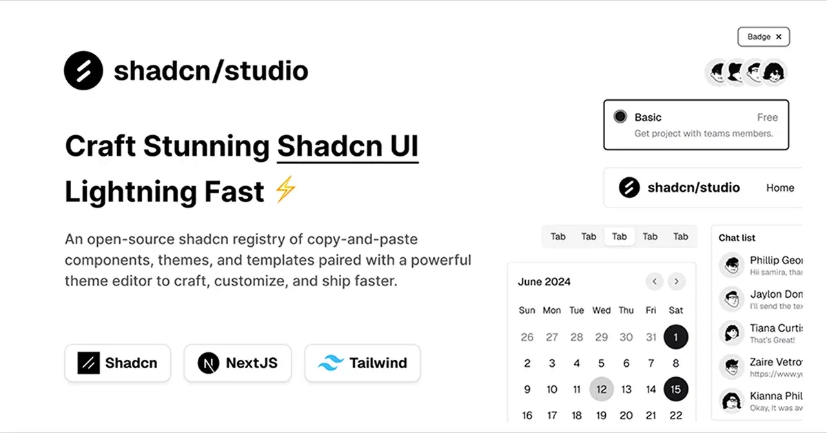
Shadcn/Studio - Theme Editor
Open-source Shadcn registry with copy-paste components.
Shadcn Date & Time Picker Collection
Introducing the Shadcn Date & Time Picker Collection — a powerful set of intuitive and customizable date and time selection components built for modern web applications. Whether you need a simple date picker, a complex datetime selector, or a range picker, these components offer everything you need to enhance your users' experience.
With Shadcn UI’s foundation and Tailwind CSS styling, the Date & Time Picker collection provides accessible, responsive, and seamlessly customizable solutions for collecting user input. These components help ensure that selecting dates and times is both simple and efficient, making them a perfect fit for forms, scheduling tools, booking systems, and more.
Features of Shadcn Date & Time Picker
The Shadcn Date & Time Picker components are designed with flexibility in mind. Whether you're building a booking system, event scheduler, or a simple form, the collection includes a variety of options to suit your needs.
Key features include:
Customizable UI: Tailor colors, sizes, typography, and layout to match your project’s design using Tailwind CSS.
Flexible Date Formats: Supports a wide range of date formats, allowing you to display the date and time in the way that suits your application best.
Time Zone Support: Handle different time zones easily with built-in options, perfect for applications that require timezone-aware functionality.
Range Selectors: Let users select start and end dates/times for better user interaction, perfect for scheduling or booking apps.
Mobile-Friendly: Designed to work seamlessly on both desktop and mobile devices, offering an optimal experience across platforms.
Accessibility-First: Includes features like screen reader support, keyboard navigation, and clear labeling to meet accessibility standards.
Effortless Integration: Easy to implement with modern JavaScript frameworks such as React, Vue, and Next.js.
Advanced Customization: Add specific validation, default values, and much more to meet your application's unique needs.
Ideal for a Variety of Applications
These date and time picker components can be integrated into any project that requires users to select or input date and time information. Ideal for:
Booking Systems: Simplify appointment scheduling by offering intuitive date and time selection.
Event Management: Allow users to pick dates and times for event registration with ease.
Forms and Surveys: Improve user experience in forms that require date and time input.
E-commerce Platforms: Use date and time pickers for order processing or product availability.
Admin Dashboards: Let users filter reports or manage schedules with ease.
Why Choose Shadcn Date & Time Pickers?
What sets Shadcn Date & Time Pickers apart is their ease of use and flexibility. Designed to integrate smoothly into Shadcn UI, these components offer seamless styling with Tailwind CSS, ensuring consistency throughout your project. Their accessibility-first design ensures that every user, regardless of ability, can interact with your date and time inputs with ease.
Not only do these components offer visually appealing date and time pickers, but they also come with robust functionality, performance optimization, and detailed documentation to streamline the development process.
Conclusion:
The Shadcn Date & Time Picker Collection is an essential toolkit for developers looking to implement intuitive and customizable date and time input components into their web applications. Whether you’re building a booking system, scheduling tool, or simply need to collect date and time information from users, these components provide the flexibility, accessibility, and ease of integration you need to create seamless user experiences.
Explore the collection now to enhance your project with powerful, user-friendly date and time selection tools.
Frequently Asked Questions
Explore frequently asked questions about Date Time Picker
Import the necessary components and integrate them into your React project.
A Shadcn DateTime Picker is a customizable, accessible component built with Shadcn UI, React, and Tailwind CSS, allowing users to select both date and time seamlessly.
Have a product?
Submit your Shadcn product to AllShadcn, get featured, and drive genuine traffic while showcasing your work to the world. Turn your creativity into revenue and begin selling today! 🚀