Details about Enhanced Button
Expanded Button Styles: Adds multiple visually appealing button variants to the default
shadcn-button.Minimal Code Overhead: Enhances functionality without bloating your codebase.
Seamless Integration: Designed to be a drop-in replacement for
shadcn-button.Tailwind CSS Support: Fully compatible with Tailwind CSS for easy customization.
Open Source: Available for free under the MIT license.
#What is Enhanced Button?
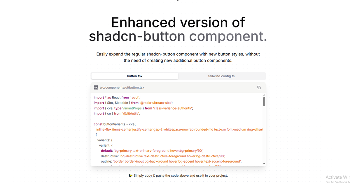
The Enhanced Button component is an upgraded version of the default shadcn-button, offering a variety of stylish button variants with minimal code changes. Built with Next.js, TypeScript, and Tailwind CSS, this component allows developers to implement modern, accessible buttons without the need to create and manage multiple button components. It's an ideal solution for projects utilizing the shadcn-ui library.
#Features ⚡️
Multiple Button Variants: Includes styles like
default,destructive,outline,secondary,ghost,link, and several hover effects.Icon Support: Easily add icons to buttons with customizable placement.
Responsive Design: Buttons are designed to look great on all screen sizes.
Accessible: Built with accessibility in mind, ensuring a seamless experience for all users.
Easy Integration: Simple installation process with clear instructions.
#Pros and Cons
#Pros ✅
Rich Styling Options: Offers a wide range of button styles to fit various design needs.
Customizable: Tailwind CSS integration allows for easy customization to match your application's design.
Time-Saving: Reduces the need to create multiple button components, streamlining development.
Open Source: Free to use and modify under the MIT license.
#Cons ⚠️
Learning Curve: May require some time to understand the full range of variants and effects.
Dependency: Requires
shadcn-uito be installed in your project.
#Included Components - Templates
The Enhanced Button package includes the following components:
Button: The main button component with various styles and effects.
ButtonIcon: A component for adding icons to buttons.
ButtonGroup: A component for grouping multiple buttons together.
#Pricing 💵
The Enhanced Button component is open-source and available for free under the MIT license. There are no costs associated with using or modifying the component.
#Integrations 🧰
The Enhanced Button integrates seamlessly with the following technologies:
React: Built specifically for React applications.
Next.js: Utilizes Next.js for server-side rendering and routing.
Tailwind CSS: Styled using Tailwind CSS for easy customization.
Shadcn UI: Requires
shadcn-uito be installed in your project
Frequently Asked Questions
Can I customize the button styles?
Yes, the buttons are styled using Tailwind CSS, allowing you to easily customize their appearance to match your application's design.
Does the Enhanced Button support icons?
Absolutely. You can add icons to buttons with customizable placement using the ButtonIcon component.
Is the Enhanced Button accessible?
Yes, the component is built with accessibility in mind, ensuring a seamless experience for all users.
Enhanced Button
An enhanced version of the default shadcn-button component.
Resource Types:
UI Kits :
Shadcn UITechnology Stack :


Have a product?
Submit your Shadcn product to AllShadcn, get featured, and drive genuine traffic while showcasing your work to the world. Turn your creativity into revenue and begin selling today! 🚀