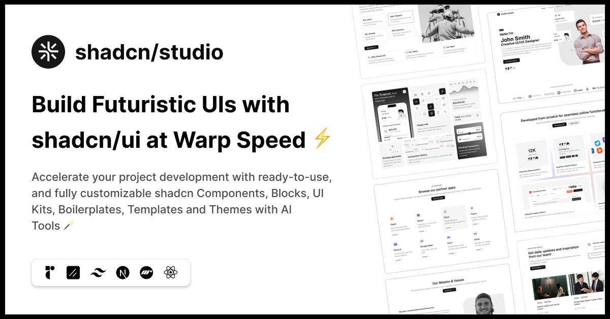
Shadcn Figma Design System
Discover the best Shadcn Figma UI Kits, Components & Design Syestem
Explore Figma1+ Shadcn Figma
Submit Resource
Shadcn Figma Design System, Figma Components & UI Kits Collection
Welcome to the Shadcn Figma Design System, Figma Components & UI Kits Collection, a comprehensive set of beautifully crafted design resources to help you build stunning, consistent, and user-friendly interfaces. Whether you're a designer, developer, or product manager, this collection provides everything you need to create high-quality user experiences with Shadcn UI components.
Built with Shadcn UI and Tailwind CSS principles in mind, our Figma resources offer a seamless way to bring your web applications from design to development. From fully functional design systems to individual UI kits and components, this collection will streamline your workflow, ensuring consistency and efficiency across all your projects.
What Are Shadcn Figma Design Systems, Figma Components & UI Kits?
The Shadcn Figma Design System, Figma Components, and UI Kits are pre-designed assets that allow designers to quickly prototype, iterate, and build interfaces while maintaining design consistency. These resources provide a unified structure for building and customizing user interfaces for web applications, ensuring that design and development are perfectly aligned.
Figma Design System: A comprehensive collection of design guidelines, reusable components, and assets that help you create consistent user interfaces for your projects.
Figma Components: Reusable design elements such as buttons, cards, forms, and icons that speed up the design process while maintaining consistency.
UI Kits: Pre-built collections of UI elements like navigation bars, modals, and input fields, ready to be used and customized to fit your project’s needs.
Key Features of Shadcn Figma Design System, Components & UI Kits
Complete Design System: Includes typography, colors, spacing, and other design elements that align with Shadcn UI and Tailwind CSS principles.
Pre-made UI Components: Ready-to-use components like buttons, cards, forms, and tables designed for web applications.
Customizable: Easily modify components and UI kits to match your brand’s look and feel using Figma's powerful design tools.
Responsive Layouts: All components are designed to work across devices, ensuring a consistent user experience on mobile, tablet, and desktop.
Consistent Design Patterns: Follow the Shadcn UI design system for a unified look across your entire application or website.
Easy Integration with Development: The design system is built to work seamlessly with Shadcn UI and Tailwind CSS, making it easier for developers to implement designs in code.
User-Focused Design: Designed with accessibility and usability in mind, helping you create intuitive and user-friendly interfaces.
Collaboration Ready: Easily collaborate with team members using Figma’s cloud-based platform to ensure smooth communication between designers and developers.
Who Should Use Shadcn Figma Design System, Components & UI Kits?
UI/UX Designers: Speed up your design process with pre-designed components and systems that ensure consistency across projects.
Product Teams: Build and maintain cohesive product interfaces that align with branding and design guidelines.
Front-End Developers: Quickly implement designs into production with a design system that integrates seamlessly with Tailwind CSS and Shadcn UI.
Agencies & Freelancers: Deliver polished, professional designs to clients with minimal effort, using comprehensive UI kits and components.
Startups & Entrepreneurs: Save time and resources by utilizing pre-made, customizable design systems and UI kits to launch your product faster.
Why Choose Shadcn Figma Design System, Components & UI Kits?
Shadcn’s Figma Design System, Figma Components, and UI Kits provide a one-stop solution for creating beautiful, consistent, and responsive user interfaces. The collection is designed to help teams move quickly from design to development, ensuring that the design system used is both flexible and easy to scale. By using these resources, you maintain consistency in design while saving time during the development process.
The seamless integration with Shadcn UI and Tailwind CSS ensures a smooth workflow, from prototyping in Figma to implementing the design in code. Additionally, the emphasis on user experience and accessibility means that the designs you create will be inclusive and functional for all users.
Conclusion:
The Shadcn Figma Design System, Figma Components & UI Kits Collection is an invaluable resource for teams looking to streamline their design and development workflow. Whether you're creating a simple landing page or a complex web application, these Figma assets provide everything you need to build beautiful, user-friendly interfaces that align with modern design principles.
Explore the collection today and take the first step towards building polished, consistent, and efficient user interfaces with Shadcn’s Figma resources.
Frequently Asked Questions
Explore frequently asked questions about Figma
A complete collection of design guidelines, reusable components, and assets that help maintain consistency across web application interfaces.
The design system is built to work seamlessly with Shadcn UI and Tailwind CSS, making it easier for developers to implement designs in code
Have a product?
Submit your Shadcn product to AllShadcn, get featured, and drive genuine traffic while showcasing your work to the world. Turn your creativity into revenue and begin selling today! 🚀


