Details about Shadcn Examples: Component Showcase for shadcn-ui
Free, open-source showcase of shadcn-ui components
Built with Next.js, TypeScript, Tailwind CSS, and shadcn-ui
Features interactive examples of buttons, forms, cards, and more
Deployed on Vercel for live demos
MIT-licensed, ideal for learning and integration
#What is Shadcn Examples?
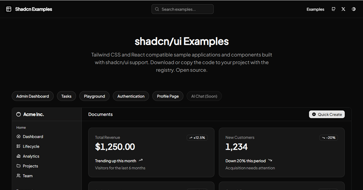
Shadcn Examples is a free, open-source project that serves as a showcase and reference for shadcn-ui components, helping developers explore and implement UI elements in their Next.js or React projects. It’s designed for developers building modern web applications, such as dashboards, landing pages, or SaaS platforms, who want to see shadcn-ui components in action.
Built with Next.js, TypeScript, Tailwind CSS, and shadcn-ui, it provides a collection of live, interactive examples for components like buttons, forms, cards, and dialogs. Hosted on Vercel, it offers a user-friendly interface to preview and copy component code, streamlining adoption in shadcn-ui projects while maintaining accessibility and customization.
#Features ⚡️
Interactive Demos: Live previews of shadcn-ui components like buttons, inputs, and modals.
Copyable Code: Easily copy component code for quick integration.
Responsive Design: Tailwind CSS ensures examples are mobile-friendly.
Accessible Components: Inherits shadcn-ui’s WAI-ARIA compliance.
TypeScript Support: Type-safe code examples for robust development.
Vercel Deployment: Fast, reliable access to demos via Vercel hosting.
#Pros and Cons
#Pros ✅
shadcn-ui Integration: Perfectly showcases shadcn-ui’s components and styling.
Free and Open-Source: MIT license allows unrestricted use and adaptation.
Learning Resource: Ideal for developers new to shadcn-ui or seeking inspiration.
Easy Access: Live demos on Vercel simplify exploration without local setup.
Community-Driven: Reflects shadcn-ui’s active ecosystem (June 2025).
#Cons ⚠️
React Dependency: Limited to React/shadcn-ui ecosystems.
Showcase Only: Not a standalone component library; meant for reference.
Setup Requirements: Using examples requires shadcn-ui and Tailwind CSS installed.
Limited Scope: Focused on shadcn-ui components, not custom or third-party extensions.
#Included Components
Button Examples: Variants like primary, secondary, and ghost buttons.
Form Components: Inputs, checkboxes, and form layouts with validation.
Card Components: Responsive cards for content display.
Dialogs/Modals: Interactive pop-ups for user interactions.
Navigation Menus: Examples of navbars and sidebars.
#Pricing 💸
Shadcn Examples is completely free under the MIT license, with no premium tiers.
#Integrations 🧰
React: Core framework for component demos.
shadcn-ui: Source of accessible, styled components.
Tailwind CSS: Utility-first styling for responsive design.
Next.js: Powers the Vercel-hosted showcase site.
TypeScript: Ensures type-safe code examples.
Vercel: Hosting platform for live demos.
Frequently Asked Questions
What is shadcnexamples?
A Vercel-hosted showcase of shadcn-ui components with interactive demos and copyable code.
Is it free?
Yes, it’s fully free under the MIT license.
Does it work outside shadcn-ui projects?
It’s a reference for shadcn-ui; examples require shadcn-ui dependencies.
Shadcn Examples: Component Showcase for shadcn-ui
Tailwind CSS and React compatible sample applications and components.
Resource Types:
UI Kits :
Shadcn UITechnology Stack :


Have a product?
Submit your Shadcn product to AllShadcn, get featured, and drive genuine traffic while showcasing your work to the world. Turn your creativity into revenue and begin selling today! 🚀