Details about Shadcn UI Color Picker
Free, open-source color picker component for shadcn-ui
Built with Next.js, TypeScript, Tailwind CSS, shadcn-ui, and react-colorful
Features a hex-based color picker with popover and manual input
Integrates via shadcn CLI with a live demo on Vercel
MIT-licensed
#What is Shadcn UI Color Picker?
Shadcn UI Color Picker is a free, open-source React component by nightspite, designed to extend shadcn-ui with an interactive color picker. It’s ideal for developers building applications requiring color customization, such as design tools, theme editors, or user profile settings, in Next.js or React projects.
Built with Next.js, TypeScript, Tailwind CSS, shadcn-ui, and react-colorful, it offers a hex-based color picker within a popover, manual hex input, and a button trigger displaying the selected color. The component integrates via shadcn CLI and addresses community demand for a color picker.
#Features ⚡️
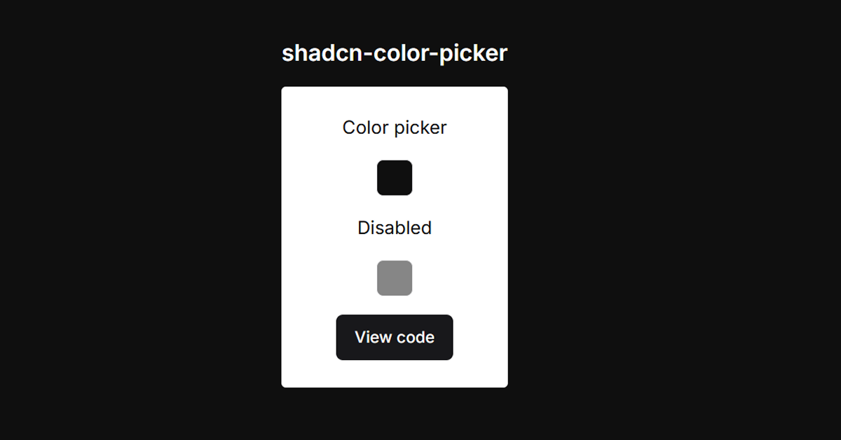
Hex Color Picker: Select colors using react-colorful’s interactive HexColorPicker.
Popover Interface: Opens a compact picker with shadcn-ui’s Popover component.
Manual Input: Enter hex values directly (7-character limit, e.g., #FF0000).
Visual Trigger: Button shows the selected color as its background.
Disabled State: Supports disabled mode for form control.
Accessible Design: Inherits shadcn-ui’s WAI-ARIA compliance.
Responsive Styling: Tailwind CSS ensures adaptability across devices.
#Pros and Cons
#Pros ✅
shadcn-ui Compatibility: Seamlessly matches shadcn-ui’s aesthetic and accessibility.
Free and Open-Source: MIT license allows unrestricted use and customization.
Lightweight: Uses react-colorful for a compact, dependency-light picker.
Easy Integration: CLI setup simplifies adoption in shadcn-ui projects.
Community-Driven: Addresses a popular feature request with a live demo.
#Cons ⚠️
React Dependency: Limited to React/shadcn-ui ecosystems.
Setup Requirements: Needs shadcn-ui, Tailwind CSS, and react-colorful installed.
Hex-Only Input: Lacks support for RGB, HSL, or other color formats (unlike Fnz11’s shadcn-color-picker).
Client-Side Focus: Color selection is client-side; persistence requires custom logic.
Basic Functionality: No advanced features like palettes or gradient picking.
#Included Components
ColorPicker: Main component combining a button trigger, popover, hex picker, and input.
Popover: shadcn-ui’s Popover, PopoverTrigger, and PopoverContent for the picker UI.
Button: shadcn-ui Button displaying the selected color.
Input: shadcn-ui Input for manual hex entry.
#Pricing 💸
Shadcn UI Color Picker is completely free under the MIT license, with no premium tiers.
#Integrations 🧰
React: Core framework for the component.
shadcn-ui: Provides accessible primitives (Button, Popover, Input).
Tailwind CSS: Utility-first styling for responsive design.
Next.js: Optimized for Next.js projects.
TypeScript: Ensures type safety.
react-colorful: Powers the hex-based color picker.
lucide-react: Optional for icons in demos.
Frequently Asked Questions
What is Shadcn UI Color Picker?
A hex-based color picker for shadcn-ui, built with react-colorful and shadcn-ui’s Popover.
Is it free?
Yes, it’s fully free under the MIT license.
Does it work outside shadcn-ui projects?
It’s designed for shadcn-ui; non-shadcn-ui use requires replacing dependencies.
Shadcn UI Color Picker
Color picker build using shadcn & react-colorful.
Resource Types:
UI Kits :
Shadcn UITechnology Stack :

Featured Shadcn Products
Add Featured Product


Have a product?
Submit your Shadcn product to AllShadcn, get featured, and drive genuine traffic while showcasing your work to the world. Turn your creativity into revenue and begin selling today! 🚀