Details about Shadcn/ui Radix Colors: Color Integration
Tailwind CSS color palette built on Radix UI Colors
Designed for use with shadcn/ui and Radix components
Provides consistent, accessible, and customizable color tokens
Supports dark and light mode variants
Easy integration into Tailwind CSS projects
Open source and free to use
#What is Shadcn Radix Colors?
Shadcn-Radix-colors is a Tailwind CSS color system inspired by Radix UI’s color palettes, crafted to work seamlessly with the shadcn/ui component library and Radix UI primitives. It aims to bring consistency, accessibility, and theme flexibility by providing a robust set of color tokens that adapt to light and dark modes. This resource helps developers implement visually appealing and accessible color schemes aligned with modern design standards while leveraging Tailwind CSS’s utility-first framework.
#Features ⚡️
Radix UI Color Palette: Uses Radix’s thoughtfully designed color scales for harmony and accessibility.
Tailwind CSS Integration: Ready to plug into Tailwind config with minimal setup.
Light/Dark Mode Support: Color tokens adapt dynamically for dark and light themes.
Customizable Tokens: Easily extend or override colors to fit your brand.
Designed for shadcn/ui and Radix: Perfect synergy with these UI frameworks for consistent theming.
Open Source: Free and community-maintained, fostering collaboration.
#Pros and Cons
#Pros ✅
Accessibility-focused color palette with contrast compliance
Simplifies theming for Tailwind projects using Radix and shadcn/ui
Supports dynamic theme switching between light and dark modes
Easy to customize and extend according to project needs
Open source and integrates well into modern React projects
#Cons ⚠️
Requires some Tailwind CSS and config knowledge to implement
Primarily geared towards users of shadcn/ui and Radix UI libraries
May require adjustments for projects with unique branding or color needs
Not a standalone UI library—color system only
#Included Components - Templates
Shadcn-radix-colors itself is a color system, not a component library. However, it complements shadcn/ui components and Radix UI primitives by providing a ready-made palette of colors. Users can expect:
Color tokens for background, text, borders, accents, and overlays
Scales of primary, secondary, success, warning, error, and neutral colors
Light and dark variants for each color scale
#Pricing 💵
Shadcn-radix-colors is free and open-source, available under the MIT license. It can be used in commercial or personal projects without cost.
#Integrations 🧰
Designed for Tailwind CSS projects
Integrates with shadcn/ui component library
Compatible with Radix UI primitives and themes
Ideal for React apps using Tailwind and Radix
Frequently Asked Questions
How do I install shadcn-radix-colors?
Typically, you add it to your Tailwind CSS config file by importing the color tokens and extending your theme.
Can I customize the colors?
Yes, you can override or extend the color tokens in your Tailwind config to match your branding.
Does it support dark mode?
Yes, it includes both light and dark color variants that switch automatically or via class toggling.
Is shadcn-radix-colors tied to React?
No, the color system is Tailwind CSS-based and can be used with any frontend framework, but it’s optimized for shadcn/ui and Radix UI in React.
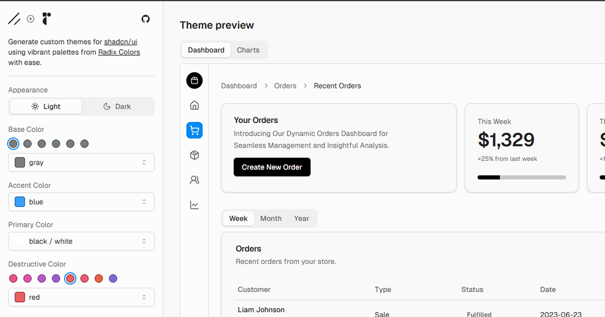
Shadcn/ui Radix Colors: Color Integration
Create shadcn/ui themes with vibrant Radix Colors palettes easily.
Resource Types:
UI Kits :
Shadcn UITechnology Stack :


Have a product?
Submit your Shadcn product to AllShadcn, get featured, and drive genuine traffic while showcasing your work to the world. Turn your creativity into revenue and begin selling today! 🚀