Details about Shadcn UI Blocks Collection
Free collection of UI blocks and components
Built with React, Tailwind CSS, and ShadCN UI
Features responsive, customizable blocks for web projects
Supports preview, customize, and copy-paste integration
MIT-licensed, focused on ease of use
#What is Shadcn UI Blocks?
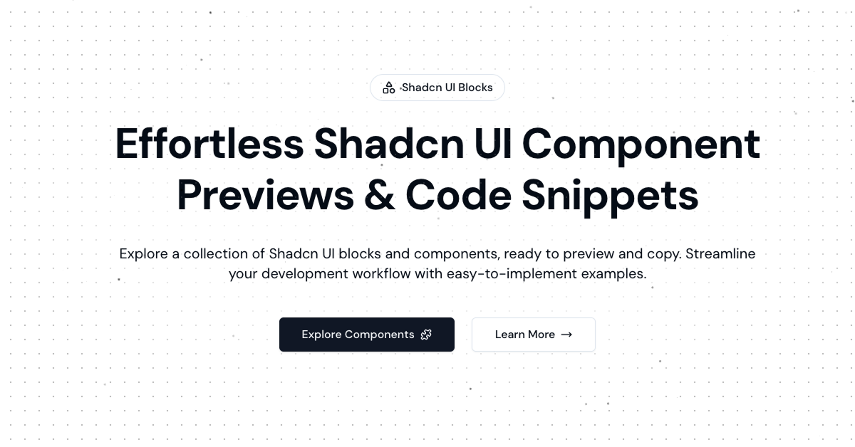
Shadcn UI Blocks is a free collection of UI blocks and components, designed to streamline web development by offering ready-to-use code snippets. Its primary goal is to simplify the process of building responsive, high-quality designs, targeting developers working on React projects who use ShadCN UI for their UI needs.
Built with React, Tailwind CSS, and ShadCN UI, this library provides a curated set of blocks like navbars, hero sections, and testimonials, all optimized for perfect display on any device. It focuses on a preview-customize-copy workflow, allowing developers to see how blocks look, adjust them, and integrate them seamlessly. For the All ShadCN platform, Shadcn UI Blocks is an ideal match, offering accessible, customizable components that align with ShadCN UI’s ecosystem.
#Features ⚡️
Curated Block Collection: Includes sections like navbars, heroes, and footers for quick integration.
ShadCN UI Integration: Leverages ShadCN UI for accessible, styled components.
Responsive Design: Blocks are optimized for all devices with Tailwind CSS.
Preview & Customize: Preview blocks, tweak styles, and copy code in one click.
Accessibility: Inherits ShadCN UI’s WAI-ARIA compliance for better usability.
Seamless Workflow: Designed for fast implementation without restrictions or fees.
#Pros and Cons
#Pros ✅
Ease of Use: Preview, customize, and copy workflow speeds up development.
Free Access: Fully free with no usage restrictions, under MIT license.
ShadCN UI Fit: Perfect for All ShadCN with its React and ShadCN UI foundation.
Responsive & Accessible: Ensures consistent display and usability across devices.
Customizable: Adjust colors, sizes, and styles to match project needs.
#Cons ⚠️
React Dependency: Limited to React projects, though fitting for All ShadCN.
Basic Documentation: Lacks detailed guides for advanced customization.
Setup Requirement: Requires ShadCN UI and Tailwind CSS to be pre-installed.
Limited Scope: Focused on blocks, may not cover all UI needs like interactive components.
#Included Components - Templates
Shadcn UI Blocks offers a variety of ShadCN UI-powered blocks:
Navbar Section: Responsive navigation blocks with multiple styles.
Hero Section: Visually appealing hero blocks for landing pages.
Testimonials: Sections for showcasing user feedback in grid or list formats.
Footer: Pre-designed footer blocks with navigation and branding elements.
#Pricing 💵
Shadcn UI Blocks operates on a Free model:
Free Access: Fully open-source under the MIT license, with no cost to use or modify.
#Integrations 🧰
Shadcn UI Blocks integrates with:
React: Core framework for building the blocks.
ShadCN UI: Accessible component library for styling and structure.
Tailwind CSS: Utility-first styling for responsive design.
Next.js: Compatible with Next.js for server-side rendering.
Frequently Asked Questions
What is Shadcn UI Blocks, and how does it work with ShadCN UI?
It’s a free collection of UI blocks for React, built on ShadCN UI, offering responsive sections for easy integration.
Is Shadcn UI Blocks free to use?
Yes, it’s fully free under the MIT license with no usage restrictions.
Can I use Shadcn UI Blocks with frameworks other than React?
No, it’s designed for React, aligning with ShadCN UI’s ecosystem.
Does Shadcn UI Blocks support accessibility?
Yes, it inherits ShadCN UI’s WAI-ARIA compliance for accessibility.
How customizable is Shadcn UI Blocks?
Customizable via Tailwind CSS, with options to tweak colors, sizes, and styles.
Shadcn UI Blocks Collection
Curated collection of customized Shadcn UI blocks and components.
Resource Types:
UI Kits :
Shadcn UITechnology Stack :


Have a product?
Submit your Shadcn product to AllShadcn, get featured, and drive genuine traffic while showcasing your work to the world. Turn your creativity into revenue and begin selling today! 🚀