Details about ShadcnUI Vaults
Free, open-source collection of shadcn/ui components
Built with React, TypeScript, Tailwind CSS
Features 100+ customizable UI components and templates
Supports copy-paste integration via shadcn CLI
MIT-licensed with responsive and accessible designs
#What is Shadcn Vaults?
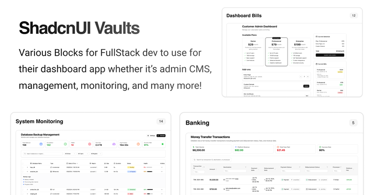
Shadcn Vaults is a free, open-source repository of shadcn/ui components and templates designed to accelerate UI development for React applications. Its primary goal is to provide developers with a centralized "vault" of ready-to-use, customizable elements, targeting React builders creating dashboards, landing pages, or SaaS apps. Built with React, TypeScript, Tailwind CSS, and shadcn/ui, it offers 100+ components like buttons, cards, modals, and forms, all styled for responsiveness and accessibility. The vault emphasizes copy-paste simplicity with shadcn CLI support (npx shadcn@latest add), enabling quick integration. For shadcn/ui enthusiasts, Shadcn Vaults is a perfect fit, leveraging shadcn/ui's accessible foundation to deliver a curated, production-ready collection for React applications. Explore at shadcn-vaults.vercel.app.
#Features ⚡️
Component Vault: 100+ shadcn/ui elements like buttons, cards, and navigation.
ShadCN UI Integration: Builds on shadcn UI for accessible, customizable components.
Accessibility: WAI-ARIA compliant with Radix UI primitives.
CLI Support: Add components with npx shadcn@latest add for quick setup.
Responsive Design: Tailwind CSS ensures components adapt to all screen sizes.
Type Safety: TypeScript ensures robust, error-free development.
#Pros ✅
Curated Collection: 100+ ready-to-use shadcn/ui components.
Free and Open-Source: MIT license allows unrestricted use and modification.
ShadCN UI Fit: Perfect for shadcn UI with its React and shadcn UI foundation.
Community Support: Vercel-hosted with active engagement.
Easy Integration: Copy-paste model with CLI simplifies adding components.
#Cons ⚠️
React Dependency: Limited to React projects, though fitting for shadcn UI.
Setup Complexity: Requires shadcn UI and Tailwind CSS pre-installed.
Limited Scope: Focused on shadcn/ui components, not full apps.
Learning Curve: Familiarity with shadcn UI and React needed.
#Included Components - Templates
Shadcn Vaults provides a variety of shadcn UI-powered components:
Button: Versatile variants with icons and loading states.
Card: Content containers with headers and shadows.
Modal: Overlay dialogs for user interactions.
Form: Input groups with validation and labels.
#Pricing 💸
Shadcn Vaults operates on a Free model:
Free Access: All components free under MIT license.
No Pro Version: No premium tiers or paid features.
#Integrations 🧰
Shadcn Vaults integrates with:
React: Core framework for component rendering.
ShadCN UI: Accessible component library for styling.
Tailwind CSS: Utility-first styling for responsive design.
TypeScript: Ensures type-safe development.
Frequently Asked Questions
What is Shadcn Vaults, and how does it work with ShadCN UI?
Shadcn Vaults is a free collection of shadcn UI components for React, with copy-paste integration.
Can I use Shadcn Vaults with frameworks other than React?
No, designed for React and shadcn UI ecosystems.
Does Shadcn Vaults support accessibility?
Yes, inherits shadcn UI's WAI-ARIA compliance.
ShadcnUI Vaults
Collection of interactive components & blocks for Internal Tools UI
Resource Types:
UI Kits :
Shadcn UITechnology Stack :


Have a product?
Submit your Shadcn product to AllShadcn, get featured, and drive genuine traffic while showcasing your work to the world. Turn your creativity into revenue and begin selling today! 🚀