Details about SmoothUI - React UI with TailwindCSS Animations
Free, open-source collection of highly customizable, production-ready UI components with fluid animations.
Built with React, TypeScript, Tailwind CSS v4, and Motion (Framer Motion) for performance and delight.
Fully compatible with shadcn/ui ecosystem—same patterns, seamless integration.
Includes interactive demos like hover-to-scramble, video galleries, and animated sliders.
100% free with active community contributions via GitHub.
#What is Smooth UI?
Smooth UI is a modern, open-source library of beautifully crafted React components designed to help teams build stunning, high-performance websites and applications with minimal effort. It focuses on delightful user experiences through buttery-smooth animations powered by Motion, while staying fully aligned with the shadcn/ui philosophy—unstyled, accessible, and infinitely customizable via Tailwind CSS. Whether you're launching a marketing site, SaaS dashboard, or creative portfolio, Smooth UI provides ready-to-use blocks like animated galleries, interactive tags, and cinematic video sections that feel premium out of the box. Fully typed with TypeScript and optimized for React Server Components, it’s perfect for Next.js projects and beyond. Best of all? It’s completely free—no Pro tiers, no paywalls, just pure open-source goodness.
#Features ⚡️
Smooth Animations: Powered by Motion (Framer Motion), every component includes micro-interactions, transitions, and hover effects for a polished feel.
React-Native Patterns: Built with hooks, Server Components, and TypeScript for optimal performance and developer experience.
Tailwind CSS v4: Leverages the latest utility-first framework with enhanced dark mode, container queries, and modern design tokens.
shadcn/ui Compatible: Follows identical structure, naming, and customization patterns—drop into existing shadcn/ui projects with zero friction.
Responsive & Accessible: Mobile-first, semantic HTML, and ARIA-compliant by default.
Easy Customization: Modify any component using Tailwind classes—no need to touch internal logic.
#Pros ✅
Production-Ready Polish: Components look and feel premium with smooth, intentional animations that elevate UX.
Zero Cost, Full Access: Completely free—use in personal, commercial, or enterprise projects without restrictions.
shadcn/ui Synergy: Perfect companion or alternative; mix and match with your existing component library.
Modern Stack: Uses React Server Components, TypeScript, and Tailwind v4—future-proof and performant.
Interactive Demos: Hover-to-scramble text, video galleries, and animated sliders showcase real-world creativity.
#Cons ⚠️
Learning Curve for Animations: While easy to use, mastering Motion for custom effects may require extra reading.
No Built-in CLI: Unlike shadcn/ui, installation is manual (copy-paste or GitHub clone)—no npx installer yet.
Limited Component Count: Focused library (not 100+ components), but high quality over quantity.
Documentation Still Growing: Demos are strong, but in-depth guides and API docs are evolving.
Tailwind Dependency: Requires Tailwind CSS v4 setup—less ideal for non-Tailwind projects.
#Included Components - Templates
Smooth UI delivers a curated set of interactive, animation-rich components and blocks, each with live previews:
Hover to Scramble: Text that scrambles and reassembles on hover—great for creative headers.
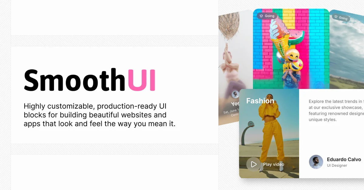
Video Gallery Blocks: Cinematic sections like "Summer Opening," "Fashion," "Gallery Art," and "Dreams" with play-on-hover video embeds.
Tag Selector: Animated, filterable tags with selected states (e.g., react, tailwindcss, nextjs).
Slide to Power Off: Fun, iOS-style power-off slider with dynamic progress rings.
Scenario Card: Orange-black themed interactive card with layered animations.
Marquee & Scroll Effects: Smooth text and image marquees for dynamic content flow.
All components are modular, responsive, and ready to copy into your project.
#Pricing 💸
Smooth UI is 100% free and open-source. There are no paid tiers, subscriptions, or feature locks. Built for the community, by the community—use it anywhere, modify it, and ship it. Support the project by starring the repo on GitHub.
#Integrations 🧰
Designed to fit seamlessly into modern workflows:
shadcn/ui: Direct drop-in compatibility—use alongside or as a motion-enhanced layer.
React & Next.js: Optimized for App Router, Server Components, and client-side interactivity.
Tailwind CSS v4: Full support for dark mode, container queries, and utility plugins.
Motion (Framer Motion): Animation engine for smooth, GPU-accelerated effects.
lucide-react, clsx, tailwind-merge: Lightweight dependencies for icons and class handling.
TypeScript: Full type safety and autocomplete in IDEs.
Frequently Asked Questions
What is Smooth UI?
A free collection of animated, production-ready React components built with Tailwind CSS and Motion, designed to enhance user delight and integrate with shadcn/ui.
Is Smooth UI free to use?
Yes—completely free for personal and commercial use, forever.
Can I use it with shadcn/ui?
Absolutely—follows the same patterns, file structure, and customization model.
SmoothUI - React UI with TailwindCSS Animations
Collection of beautifully designed components with smooth animations
Resource Types:
UI Kits :
Tailwind UITechnology Stack :


Have a product?
Submit your Shadcn product to AllShadcn, get featured, and drive genuine traffic while showcasing your work to the world. Turn your creativity into revenue and begin selling today! 🚀