Details about TWBlocks - SaaS website blocks
Open-source React components
Styled with Tailwind CSS
Supports dark & light mode
Built with shadcn-ui & Radix UI
Animated with Framer Motion
Easy copy/paste integration
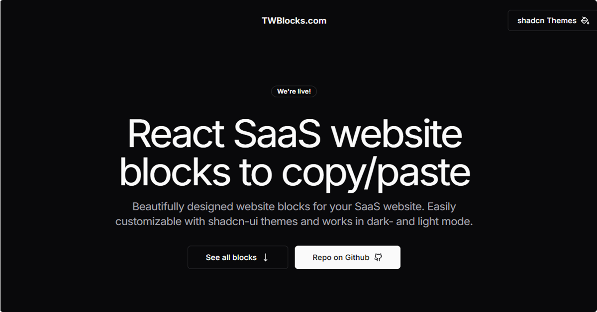
#What is TW Blocks?
TWBlocks is an open-source library offering a collection of pre-designed, customizable website blocks tailored for SaaS applications. Built with React, TypeScript, Tailwind CSS, and shadcn-ui, TWBlocks enables developers to seamlessly integrate ready-made components into their projects. Each block is responsive and supports both dark and light themes, streamlining the development process for modern web applications.
#Features ⚡️
Pre-built Components: Includes headers, hero sections, testimonials, pricing tables, CTAs, blogs, FAQs, contact forms, and footers.
Customizable Themes: Easily style components using shadcn-ui themes.
Responsive Design: Blocks are optimized for various screen sizes.
Animations: Utilizes Framer Motion for smooth transitions and animations.
Light & Dark Mode: Built-in support for both modes enhances user experience.
#Pros and Cons
#Pros ✅
Rapid Development: Accelerates the creation of SaaS websites with ready-to-use components.
Consistent Design: Maintains uniform aesthetics across the application.
Easy Integration: Simplifies the process of adding components to React projects.
Open Source: Free to use and modify under the MIT license.
#Cons ⚠️
Limited Component Variety: Currently offers a fixed set of components; may require additional customization for unique needs.
Dependency on shadcn-ui: Optimal usage requires integrating shadcn-ui, which may add complexity for some developers.
#Included Components - Templates
TWBlocks provides a range of components suitable for building comprehensive SaaS websites:
Headers: Navigation bars and top sections.
Heroes: Introductory sections with call-to-action elements.
Cases: Showcase sections for case studies or use cases.
Features: Highlight key features or services.
CTAs: Call-to-action sections to engage users.
Stats: Data presentation blocks.
Pricing: Pricing tables and plans.
FAQs: Frequently asked questions sections.
Blogs: Blog post previews and lists.
Contacts: Contact forms and information.
Footers: Footer sections for additional links and information.
#Pricing 💵
TWBlocks is entirely free and open-source under the MIT license. There are no paid plans or subscriptions.
#Integrations 🧰
React: Designed specifically for React applications.
Tailwind CSS: Utilizes Tailwind CSS for styling.
shadcn-ui: Enhances theming and customization.
Framer Motion: Adds animations to components.
Frequently Asked Questions
What is TWBlocks?
TWBlocks is a free, open-source library of pre-designed website blocks for React applications, optimized for SaaS projects.
How do I use TWBlocks in my project?
Simply copy the desired component code from the TWBlocks website and paste it into your React project. Ensure you have the necessary dependencies installed.
Is TWBlocks compatible with both dark and light modes?
Yes, TWBlocks components are designed to support both dark and light themes, providing a seamless user experience.
Do I need to install shadcn-ui to use TWBlocks?
While not strictly required, integrating shadcn-ui enhances the customization and theming capabilities of TWBlocks components.
TWBlocks - SaaS website blocks
Free SaaS website blocks based on React with shadcn & Tailwind
Resource Types:
UI Kits :
Shadcn UITechnology Stack :


Have a product?
Submit your Shadcn product to AllShadcn, get featured, and drive genuine traffic while showcasing your work to the world. Turn your creativity into revenue and begin selling today! 🚀