Details about Animate UI – Animated React Components for Tailwind CSS
Open-source and free to use
Built with React, TypeScript, Tailwind CSS, and Motion
Compatible with Shadcn UI components
Install components via Shadcn CLI or copy-paste code
Supports dynamic backgrounds, animated text, and effects
Provides various animated primitives and UI elements
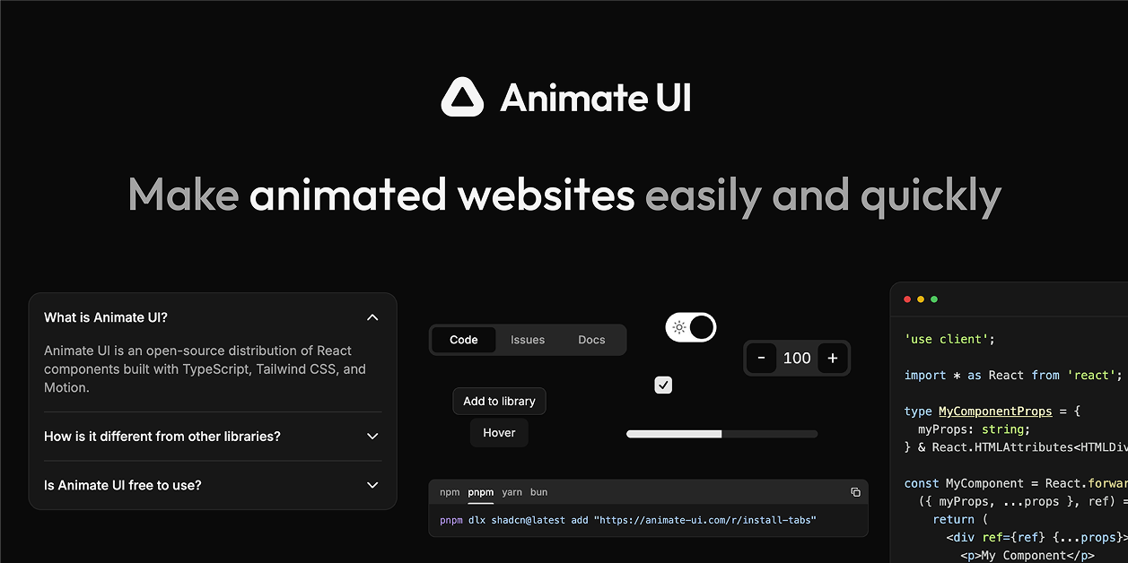
#What is Animate UI?
Animate UI is not a traditional component library but a distribution system that allows developers to install or copy-paste animated components into their projects. By leveraging Motion for animations and Shadcn UI for styling, it provides a seamless way to add interactive and engaging elements to web applications.
#Features ⚡️
Motion-animated Components: Utilize Motion for smooth animations like slide-ins, text effects, and dynamic backgrounds.
Tailwind CSS Styling: Components are styled using Tailwind CSS, ensuring consistency and responsiveness.
Shadcn UI Integration: Designed to complement Shadcn UI components, allowing for cohesive UI development.
Easy Integration: Install components via Shadcn CLI or copy-paste code directly into your project.
Variety of Components: Includes animated primitives, text effects, background animations, and more.
#Pros and Cons
#Pros ✅
Open-source and Free: No cost to use, making it accessible for all developers.
Seamless Integration: Easily integrates with existing React and Tailwind CSS projects.
Enhances User Experience: Adds dynamic animations that improve user engagement.
Customizable: Components can be modified to fit specific project needs.
#Cons ⚠️
Limited Component Variety: May not have as extensive a selection as some other component libraries.
Requires Familiarity with Tailwind CSS: Best suited for projects already using Tailwind CSS.
#Included Components & Templates
Animate UI offers a range of animated components, including:
Primitives: Basic building blocks with animations.
Text Effects: Animated text elements for dynamic content presentation.
Background Animations: Effects like fireworks and cursor interactions to enhance visual appeal.
UI Components: Interactive elements such as accordions and buttons with built-in animations.
These components are designed to be easily integrated and customized within your projects.
#Pricing 💵
Open Source: Animate UI is completely free to use.
No Premium Plans: All components and features are available at no cost.
#Integrations 🧰
Animate UI is compatible with:
Frontend Frameworks: React
Styling: Tailwind CSS
Animation: Motion
Component Library: Shadcn UI
This ensures seamless integration into modern web development workflows.
Frequently Asked Questions
Is Animate UI free to use?
Yes, all components are free under the MIT license, with a Pro version for premium templates.
Are the components customizable?
Yes, components are styled using Tailwind CSS, allowing for easy customization to fit your project's needs.
Can I integrate Animate UI with other libraries?
Animate UI is designed to complement Shadcn UI components, but it can be integrated with other libraries as needed.
How customizable are Animate UI components with Tailwind CSS?
Highly customizable, as Tailwind’s utility classes allow full styling control.
Animate UI – Animated React Components for Tailwind CSS
Open-source animated React components with Motion & Tailwind CSS.
Resource Types:
UI Kits :
Tailwind UITechnology Stack :


Have a product?
Submit your Shadcn product to AllShadcn, get featured, and drive genuine traffic while showcasing your work to the world. Turn your creativity into revenue and begin selling today! 🚀