Shadcn Card Components
Collection of responsive, customizable Shadcn card components perfect for your projects.
Explore Cards


71+ Shadcn Cards
Submit Resource
Componentry
Beautiful, interactive UI components you can copy and paste into apps.

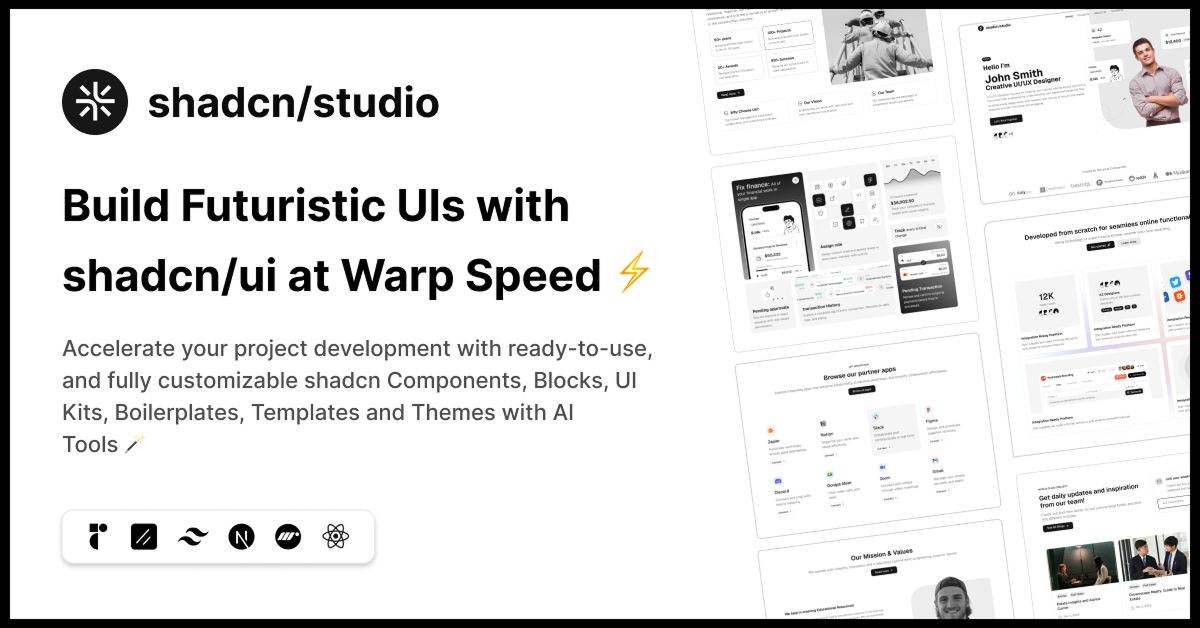
shadcn/studio
Open-source Shadcn registry with copy-paste components.

PDFx: shadcn/ui for React PDFs
Pre-built PDF components for React. Copy them into your project


ForgeUI
Launch sleek, responsive UIs in minutes using ready‑to‑use components


Starwind UI
Set of powerful, accessible components for your Astro projects.

NativeUI
Accessible React Native components via shadcn registry. Open source.
Pixelact UI
Pixel art React components on shadcn/ui. Open source & customizable.

Alpine Registry
A example registry for distributing code using shadcn.

Use layouts
Modern animated React components & micro-interactions for conversion


CSS Snippets
Freemium, ready-to-use snippets for modern HTML, CSS, and React.

Glass UI
Glassmorphic components inspired by Apple’s modern design.


ScrollX UI – Interactive React Components for Modern UIs
Create stunning interfaces with handcrafted components.

21st.dev
Explore, copy, and remix thousands of high-quality React components

UI TripleD
UI components, blocks, and landing page templates powered by shadcn/ui

Basecoat
A components library built with TailwindCSS that works with web stack.
Shadcn Card Components Collection
Welcome to the Shadcn Card Components Collection, a versatile set of beautifully designed card UI elements built with Shadcn UI and styled using Tailwind CSS. Cards are fundamental building blocks in modern web design, used to display content in a visually appealing, organized, and digestible way.
Whether you’re showcasing products, user profiles, articles, or feature highlights, Shadcn Card Components provide a flexible, customizable foundation to create engaging and responsive card layouts that elevate your user experience.
What Are Shadcn Card Components?
Shadcn Card Components are modular, reusable UI blocks designed to present various types of content inside a bordered or elevated container. Built with the utility-first approach of Tailwind CSS and powered by Shadcn UI, these cards offer clean designs, customizable layouts, and responsive behavior to suit any project.
From simple informational cards to complex interactive ones with images, buttons, and badges, this collection covers a wide range of use cases with consistent styling and ease of customization.
Key Features of Shadcn Card Components
Multiple Variants: Includes basic cards, image cards, profile cards, feature cards, and interactive cards with buttons and badges.
Responsive Design: Cards adapt seamlessly across devices, ensuring a smooth and accessible user experience.
Customizable Styles: Easily modify backgrounds, borders, shadows, spacing, and typography using Tailwind CSS utilities.
Flexible Layouts: Supports grid, list, and masonry-style arrangements to fit your content strategy.
Interactive Elements: Add buttons, links, hover effects, and badges to enhance user engagement.
Accessibility Ready: Built following accessibility best practices for keyboard navigation and screen reader compatibility.
Lightweight and Performant: Optimized for fast rendering without sacrificing visual quality.
Easy Integration: Designed to integrate effortlessly with React, Next.js, and other modern frontend frameworks.
Who Should Use Shadcn Card Components?
Developers: Speed up UI development with ready-to-use, customizable card components.
Designers: Maintain consistent card designs across projects with modular components.
Product Teams: Showcase products, features, or testimonials attractively to boost engagement.
Content Creators: Display articles, portfolios, or case studies with elegant card layouts.
Why Choose Shadcn Card Components?
Shadcn Card Components combine aesthetic versatility with functional flexibility, allowing you to craft visually compelling and user-friendly content blocks quickly. Built on the robust foundation of Shadcn UI and Tailwind CSS, these cards ensure design consistency and responsive behavior out of the box.
The utility-first styling approach enables developers to tweak card appearances without writing additional CSS, making customization straightforward and efficient. Additionally, the emphasis on accessibility guarantees that your content reaches a broader audience.
Conclusion:
The Shadcn Card Components Collection is an essential toolkit for creating clean, responsive, and customizable card layouts that enhance content presentation in any web application. Whether you need simple informational cards or complex interactive elements, this collection offers the flexibility and performance required to deliver an outstanding user experience.
Explore the collection today and start building engaging, well-structured card interfaces that make your content shine across all devices and platforms.
Frequently Asked Questions
Explore frequently asked questions about Cards
A customizable UI component to display content in a card layout.
Use pnpm dlx shadcn@latest add card or similar CLI commands.
Have a product?
Submit your Shadcn product to AllShadcn, get featured, and drive genuine traffic while showcasing your work to the world. Turn your creativity into revenue and begin selling today! 🚀