Details about Components work: Components for React
Tailwind CSS Integration: Built with Tailwind CSS for utility-first styling.
React Compatibility: Designed specifically for React applications.
Component Library: Offers a collection of reusable UI components.
Open Source: Available for free under the MIT license.
No Dependencies: Does not require additional libraries or frameworks.
#What is Components works?
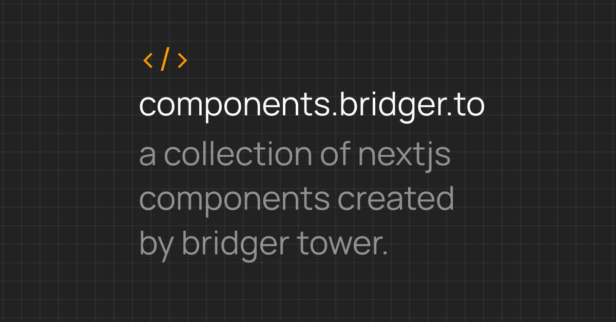
Components.work is an open-source UI component library tailored for React applications. Leveraging the utility-first approach of Tailwind CSS, it provides a collection of reusable and customizable components designed to accelerate frontend development. Whether you're building a landing page, dashboard, or any other web application, Components.work offers a straightforward solution to enhance your UI development process.
#Features ⚡️
Tailwind CSS Integration: Utilizes Tailwind's utility classes for styling, promoting a consistent design system.
React Compatibility: Components are designed to integrate seamlessly into React projects.
Reusable Components: Provides a variety of UI elements like buttons, cards, modals, and more.
No Dependencies: Built without additional libraries, ensuring lightweight and efficient performance.
Open Source: Released under the MIT license, encouraging community contributions.
#Pros and Cons
#Pros ✅
Seamless Integration: Easily integrates with existing React and Tailwind CSS projects.
Reusable Components: Offers a library of reusable UI components, reducing development time.
Lightweight: Built without additional dependencies, ensuring efficient performance.
Open Source: Freely available for developers to use and contribute.
#Cons ⚠️
Limited Components: The library may not have as extensive a collection of components as some other UI libraries.
React Only: Currently designed specifically for React applications.
#Included Components - Templates
Components.work offers a variety of UI components, including:
Buttons: Various button styles for different actions.
Inputs: Text fields and form inputs.
Modals: Dialog boxes for user interactions.
Cards: Content containers for displaying information.
Tooltips: Hover-over text for additional information.
Dropdowns: Menus for selecting options.
Tabs: Navigation elements for switching between views.
Progress Bars: Indicators for task completion.
Each component is designed to be reusable and customizable, allowing developers to build consistent and accessible user interfaces.
#Pricing 💵
Components.work is an open-source project, meaning it is free to use for both personal and commercial projects. There are no licensing fees or subscription costs associated with using Components.work.
#Integrations 🧰
Components.work is designed for seamless integration with:
React: Utilizes React's component-based architecture for building user interfaces.
Tailwind CSS: Employs Tailwind's utility-first approach for styling components.
Frequently Asked Questions
What is Components.work?
Components.work is an open-source UI component library for React applications, built with Tailwind CSS. It provides reusable and customizable components to accelerate frontend development.
Is Components.work free to use?
Yes, Components.work is open-source and free to use for both personal and commercial projects.
Can I use Components.work with frameworks other than React?
Currently, Components.work is designed specifically for React applications and does not offer official support for other frameworks.
Components work: Components for React
Collection of components for Nextjs built using Tailwind and shadcnui.
Resource Types:
UI Kits :
Shadcn UITechnology Stack :


Have a product?
Submit your Shadcn product to AllShadcn, get featured, and drive genuine traffic while showcasing your work to the world. Turn your creativity into revenue and begin selling today! 🚀