Details about Extend UI
Reusable Components: Pre-built, customizable UI elements.
Performance Optimized: Built on shadcn/ui for efficient rendering.
Easy Integration: Compatible with React and Next.js projects.
Compound Components: Designed for flexibility and composability.
Active Development: Regular updates and community support.
#What is Extend UI?
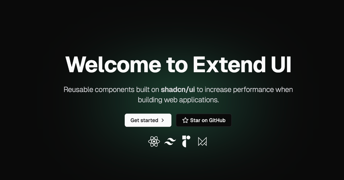
Extend UI is a component library tailored for React and Next.js applications, leveraging the shadcn/ui framework. It aims to accelerate UI development by providing a collection of reusable, performance-optimized components. Whether you're building a dashboard, a landing page, or a complex web application, Extend UI offers a solid foundation to streamline your development process.
#Features ⚡️
Pre-built Components: Access a variety of UI elements like buttons, inputs, selects, and date pickers, each with multiple variants to suit different design needs.
Performance Focused: Components are optimized for fast rendering, ensuring smooth user experiences even in complex applications.
Customizable: Easily adapt components to fit your project's design system or branding guidelines.
Seamless Integration: Designed to integrate effortlessly into React and Next.js projects, reducing setup time.
Compound Components: Utilize compound components that offer greater flexibility and composability, allowing for more dynamic and interactive UIs.
#Pros and Cons
#Pros ✅
Rapid Development: Accelerate your UI development with ready-to-use components.
Optimized Performance: Built with performance in mind, ensuring fast load times and smooth interactions.
Easy to Use: Intuitive API and seamless integration with React and Next.js.
Customizable: Easily tweak components to match your project's design requirements.
Active Community: Benefit from ongoing updates and support from the Extend UI community.
#Cons ⚠️
Limited to React/Next.js: Currently tailored for React and Next.js, which may not suit projects using other frameworks.
Learning Curve: New users may need time to familiarize themselves with the shadcn/ui framework and compound component patterns.
#Included Components - Templates
Extend UI offers a diverse set of components and templates to kickstart your project:
Buttons: Over 25 variants to suit various actions and styles.
Inputs: 17+ input types, including text fields, checkboxes, and toggles.
Selects: 7+ select components for dropdown menus and multi-select options.
Date Pickers: 5+ date picker variants for date selection needs.
Commands: 3+ command components for implementing command palettes.
Cards: 4 card layouts for displaying content in a structured manner.
Forms: 2 form templates to handle user input efficiently.
File Upload: 1 file upload component for handling file inputs.
Each component is designed with flexibility in mind, allowing you to customize styles and behaviors to fit your application's requirements.
#Pricing 💵
Extend UI offers both free and paid options:
Custom Components: $199 Get bespoke components designed and developed to fit your specific needs.
Pages: $1299 Full-page designs and development for a complete web presence.
#Integrations 🧰
Extend UI is designed for seamless integration with:
React: Utilize React's component-based architecture for building user interfaces.
Next.js: Leverage Next.js's features like server-side rendering and static site generation for optimized performance.
Currently, Extend UI does not offer official support for other frameworks like Vue or Svelte.
Frequently Asked Questions
Can I use Extend UI with Vue or Svelte?
Currently, Extend UI is tailored for React and Next.js. There is no official support for Vue or Svelte.
How do I customize the components?
Components are designed to be easily customizable through props and Tailwind CSS classes. You can adjust styles, sizes, and behaviors to fit your needs.
Is Extend UI suitable for production applications?
Yes, Extend UI is optimized for performance and designed to be used in production environments.
Extend UI
Beautifully designed landing page components built with Shadcn/UI.
Resource Types:
UI Kits :
Shadcn UITechnology Stack :


Have a product?
Submit your Shadcn product to AllShadcn, get featured, and drive genuine traffic while showcasing your work to the world. Turn your creativity into revenue and begin selling today! 🚀