Details about Fellipeutaka UI
A modern UI component library designed for speed and ease of use
Built with Tailwind CSS for easy customization and integration
Offers a wide range of pre-built, reusable components
Fully responsive and mobile-friendly design
Ideal for React applications (or adaptable for other frameworks)
#What is Fellipeutaka/ui?
Fellipeutaka/ui is a lightweight yet powerful UI component library that accelerates frontend development. Designed with Tailwind CSS, it offers a collection of pre-designed, fully responsive components that can be easily integrated into modern web applications. Whether you are building a landing page, an e-commerce site, or a complex dashboard, fellipeutaka/ui provides all the necessary building blocks to create a beautiful and functional interface in no time.
The library emphasizes both simplicity and flexibility, making it an excellent choice for developers looking to build clean, user-friendly UIs quickly while retaining full control over the design.
#Features ⚡️
Tailwind CSS Integration
Built on top of Tailwind CSS, the library allows for extensive customization. Tailwind’s utility-first approach means you can tweak styles directly using classes, giving you flexibility and consistency throughout your project.Pre-designed Components
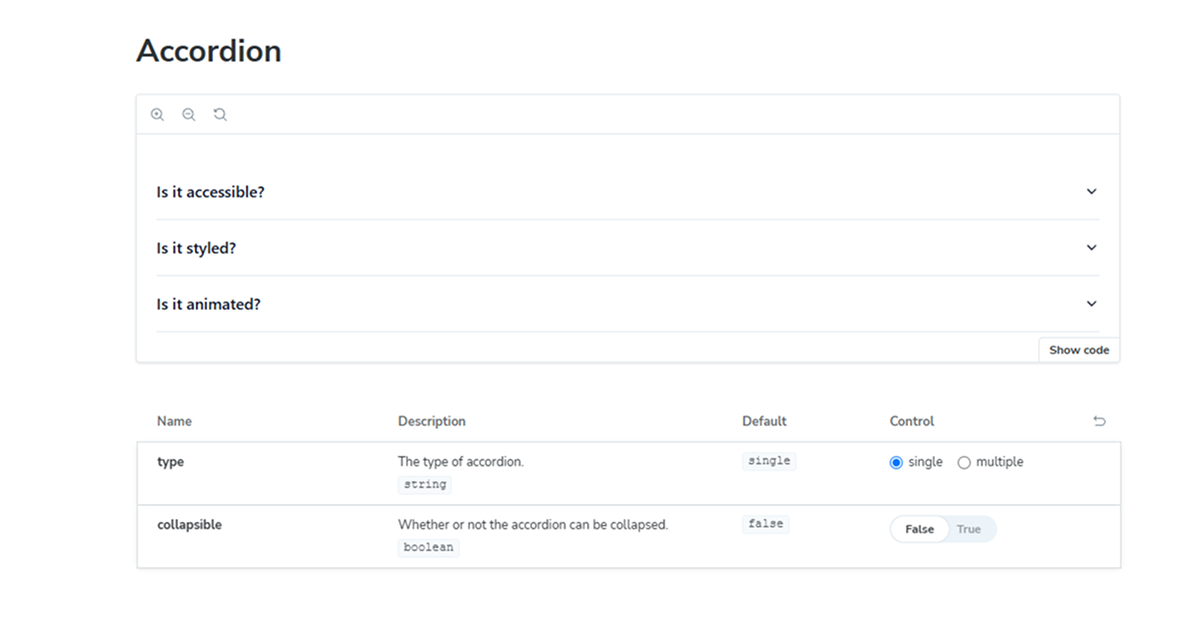
fellipeutaka/ui includes a range of reusable UI components, including buttons, cards, modals, navigation bars, forms, and more. These components are designed to be ready-to-use while also offering customization options.Responsive Design
Every component is designed with responsiveness in mind. From small mobile screens to large desktop monitors, the library ensures that your application will look great on any device.Easy to Use
With minimal setup required, you can integrate fellipeutaka/ui into your project and start building right away. The components are intuitive, and the library documentation provides clear examples and usage instructions.Dark Mode Support
Many components come with built-in support for dark mode, making it easy to implement modern, user-preference-based design systems.Highly Customizable
While the components come with default designs, they are highly customizable using Tailwind's utilities. You can modify colors, spacing, typography, and more to fit your project’s branding.
#Pros and Cons
Pros ✅
Speedy Development
fellipeutaka/ui drastically reduces development time by providing pre-built, high-quality components that are ready to use out of the box.Fully Customizable
With the flexibility of Tailwind CSS, developers can easily modify the appearance of components to suit their specific needs and design system.Mobile-Friendly
All components are built with mobile-first in mind, ensuring your web app or site is fully responsive and looks great on all screen sizes.
Cons ⚠️
Tailwind Dependency
Since the library is built with Tailwind CSS, you need to have Tailwind set up in your project. For developers unfamiliar with Tailwind, there may be a learning curve involved.Limited Features for Advanced Applications
While the library provides many essential components, it might lack some of the more advanced features or complex components found in larger UI frameworks like Material UI or Ant Design.
#Included Components - Templates
fellipeutaka/ui offers a wide variety of pre-designed components and templates, including:
Buttons
Customizable primary, secondary, and tertiary buttons for different use cases.Cards
Elegant card layouts for showcasing content, products, or services.Modals
Pop-up modals for alerts, confirmations, or displaying additional content.Navigation
Responsive navigation bars, side menus, and dropdowns for efficient site navigation.Forms
Pre-designed form components, including input fields, checkboxes, and radio buttons, to help you gather user data quickly and efficiently.Notifications
Simple, customizable notification components for displaying success, error, or informational messages to users.
#Pricing 💵
fellipeutaka/ui is open-source and free to use, making it an excellent choice for developers on a budget or startups that want to speed up their product development without breaking the bank.
#Integrations 🧰
React
While primarily built for React applications, fellipeutaka/ui components can be adapted for use in other frameworks like Vue or Svelte with some modifications. The library’s components are modular, allowing you to pick and choose what you need.Tailwind CSS
Since the library is based on Tailwind CSS, it integrates seamlessly into projects that already use Tailwind, and it’s easy to customize the components to align with your design system.Backend Integrations
The library’s components can be easily integrated with backend systems for dynamic data presentation. Use them in your forms, cards, or dashboards to display live information from your database.
Frequently Asked Questions
What is fellipeutaka/ui?
fellipeutaka/ui is a UI component library built with Tailwind CSS, providing developers with a collection of customizable, responsive components that can be used to build modern web applications.
Can I use fellipeutaka/ui with frameworks other than React?
While fellipeutaka/ui is built for React, it can be adapted for use with other frameworks such as Vue or Angular by modifying the components or using them as pure HTML/CSS.
How do I customize the components?
The components in fellipeutaka/ui are built using Tailwind CSS, allowing you to customize them using standard Tailwind utility classes to match your project’s design system.
Is there any support or documentation?
Yes, the fellipeutaka/ui GitHub repository provides documentation with detailed instructions and examples on how to use and customize the components.
Fellipeutaka UI
Design System with accessible and customizable components by shadcn/ui
Resource Types:
UI Kits :
Shadcn UITechnology Stack :


Have a product?
Submit your Shadcn product to AllShadcn, get featured, and drive genuine traffic while showcasing your work to the world. Turn your creativity into revenue and begin selling today! 🚀