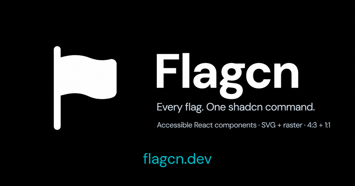
Details about Flagcn: Accessible Flag Components for shadcn/ui
Includes 306 ready-to-use flag components for React and shadcn/ui.
Components can be installed using the familiar shadcn CLI workflow.
Supports multiple image formats including SVG, PNG, WebP, and JPEG.
Offers multiple flag presentation styles including 4:3, square, and original aspect ratios.
Designed around accessible, source-owned React components.
Fits naturally into projects already using shadcn/ui.
Useful for country selectors, language pickers, international dashboards, ecommerce, SaaS apps, and location-based interfaces.
#What is Flagcn?
Flagcn is a collection of accessible React flag components designed specifically for developers working with shadcn/ui. It provides 306 country and regional flag components that can be installed directly into a project using the shadcn CLI. Developers can choose between SVG, PNG, WebP, and JPEG assets and display flags in 4:3, square, or original aspect ratios, making Flagcn useful for international applications, language selectors, country inputs, dashboards, ecommerce interfaces, and other location-aware products.
#Features ⚡
306 Flag Components: Access a large library of ready-to-use country and regional flags.
Shadcn CLI Installation: Add individual flag components using a workflow familiar to shadcn/ui developers.
React Components: Flags are designed to work directly inside modern React applications.
Multiple Formats: Choose from SVG, PNG, WebP, or JPEG depending on your project requirements.
Flexible Aspect Ratios: Display flags in 4:3, square, or their original proportions.
Accessible Components: The library is designed with accessibility in mind.
Source Ownership: Components are added directly to your project instead of being locked behind a runtime package.
Easy Customization: Adjust sizing, presentation, and surrounding UI to match your application's design system.
International UI Ready: Ideal for localization controls, country selectors, phone inputs, currency selectors, and global dashboards.
#Pro and cons
Pro ✅:
306 ready-made flags
Built for shadcn/ui
Familiar CLI installation workflow
Multiple image formats
Flexible aspect ratios
Accessible implementation
Easy to integrate into React applications
Useful for international and localization-focused interfaces
Cons ⚠️:
Primarily useful for React and shadcn-based projects
Focused specifically on flags rather than being a general icon library
Developers may still need additional logic for country selectors or localization
Flag assets alone do not provide complete dropdown, phone input, or language-selection functionality
#Included Components/Templates
Flagcn focuses on individual reusable flag components rather than complete application templates.
306 flag components
Country flags
Regional flag assets
SVG flag variants
PNG flag variants
WebP flag variants
JPEG flag variants
4:3 flag layouts
Square flag layouts
Original-aspect-ratio layouts
React-compatible implementations
shadcn CLI-installable components
#Pricing 💸
Flagcn is positioned as an open component resource rather than a paid UI marketplace product. Its components can be installed directly into compatible projects through the shadcn workflow.
Free to use
No advertised Pro tier
No per-component pricing
No subscription required for the core flag collection
#Integrations 🧰
Flagcn is designed primarily for the modern React and shadcn ecosystem.
shadcn/ui
shadcn CLI
React
TypeScript
Next.js
SVG
PNG
WebP
JPEG
Modern React frameworks
Frequently Asked Questions
What is Flagcn?
Flagcn is a collection of accessible flag components for React and shadcn/ui. It provides 306 ready-to-use flag components
How many flags does Flagcn include?
306 flag components are currently available.
Does Flagcn work with shadcn/ui?
Yes. It is specifically designed for the shadcn ecosystem and supports shadcn CLI installation.
Flagcn: Accessible Flag Components for shadcn/ui
306 accessible flag components built for shadcn/ui.
Resource Types:
UI Kits :
Shadcn UITechnology Stack :
Featured Shadcn Products
Add Featured Product

.png?width=300&height=156&format=auto)
Have a product?
Submit your Shadcn product to AllShadcn, get featured, and drive genuine traffic while showcasing your work to the world. Turn your creativity into revenue and begin selling today! 🚀