Details about Inspira UI
Comprehensive UI Toolkit: A complete set of pre-designed UI components for building modern web applications.
Customizable and Scalable: Flexible components that can be easily customized to suit your needs.
Responsive Design: Components that adapt to various screen sizes, ensuring a seamless experience across devices.
Developer-Friendly: Optimized for rapid development with minimal setup and integration.
Modern Aesthetic: Offers a clean and modern look, ideal for contemporary web and mobile apps.
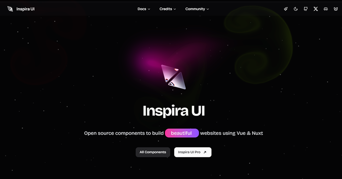
#What is Inspira UI?
Inspira UI is a powerful and flexible UI toolkit that enables developers to create stunning, responsive user interfaces for modern web applications. Packed with pre-built components and a focus on usability, Inspira UI allows you to speed up development while maintaining a high standard of design quality.
Whether you're working on a personal project, an enterprise-level application, or a startup website, Inspira UI provides everything you need to build beautiful, functional, and intuitive interfaces. The toolkit is designed with both developers and designers in mind, offering a seamless experience for building, customizing, and deploying your applications.
#Features ⚡️
Pre-designed Components: A wide variety of components such as buttons, cards, forms, modals, and navigation menus, all designed with a modern aesthetic in mind.
Responsive Layouts: Fully responsive designs that ensure your app looks great on mobile, tablet, and desktop screens.
Customization Options: Easily customize the colors, typography, spacing, and more to match your project’s branding.
Dark Mode Support: Built-in dark mode support that allows your app to toggle between light and dark themes seamlessly.
Cross-Platform Compatibility: Components are optimized for web and mobile platforms, ensuring consistency across devices.
Intuitive Documentation: Well-organized, easy-to-follow documentation to help you get started quickly and make the most of the toolkit.
Optimized Performance: Designed with performance in mind, components are lightweight and fast, minimizing any impact on page load times.
#Pros and Cons
#Pros ✅
Rapid Development: Pre-designed, responsive components allow for quick development, reducing the time spent on design.
Highly Customizable: Offers deep customization options to fit your brand’s needs, from color schemes to component styles.
User-Friendly: The intuitive interface and clear documentation make it easy to integrate into your projects, regardless of experience level.
Responsive: Ensures your UI looks great across different devices, providing an excellent user experience on mobile and desktop.
Open Source: The library is open-source, meaning it's free to use, extend, and contribute to.
#Cons ⚠️
Limited Advanced Features: The toolkit might not have all the advanced UI patterns that some larger frameworks provide, such as complex animations or highly specialized components.
Learning Curve: While the documentation is helpful, developers new to UI libraries may need some time to get familiar with the structure.
Dependency on a Specific Design Philosophy: While customization is possible, the design philosophy of Inspira UI may not suit all projects, especially if you need a more minimalistic or highly unique style.
#Included Components - Templates
Inspira UI includes a range of pre-built components and templates designed to make building modern web applications quicker and easier:
Buttons: Customizable buttons in various sizes, shapes, and styles to match your design.
Forms: Ready-to-use form components such as input fields, checkboxes, radio buttons, and dropdowns.
Navigation: Pre-designed navigation components including top bars, sidebars, and breadcrumbs.
Cards: Versatile cards for displaying content, with options for images, text, and buttons.
Modals and Alerts: Lightweight modals and alert components that can be used for notifications, confirmation dialogues, and more.
Tooltips: Simple yet effective tooltips for additional user guidance on hover.
#Pricing 💵
Inspira UI is free and open-source, making it accessible to developers of all skill levels. You can freely use, customize, and contribute to the library. If you require premium support or additional services (like enterprise-level features or custom components), that might be available separately, depending on the creator's offerings.
#Integrations 🧰
Inspira UI is designed to work seamlessly with modern JavaScript frameworks, including:
React: Easily integrate Inspira UI components into your React applications, leveraging hooks and component-based architecture.
Vue: Integrate Inspira UI with Vue.js for building dynamic single-page applications.
Angular: Perfect for Angular applications, with pre-built components that integrate easily into Angular templates.
Tailwind CSS: The toolkit pairs well with Tailwind CSS, allowing for utility-first design and further customization.
Additionally, you can extend Inspira UI with third-party libraries or backend technologies to meet your specific project requirements.
Frequently Asked Questions
What is Inspira UI?
Inspira UI is a modern UI component toolkit designed to help developers build responsive, visually appealing web applications quickly. It includes pre-designed components for everything from buttons to forms, with customization options.
Is Inspira UI free?
Yes, Inspira UI is open-source and free to use. You can integrate it into any project without worrying about licensing fees.
Can I customize the Inspira UI components?
Absolutely! All the components in Inspira UI are fully customizable. You can adjust the colors, typography, spacing, and other styles to fit your needs.
Does Inspira UI support dark mode?
Yes, Inspira UI comes with built-in support for dark mode, allowing your users to toggle between light and dark themes.

Featured Shadcn Products
Add Featured Product


Have a product?
Submit your Shadcn product to AllShadcn, get featured, and drive genuine traffic while showcasing your work to the world. Turn your creativity into revenue and begin selling today! 🚀