Details about Kokonut UI: Tailwind CSS Components for React & Next.js
100+ open-source UI components
Built with Tailwind CSS, React, Next.js, and shadcn/ui
Framer Motion animations for smooth UX
CLI-based installation for seamless integration
Pro version offers premium templates and lifetime updates.
#What is Kokonut UI?
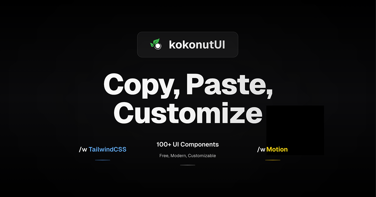
Kokonut UI is a modern, open-source UI component library crafted for developers building with React and Next.js. Leveraging Tailwind CSS and shadcn/ui, it provides a collection of customizable components designed to accelerate web development. The integration of Framer Motion ensures smooth animations, enhancing user experience. For those seeking more advanced features, KokonutUI Pro offers premium templates and components with lifetime updates.
#Features ⚡️
Tailwind CSS Integration: Utilizes Tailwind's utility-first approach for rapid styling and customization.
React & Next.js Compatibility: Components are optimized for seamless integration with React and Next.js projects.
Framer Motion Animations: Incorporates smooth, modern animations to enhance user interactions.
shadcn/ui Components: Built upon shadcn/ui for accessible and customizable UI elements.
CLI Installation: Offers a command-line interface for easy component installation and updates.
Dark Mode Support: Components are designed to support both light and dark themes.
Responsive Design: Ensures components are mobile-friendly and adapt to various screen sizes.
#Pros and Cons
#Pros ✅
Open Source: Free to use and modify, encouraging community contributions.
Comprehensive Documentation: Provides clear guides and examples for easy integration.
Active Development: Regular updates and new components added to the library.
Versatile Components: Suitable for a wide range of applications, from dashboards to landing pages.
Performance Optimized: Lightweight components designed for fast load times.
#Cons ⚠️
Limited Framework Support: Primarily designed for React and Next.js; may require adjustments for other frameworks.
Learning Curve: Beginners may need time to familiarize themselves with Tailwind CSS and shadcn/ui.
Pro Version Cost: Access to premium templates and components requires a paid license.
#Included Components - Templates
Kokonut UI offers a diverse set of components and templates, including:
Hero Sections: Engaging introductory sections for landing pages.
Pricing Tables: Clear and concise pricing layouts.
Authentication Pages: Login and registration forms with modern design.
Dashboards: Components for building admin panels and analytics dashboards.
Feature Sections: Highlight product features effectively.
Testimonials: Display customer feedback and reviews.
Footers and Headers: Essential layout components for navigation and information.
These components are designed to be easily customizable, allowing developers to tailor them to specific project needs.
#Pricing 💵
Kokonut UI (Free Version): Access to over 100 open-source components.
KokonutUI Pro: A one-time payment of $99 (discounted from $169) for lifetime access to:
70+ premium components.
7 professionally designed templates.
Lifetime updates and new additions.
Commercial usage rights.
Priority support.
#Integrations 🧰
Frameworks: Optimized for React and Next.js applications.
Styling: Built with Tailwind CSS for utility-first styling.
Animations: Incorporates Framer Motion for smooth transitions and animations.
UI Components: Utilizes shadcn/ui for accessible and customizable UI elements.
Icons: Supports lucide-icons for consistent iconography.
CLI Tool: Provides a command-line interface for easy component installation and management.
Frequently Asked Questions
Is Kokonut UI free to use?
Yes, Kokonut UI offers a free version with over 100 components. For additional premium components and templates, KokonutUI Pro is available for purchase.
What is Kokonut UI?
Kokonut UI is an open-source library of UI components built with Tailwind CSS, React, and Next.js. It offers a range of customizable components to accelerate web development.
How do I install components from Kokonut UI?
Components can be installed using the provided CLI tool, which simplifies the process and ensures all dependencies are correctly configured. Detailed installation instructions are available in the documentation.
Do I need to know Tailwind CSS to use Kokonut UI?
While familiarity with Tailwind CSS is beneficial, the components are designed to be user-friendly, and the documentation provides guidance for developers of all levels.
Kokonut UI: Tailwind CSS Components for React & Next.js
Collection of components built for Next.js with Tailwind CSS & shadcn.
Resource Types:
UI Kits :
Shadcn UITechnology Stack :


Have a product?
Submit your Shadcn product to AllShadcn, get featured, and drive genuine traffic while showcasing your work to the world. Turn your creativity into revenue and begin selling today! 🚀