Details about Magic UI
150+ Animated Components: Pre-built, interactive UI elements.
Built with React, TypeScript, Tailwind CSS, and Framer Motion: Modern tech stack for seamless integration.
Designed for Design Engineers: Focus on bridging design and development.
Open Source: Free to use and contribute.
Magic UI Pro: Premium templates and blocks for rapid landing page creation.
#What is Magic UI?
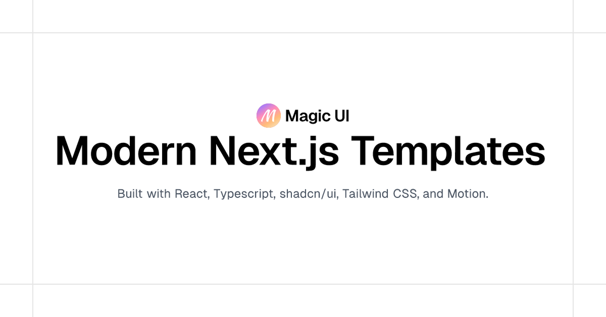
Magic UI is an open-source UI component library tailored for design engineers. It offers over 150 animated components built with React, TypeScript, Tailwind CSS, and Framer Motion. The library aims to bridge the gap between design and development, providing developers with visually appealing and interactive elements that can be easily integrated into web applications. Magic UI is particularly suitable for startups, personal portfolios, and MVPs, offering a design-centric approach to UI development.
#Features ⚡️
Animated Components: Includes over 150 pre-built animated UI elements.
Modern Tech Stack: Built with React, TypeScript, Tailwind CSS, and Framer Motion.
Design-Centric: Focus on bridging design and development.
Open Source: Free to use and contribute.
#Pros and Cons
#Pros ✅
Rapid Development: Accelerate UI development with pre-built components.
High Customizability: Easily adapt components to fit your project's design system or branding guidelines.
Seamless Integration: Designed to integrate effortlessly into React and Next.js projects.
Active Community: Benefit from ongoing updates and support from the Magic UI community.
#Cons ⚠️
Limited to React: Currently tailored for React applications, which may not suit projects using other frameworks.
Learning Curve: New users may need time to familiarize themselves with the Magic UI framework and component patterns.
#Included Components - Templates
Magic UI offers a diverse set of components and templates to kickstart your project:
Buttons: Various button styles for different actions.
Inputs: Text fields and form inputs.
Modals: Dialog boxes for user interactions.
Cards: Content containers for displaying information.
Tooltips: Hover-over text for additional information.
Dropdowns: Menus for selecting options.
Tabs: Navigation elements for switching between views.
Progress Bars: Indicators for task completion.
Each component is designed with flexibility in mind, allowing you to customize styles and behaviors to fit your application's requirements.
#Pricing 💵
Free Version: Access to a limited set of components and features.
#Integrations 🧰
Magic UI is designed for seamless integration with:
React: Utilize React's component-based architecture for building user interfaces.
Next.js: Leverage Next.js's features like server-side rendering and static site generation for optimized performance.
Currently, Magic UI does not offer official support for other frameworks like Vue or Svelte.
Frequently Asked Questions
Can I use Magic UI with Vue or Svelte?
Currently, Magic UI is tailored for React applications. There is no official support for Vue or Svelte.
How do I customize the components?
Components are designed to be easily customizable through props and Tailwind CSS classes. You can adjust styles, sizes, and behaviors to fit your needs.
Is Magic UI suitable for production applications?
Yes, Magic UI is optimized for performance and designed to be used in production environments.
Magic UI
Free and open-source animated components built with React.
Resource Types:
UI Kits :
Shadcn UITechnology Stack :


Have a product?
Submit your Shadcn product to AllShadcn, get featured, and drive genuine traffic while showcasing your work to the world. Turn your creativity into revenue and begin selling today! 🚀