Details about Matos UI
Copy-first component registry built on top of shadcn/ui.
Includes 21 styled UI components and 10 form-related resources.
Components are installed directly through the shadcn CLI.
Uses Tailwind CSS design tokens for straightforward customization.
Adds polished animations and micro-interactions with Framer Motion.
Developers receive editable source code instead of a locked package.
#What is Matos UI?
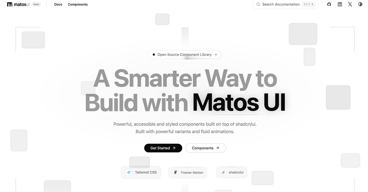
Matos UI is a source-first collection of styled React components created for developers building polished React and Next.js applications. It extends shadcn/ui with opinionated visual styling, accessible states, responsive layouts, flexible variants, and motion-rich interactions. The library is especially useful for SaaS products, dashboards, internal tools, productivity apps, and modern interfaces that need more character than standard component primitives without sacrificing source-code ownership.
#Features ⚡
Copy-first architecture: Components are copied into your application, giving you complete control over their code and behavior.
shadcn CLI installation: Add an individual component, its demo, or the complete registry using familiar shadcn commands.
Motion-rich interactions: Framer Motion powers subtle hover, presence, layout, and state transitions.
Accessible states: Focus, disabled, loading, and ARIA-related behavior are considered within the component designs.
Design-token styling: Components use semantic tokens such as
bg-card,border-border, andtext-muted-foreground.Flexible customization: Modify component styles, variants, animations, and APIs directly inside your project.
Responsive layouts: Components are designed for use across different screen sizes and application layouts.
Developer-focused APIs: Each component aims to provide a focused interface without introducing unnecessary abstractions.
Component demos: Most registry components include matching demonstration files for implementation guidance.
Form resources: The documentation covers fields, inputs, selects, checkboxes, form layouts, and React Hook Form with Zod.
#Pro and cons
Pro ✅: Matos UI provides several practical benefits for React developers.
Full ownership of installed component source code.
Visually distinctive components beyond default shadcn/ui styling.
Strong compatibility with existing shadcn/ui projects.
Individual component installation helps avoid unnecessary code.
Useful animated components for modern product interfaces.
Accessibility and responsive behavior are considered from the start.
No proprietary runtime package or black-box abstraction.
Cons ⚠️: There are also some current limitations to consider.
The component collection is still relatively small.
The website currently identifies the project as being in beta.
Primarily designed for React and Next.js projects.
Motion-heavy components can require additional performance consideration.
Some components may need styling adjustments to match an established design system.
The GitHub repository does not currently include a formal license file, so teams should verify usage terms before commercial redistribution.
#Included Components/Templates
Matos UI currently provides 21 primary components alongside form primitives and implementation resources.
Accordion
Action Bar
Activity Feed
Badge
Button
Command Dock
Data Table
Detail Panel
Dynamic Island
Feedback Card
File Upload
Inset Command Dock
Kinetic Card
Metric Card
Motion Tabs
Notification Stack
Process Timeline Engine
Progress Orbit
Reactive Button
Spotlight Card
Status Pulse Card
Field and Input components
Password Input
Select and Textarea
Checkbox
Form Grid
Form Section
React Hook Form and Zod integration example
#Pricing 💸
Matos UI is currently presented as a publicly accessible component registry, with no paid subscription or premium pricing tier listed on its website.
Components can be installed directly from the public registry.
Individual components and the complete collection are currently accessible without a listed purchase requirement.
No Pro, Team, or Enterprise plan is currently advertised.
The repository is publicly available on GitHub.
A formal open-source license file is not currently included, according to the repository documentation, so this should be reviewed before redistributing the code.
#Integrations 🧰
React
Next.js
TypeScript
Tailwind CSS
shadcn/ui
shadcn CLI
Framer Motion
React Hook Form
Zod
Node.js 18+
Bun
Fumadocs
Docker and Nginx for self-hosted documentation workflows
Frequently Asked Questions
Is Matos UI a traditional npm component library?
No. It follows a copy-first model where component source files are installed directly into your application.
Do I need shadcn/ui before installing Matos UI?
Yes. Your React or Next.js project should have Tailwind CSS configured and shadcn/ui initialized.
Can I install only one component?
Yes. Individual components can be installed from their registry JSON URLs using the shadcn CLI.
Matos UI
Styled shadcn/ui components with fluid interactions
Resource Types:
UI Kits :
Shadcn UITechnology Stack :


Have a product?
Submit your Shadcn product to AllShadcn, get featured, and drive genuine traffic while showcasing your work to the world. Turn your creativity into revenue and begin selling today! 🚀