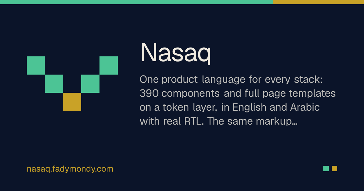
Details about Nasaq: Open-Source Multi-Framework UI Component Library
Open-source design system featuring 392 UI components across 49 component categories.
Supports React, shadcn/ui, Vue 3, Laravel Blade, and HTML with Alpine.js.
Built using Base UI and Tailwind CSS v4.
Includes 13 bilingual website templates through the Nasaq Studio and CircleXO ecosystem.
Offers 11 brand themes with customizable design tokens.
Supports English, Arabic, and right-to-left (RTL) layouts.
Provides light and dark modes with consistent styling.
Includes an MCP server for Claude, Cursor, and other AI coding assistants.
Offers application-specific components for AI assistants, dashboards, CRM, eCommerce, and developer tools.
Available under the MIT open-source license.
#What is Nasaq?
Nasaq is an open-source, multi-framework UI component library and design system created by Fady Mondy for building consistent, accessible, and multilingual web applications. Featuring 392 components, 11 brand themes, and 13 website templates, Nasaq provides a unified design language across React, Next.js, Vue 3, Nuxt, Laravel, Filament, and HTML applications. Built on Base UI and Tailwind CSS v4, it follows shadcn/ui conventions while offering both source-code ownership through the shadcn registry and versioned dependencies through npm. Its support for English, Arabic, RTL layouts, and AI-assisted development makes it particularly useful for SaaS dashboards, admin panels, eCommerce platforms, AI applications, and enterprise software.
#Features ⚡
392 UI Components: Extensive collection covering forms, navigation, tables, charts, AI interfaces, editors, commerce, and application workflows.
Multi-Framework Support: Shared design system across React, Vue 3, Laravel Blade, and HTML with Alpine.js.
shadcn/ui Registry: Install individual components directly into React projects using the shadcn CLI.
Tailwind CSS v4: Modern utility-first styling with reusable design tokens.
11 Brand Themes: Switch between predefined visual identities without rewriting components.
RTL and Arabic Support: Built-in right-to-left layouts, localized text, and Arabic typography.
Light and Dark Modes: Theme-aware components powered by shared CSS variables.
AI Assistant Components: Includes chat interfaces, model selectors, AI citations, voice overlays, and generative UI elements.
Advanced Data Components: Tables, analytics interfaces, reporting layouts, filters, and dashboard widgets.
Commerce Components: Product listings, carts, checkout flows, pricing tables, and store management interfaces.
Component Playground: Preview components and experiment with themes, locales, density, and other settings.
13 Website Templates: Bilingual website templates for agencies, businesses, clinics, portfolios, and online stores.
AI-Powered Development: MCP server allows AI coding assistants to discover components and understand their documentation.
Design Token System: Customizable colors, spacing, typography, border radius, and density settings.
Accessibility Features: Keyboard navigation, focus handling, screen-reader support, and reduced-motion considerations.
Cross-Platform Resources: Additional React Native and Electron UI packages.
#Pro and cons
Pro ✅:
Completely open-source under the MIT license.
Large collection of 392 reusable components.
Supports multiple frameworks beyond React.
Strong integration with the shadcn/ui ecosystem.
Built-in Arabic and RTL support.
Includes both standard and advanced application components.
Customizable brand themes and design tokens.
Provides AI-specific UI components and MCP integration.
Offers ready-made website and application templates.
Allows developers to own component source code through the shadcn registry.
Cons ⚠️:
Currently at version 0.1.0, so APIs may change.
Some components are marked beta or experimental.
Broad component coverage may increase the learning curve.
Framework-specific configuration can require additional setup.
React Native and Electron integrations are still in early development.
Full functionality of complex components may require backend integration.
Smaller community and ecosystem compared with mature UI libraries.
#Included Components/Templates
Nasaq organizes its 392 components into 49 categories. The following are some of its major component groups.
Component category | Count |
|---|---|
Forms | 21 |
Authentication | 16 |
Data Display | 16 |
Storefront | 14 |
Navigation | 13 |
Layout | 13 |
Developer Tools | 12 |
AI Assistant | 11 |
Workflow | 11 |
Server Tools | 11 |
Pricing | 6 |
Editors | 10 |
Monitoring | 10 |
Overlays | 10 |
Analytics | 9 |
AI Agents | 9 |
Security | 9 |
Pickers | 8 |
Alerts & Notifications | 8 |
Account | 8 |
The remaining categories cover billing, bookings, CRM, healthcare, marketing, SEO, productivity, collaboration, integrations, charts, and other application interfaces.
#Notable UI Components
CopilotChat: AI assistant chat interface with streaming messages, model selection, sources, and file attachments.
CopilotDock: Dockable AI assistant panel for web applications.
Artifact Renderer: Displays structured AI-generated cards, tables, charts, and other UI outputs.
AI Model Picker: Select AI models, reasoning effort, agents, and skills.
Agent Steps and Confirm: Displays agent operations and requires approval before applying changes.
PricingTable: Interactive subscription pricing with monthly and yearly billing.
PlanCard: Pricing plan presentation with highlighted recommendations.
LandingPageEditor: Section-based editor with live responsive previews.
RichTextEditor: Tiptap-powered rich text editor.
Content Table Editor: Editable data grid with sorting, validation, and CSV export.
EmojiPicker: Searchable emoji picker with keyboard navigation.
DatePicker: Locale-aware date and date-range selection.
#Included Website Templates
Nasaq documentation lists 13 website templates available through CircleXO. Examples include:
Agency: Creative agency and consulting website.
Business: Corporate website with services, company information, and contact pages.
Clinic: Healthcare website with treatments, specialists, and booking functionality.
Portfolio: Personal portfolio and online CV.
Daleel: Documentation and plugin marketplace website for open-source projects.
Nafha: Direct-to-consumer eCommerce storefront with checkout and order tracking.
#Pricing 💸
Nasaq follows an open-source licensing model.
Free: Core UI components are available under the MIT license.
Commercial Use: Allowed under the MIT license terms.
shadcn Registry: Install individual component source files without purchasing a license.
npm Package: Use the published versioned component library.
MCP Server: Hosted, read-only MCP integration without an account or API key.
Website Templates: Several templates are listed as free, while individual CircleXO templates may have separate terms.
Pro and Enterprise Plans: No official paid Nasaq Pro or Enterprise subscription was identified in the reviewed documentation.
The main design system is free to use, although hosting, third-party services, and other project dependencies may introduce separate costs.
#Integrations 🧰
React 19: Component-based frontend development.
Next.js: React framework for modern web applications.
Vue 3: Vue single-file components.
Nuxt: Vue-based application framework.
Laravel: Backend integration through Blade components.
Livewire: Interactive Laravel application development.
FilamentPHP: Laravel admin panel development.
Inertia.js: Integration with React or Vue applications.
HTML + Alpine.js: Lightweight websites without a build process.
Tailwind CSS v4: Styling framework and theme configuration.
Base UI: Accessible React component primitives.
shadcn/ui: Registry-based component installation.
TypeScript: Typed component APIs.
React Native: Early-stage mobile component support.
Electron: Early-stage desktop application support.
Claude Code: MCP-assisted component discovery.
Cursor: AI development through the MCP server.
Model Context Protocol: Read-only access to component documentation and design rules.
Frequently Asked Questions
1. What is Nasaq?
Nasaq is an open-source, multi-framework UI component library offering reusable components, design tokens, themes, and templates for modern applications.
2. Is Nasaq free?
Yes. The core design system is available under the MIT license for personal and commercial projects.
3. How many components does Nasaq provide?
392 components across 49 categories, according to its official documentation.
Nasaq: Open-Source Multi-Framework UI Component Library
392 UI components for React, Vue, Laravel, and shadcn/ui.
Resource Types:
UI Kits :
Shadcn UITechnology Stack :
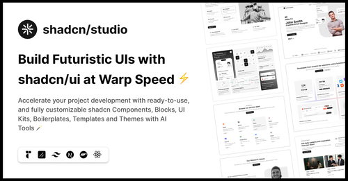
Featured Shadcn Products
Add Featured Product
.png?width=300&height=156&format=auto)
.png?width=300&height=156&format=auto)
Have a product?
Submit your Shadcn product to AllShadcn, get featured, and drive genuine traffic while showcasing your work to the world. Turn your creativity into revenue and begin selling today! 🚀