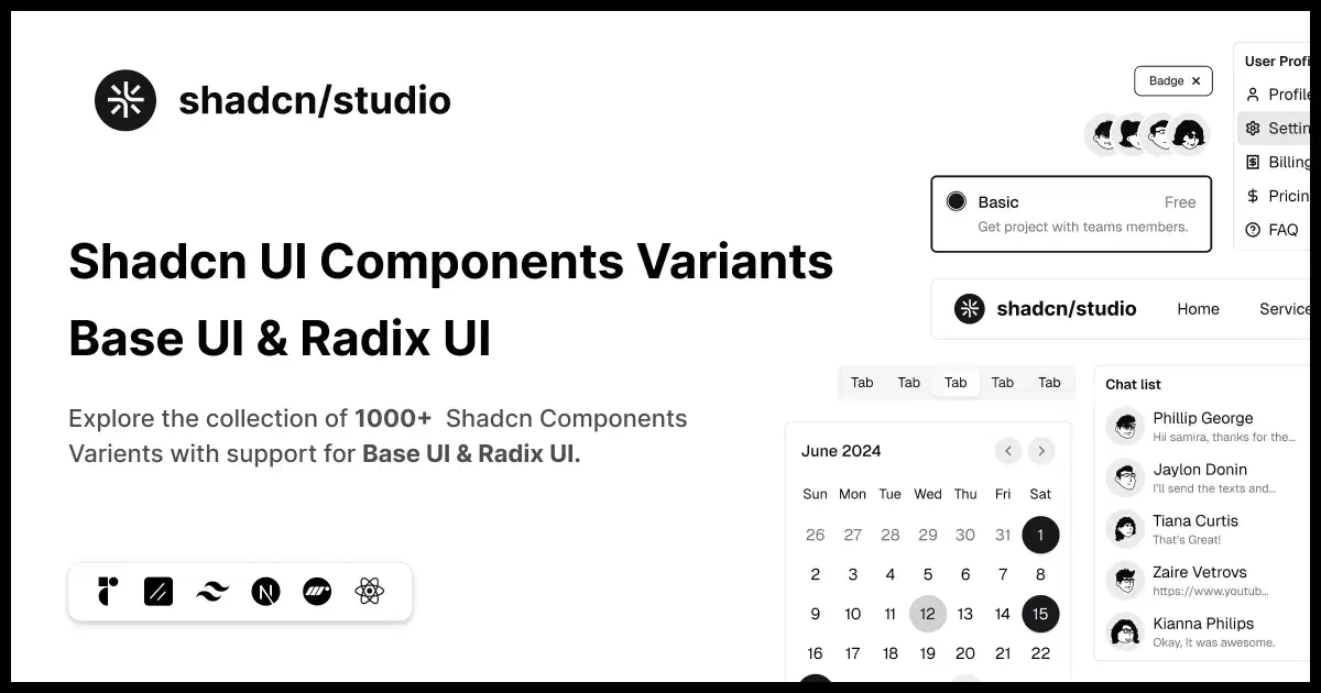
Details about Production-Ready shadcn/ui Components
Extensive collection of reusable shadcn/ui components.
Built with React, TypeScript, Tailwind CSS, and modern frontend technologies.
Fully customizable components following shadcn/ui principles.
Helps developers build production-ready interfaces faster.
Suitable for SaaS apps, dashboards, marketplaces, and web products.
#What is Shadcn Studio Components?
Shadcn Studio Components is a premium collection of reusable UI components designed for developers building modern React applications with the shadcn/ui ecosystem. It provides ready-to-use components, patterns, and interface elements that can be copied, customized, and integrated directly into projects. Built around Tailwind CSS, TypeScript, and modern React practices, it helps teams create consistent, scalable, and visually polished user interfaces without starting every component from scratch.
#Features ⚡
Large Component Library: Access a wide range of reusable UI components for different application needs.
shadcn/ui Compatible: Built around the shadcn/ui philosophy of ownership, customization, and flexibility.
Tailwind CSS Ready: Uses utility-first styling for easy customization and theme adjustments.
TypeScript Support: Provides type-safe components suitable for modern React projects.
Production Ready: Components are designed for real-world applications, not just demos.
Dark Mode Support: Includes components compatible with modern theme switching workflows.
Responsive Design: Components adapt smoothly across desktop and mobile devices.
Copy & Customize Workflow: Developers can own and modify components directly inside their projects.
#Pro and cons
Pro ✅:
Saves significant frontend development time.
High-quality components designed for modern applications.
Easy customization compared to traditional UI libraries.
Built specifically for the growing shadcn/ui ecosystem.
Useful for both developers and product designers.
Cons ⚠️:
Requires React and modern frontend knowledge.
May need customization for highly unique design systems.
Large collections can require time to find the perfect component.
#Included Components/Templates
Form components
Data tables
Navigation components
Dashboard UI elements
Cards and content layouts
Authentication components
Charts and visualization elements
Application interface components
Marketing and SaaS UI sections
Interactive components and advanced UI patterns
#Pricing 💸
Shadcn Studio Components are available through Shadcn Studio licensing plans.
Free resources are available for selected components.
Premium access provides additional components, blocks, templates, and design resources.
One-time purchase and Pro access options may be available depending on the selected plan.
#Integrations 🧰
React
Next.js
TypeScript
Tailwind CSS
shadcn/ui
Figma
Modern SaaS and dashboard applications
Frontend frameworks supporting React ecosystems
Frequently Asked Questions
What are Shadcn Studio Components?
Shadcn Studio Components are reusable UI components built for the shadcn/ui ecosystem and modern React applications.
Are these components based on shadcn/ui?
Yes, they follow the shadcn/ui approach of customizable, developer-owned components.
Can I modify the components after installation?
Yes, components are designed to be copied into your project and customized freely.
Production-Ready shadcn/ui Components
A powerful collection of customizable shadcn/ui components.
Resource Types:
UI Kits :
Shadcn UITechnology Stack :
Featured Shadcn Products
Add Featured Product
.png?width=300&height=156&format=auto)

Have a product?
Submit your Shadcn product to AllShadcn, get featured, and drive genuine traffic while showcasing your work to the world. Turn your creativity into revenue and begin selling today! 🚀