Details about ProgressButton
Interactive progress buttons for showing the status of tasks.
Customizable styles to fit any design or brand.
Simple integration with your web applications.
Visual feedback to keep users informed during long-running processes.
Lightweight and easy to implement.
Open-source with full access to the code for customization.
#What is ProgressButton ?
The ProgressButton repository by TomRedman provides a lightweight and interactive button component that visually displays the progress of ongoing tasks. Whether you're processing form submissions, file uploads, or performing background operations, ProgressButton gives users instant feedback on the status of their actions.
By offering a clear, animated indication of progress, this component helps to enhance user experience by reducing uncertainty during long-running processes. The ProgressButton is highly customizable, making it easy to integrate into various types of web applications with minimal setup.
#Features ⚡️
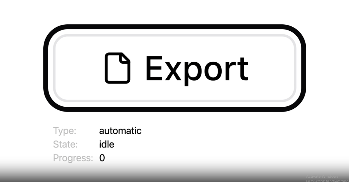
Interactive Progress: The button dynamically shows progress, from "Start" to "Complete," offering a smooth user experience.
Customizable Appearance: The button can be styled to match the branding and design of your application using simple CSS.
Multiple States: Includes states like "loading", "success", and "error," so users always know the status of their task.
Lightweight: The component is minimal and doesn’t bloat your project, making it perfect for use in any application.
Simple Integration: Easy-to-follow installation and usage instructions ensure a quick setup in just a few lines of code.
Open Source: Fully open-source, allowing you to modify and extend the functionality as needed.
CSS Animations: Uses smooth animations to show progress, making the button visually appealing and intuitive.
#Pros and Cons
Pros ✅
Improved User Feedback: With visual progress updates, users are better informed about ongoing tasks, leading to better engagement.
Customizable and Flexible: The button's appearance and functionality can be easily adjusted to match your design needs.
Easy to Integrate: The installation and usage process is simple, so you can get started quickly without dealing with complex setup steps.
Lightweight and Performance-Oriented: Since it's a minimal component, ProgressButton doesn't affect the performance of your app or add unnecessary bloat.
Free and Open Source: The repository is open-source, so you can use and modify the code freely in any project.
Cons ⚠️
Basic Functionality: While ProgressButton covers basic progress functionality, more complex use cases (like advanced animations or multiple progress steps) may require further customization.
No Backend Integration: This component is focused on frontend interactions, so integrating it with backend processes like file uploads or API calls will require additional coding.
#Included Components - Templates
ProgressButton provides the following key features and templates:
Loading State: A state to indicate that a process is running and the button is waiting for completion.
Success State: A state that indicates the successful completion of a task.
Error State: A state to show when something goes wrong during a task (e.g., an upload fails).
Customizable CSS Styles: Options to easily adjust colors, sizes, and animations using simple CSS.
Animated Progress Bar: A smooth, animated progress bar that visually displays how much of the task is completed.
#Pricing 💵
Open Source (Free): ProgressButton is completely open-source, available for free on GitHub. There are no licensing fees, and you can modify the code to suit your needs.
#Integrations 🧰
Vanilla JavaScript: The component can be used in any JavaScript-based web application, and it works seamlessly with plain JavaScript.
React, Vue, and Angular: While primarily written for plain JavaScript, you can easily integrate the ProgressButton into frameworks like React, Vue, and Angular with some minor adjustments.
CSS Frameworks: ProgressButton works well with other CSS frameworks such as Bootstrap, Tailwind CSS, or custom styles, making it adaptable to any project.
Frequently Asked Questions
How do I install ProgressButton?
You can easily install ProgressButton by including the JavaScript and CSS files in your project, or by using npm/yarn to install the package if you're using a build system like Webpack.
Is ProgressButton suitable for large projects?
Yes, it is lightweight and designed for easy integration into projects of any size. It's especially useful for adding simple, interactive feedback to long-running processes.
Can I customize the look of the button?
Absolutely! ProgressButton can be customized using simple CSS to match the style and branding of your app.
Is ProgressButton responsive?
Yes, ProgressButton is designed to be responsive, making it suitable for use across different devices and screen sizes.
Does ProgressButton support multiple progress stages?
Out of the box, ProgressButton supports basic loading, success, and error states. If you need more complex functionality, you can extend it with custom code.
ProgressButton
shadcn/ui button extended with state machine for progress UX.
Resource Types:
UI Kits :
Shadcn UITechnology Stack :


Have a product?
Submit your Shadcn product to AllShadcn, get featured, and drive genuine traffic while showcasing your work to the world. Turn your creativity into revenue and begin selling today! 🚀