Details about React Confirm Dialog
Customizable UI: Offers various styles including default, success, warning, delete, and custom actions.
Tailwind CSS Support: Seamless integration with Tailwind for styling.
Shadcn UI Compatibility: Designed to work well with Shadcn UI components.
TypeScript Support: Built with TypeScript, ensuring type safety.
Promise-based API: Utilizes async/await syntax for handling user responses.
Accessibility Focused: Ensures dialogs are accessible to all users.
#What is React Confirm Dialog?
React Confirm Dialog is a lightweight and customizable confirmation dialog component for React applications. It provides a flexible API and a variety of built-in styles, making it easy to integrate into your app. Whether you're confirming a delete action or a simple user decision, this component offers a clean and accessible solution.
#Features ⚡️
Customizable Dialogs: Easily create dialogs with different styles and actions.
Tailwind CSS Integration: Utilize Tailwind's utility classes for styling.
Shadcn UI Compatibility: Integrate seamlessly with Shadcn UI components.
TypeScript Support: Ensure type safety with TypeScript.
Promise-based API: Handle user responses using async/await syntax.
Accessibility: Built with accessibility in mind.
#Pros and Cons
#Pros ✅
Easy Integration: Simple to add to any React application.
Customizable: Tailor the appearance and behavior to fit your needs.
Accessible: Designed with accessibility best practices.
Type Safety: Leverages TypeScript for safer code.
Promise-based: Utilizes async/await for handling user responses.
#Cons ⚠️
Limited Pre-built Themes: While customizable, the component offers a limited number of pre-built themes.
No Native Modal Support: Relies on external libraries for modal functionality.
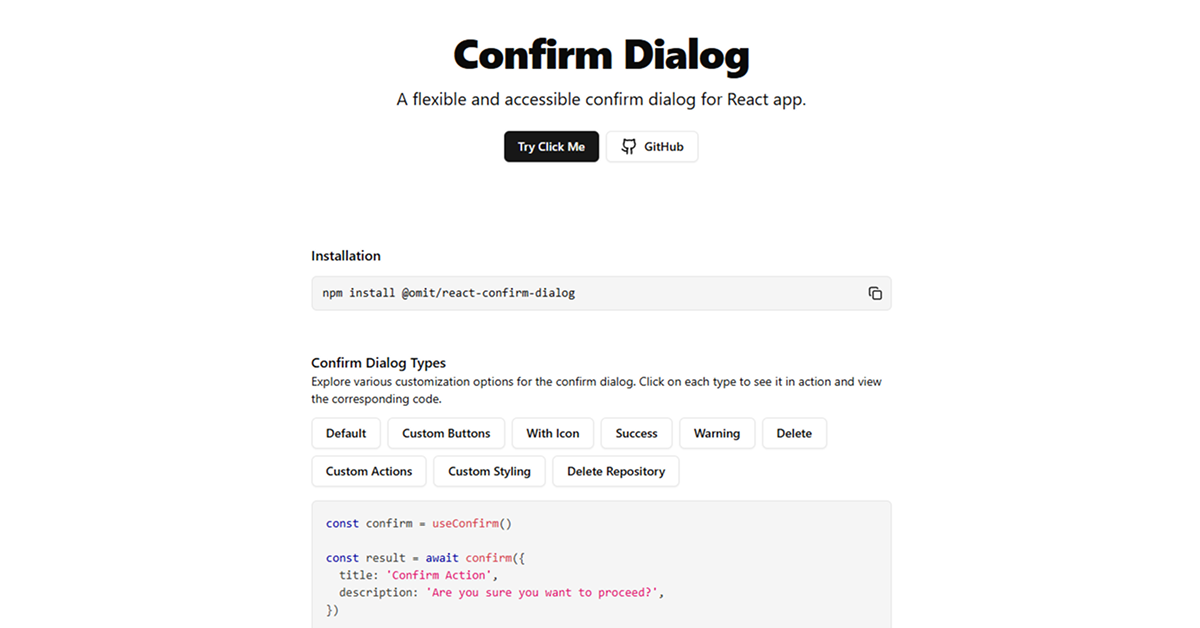
#Included Components - Templates
React Confirm Dialog provides several built-in dialog styles:
Default: A basic confirmation dialog.
Success: Indicates a successful action.
Warning: Warns the user about a potential issue.
Delete: Specifically for delete actions.
Custom Actions: Allows for custom buttons and actions.
Custom Styling: Fully customizable appearance using Tailwind CSS.
#Pricing 💵
Open Source: React Confirm Dialog is free to use and modify under the MIT license.
#Integrations 🧰
React: Built specifically for React applications.
Tailwind CSS: Designed to work seamlessly with Tailwind for styling.
Shadcn UI: Compatible with Shadcn UI components.
TypeScript: Provides type definitions for TypeScript users.
Frequently Asked Questions
How do I use the confirm dialog in my component?
First, wrap your application with the ConfirmDialogProvider. Then, use the useConfirm hook in your components.
Can I customize the appearance of the dialog?
Yes, React Confirm Dialog is fully customizable using Tailwind CSS.
Is this component accessible?
Yes, the component is built with accessibility in mind, ensuring it works well with screen readers and other assistive technologies.


Have a product?
Submit your Shadcn product to AllShadcn, get featured, and drive genuine traffic while showcasing your work to the world. Turn your creativity into revenue and begin selling today! 🚀