Details about React Fancy Switch
A sleek and customizable toggle switch component for React.
Supports both light and dark themes.
Easily integrates into React projects.
Designed for enhanced user experience and interactivity.
Supports various animation effects for smooth transitions.
Fully customizable design, including colors, sizes, and styles.
Lightweight and responsive for fast performance across devices.
#What is React Fancy Switch?
React Fancy Switch is a versatile and customizable toggle switch component designed to enhance the user interface of your React applications. It offers a sleek, modern look with smooth animations, making it an ideal solution for users who want to replace the default HTML checkbox with something more interactive and visually appealing. Whether you're building a theme switcher, preference toggles, or any other type of on/off switch, React Fancy Switch allows you to create a seamless experience with minimal effort.
Built with React in mind, the component is easy to integrate into any React project, offering flexibility, smooth transitions, and full customization of its appearance. Whether you need a simple switch or one with advanced animations, React Fancy Switch has you covered.
#Features ⚡️
Customizable Design: React Fancy Switch allows full customization, including color, size, and style. You can adjust the appearance to match your app’s theme, making it suitable for both light and dark mode.
Smooth Animations: Enjoy fluid transitions with various animation effects, ensuring a visually engaging experience when toggling the switch.
Fully Responsive: Whether your app is viewed on a desktop, tablet, or mobile device, the switch scales perfectly and maintains a consistent design.
Theming Support: You can easily integrate React Fancy Switch into both light and dark mode themes, making it a great choice for modern web apps.
Lightweight: The component is optimized for performance, ensuring it doesn’t slow down your app, even with multiple instances on the page.
Accessibility-Friendly: Supports keyboard interactions and ARIA attributes to ensure the switch is usable by all users, including those with disabilities.
Multiple Sizes: Choose from various sizes to fit the design of your application, from compact switches to larger, more prominent ones.
Event Handling: React Fancy Switch offers simple event handling, making it easy to capture toggle actions and trigger specific functions in your application.
#Pros and Cons
#Pros ✅
Customizable: React Fancy Switch offers a high degree of customization, allowing you to tweak every detail of the component’s appearance and behavior.
Enhanced UX: With smooth animations and a modern design, the component greatly improves the user experience of your app, making simple toggles feel more interactive and engaging.
Easy to Use: Integrating the switch into a React project is straightforward, requiring minimal configuration. It’s ready to use out of the box and can be customized with just a few lines of code.
Responsive: It works seamlessly across devices, ensuring that the switch looks great on all screen sizes and adapts to different user environments.
Performance Optimized: The lightweight nature of the component ensures that it doesn’t impact your app’s performance, even when used in multiple places.
#Cons ⚠️
Limited Features in Basic Version: While the basic version is great for most use cases, advanced features (like complex multi-state switches) might require additional customization or external libraries.
Styling Limitations: While the component is highly customizable, very specific styling requirements (e.g., adding icons inside the switch) might require additional work.
Dependency on React: React Fancy Switch is specifically built for React, so it cannot be used directly in non-React applications without adjustments or wrappers.
#Included Components - Templates
React Fancy Switch includes the following features that help you create polished and professional UI elements with ease:
Toggle Switch: A beautifully animated, on/off switch with customizable labels, colors, and transition effects.
Themed Switches: Built-in support for both light and dark modes, allowing you to switch between themes effortlessly.
Multi-State Switches: Create switches with more than two states, suitable for complex scenarios like multiple levels of options or settings.
Custom Size Options: Choose from small, medium, or large sizes to fit your design needs, or create your own using the provided customization options.
Smooth Transitions: Animate the switch with smooth on/off transitions, giving your app a modern, polished feel.
Accessibility Features: Supports keyboard navigation and ARIA attributes, ensuring the switch is accessible to all users.
#Pricing 💵
React Fancy Switch is an open-source project, meaning it’s free to use in both personal and commercial projects. However, if you require premium features such as advanced animations or priority support, there might be a paid version or premium package available.
#Integrations 🧰
React Fancy Switch is designed to seamlessly integrate with a variety of React projects and third-party tools:
React: Fully integrated with React, it can be used in functional or class components.
Tailwind CSS: Easily customizable using Tailwind’s utility-first approach for styling.
Redux: Can be used with Redux to store switch state and manage user preferences across your app.
Styled Components: Works perfectly with Styled Components for custom theming and design.
Next.js: Integrates easily with Next.js for server-side rendering and faster performance in React-based web applications.
React Hooks: Fully supports React hooks, enabling you to manage the state and functionality of the switch with ease.
Frequently Asked Questions
What is React Fancy Switch?
React Fancy Switch is a customizable, animated toggle switch component built for React applications. It allows developers to easily integrate stylish switches into their projects with smooth transitions and customization options.
Can I customize the appearance of the switch?
Yes, the switch is highly customizable. You can change its size, color, animation effects, and more to suit your app’s design.
Is React Fancy Switch mobile-friendly?
Yes, React Fancy Switch is fully responsive, ensuring it looks great on all devices, from desktops to mobile phones.
How do I integrate the switch into my React app?
Integration is simple. Just install the package, import the component, and use it in your JSX code. It’s designed to be easy to implement and customize.
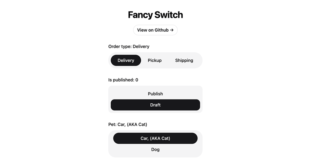
React Fancy Switch
Elegant and interactive way to switch between multiple options.
Resource Types:
UI Kits :
Shadcn UITechnology Stack :


Have a product?
Submit your Shadcn product to AllShadcn, get featured, and drive genuine traffic while showcasing your work to the world. Turn your creativity into revenue and begin selling today! 🚀