Details about RetroUI - Component Library
Free, open-source retro-styled component library
Built with React and Tailwind CSS
Features 100+ components with neo-brutalism and pixelated aesthetics
Copy-paste ready with utility-first styling
MIT-licensed, with premium options available
#What is Retro UI?
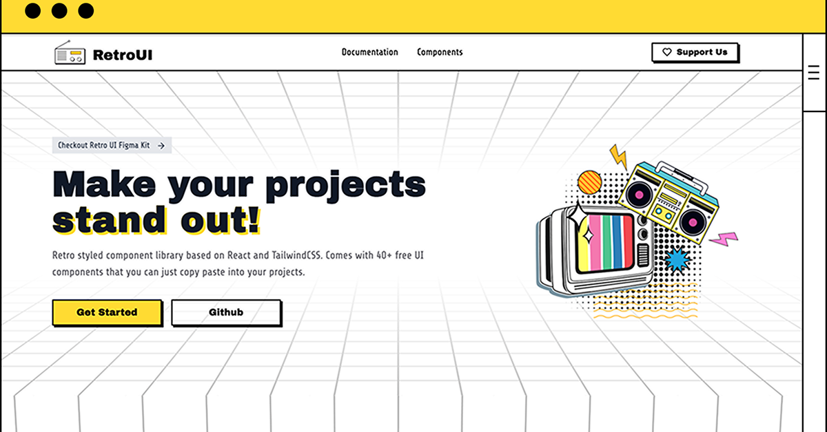
Retro UI is a free, open-source Tailwind CSS component library that blends nostalgic, retro-inspired design with modern web development practices. It’s ideal for developers building unique, visually engaging interfaces for portfolios, blogs, or creative applications, particularly in React or Next.js projects using shadcn-ui.
Built with Tailwind CSS and designed to complement shadcn-ui, Retro UI offers a collection of components like buttons, cards, forms, and navigation elements, all styled with a retro aesthetic (e.g., pixelated fonts, neon colors). It integrates directly into shadcn-ui projects via Tailwind configuration and supports copy-paste component code from its documentation.
#Features ⚡️
Retro Aesthetic: Pixelated fonts, neon glows, and VHS-style effects for a nostalgic look.
Component Library: Includes buttons, cards, inputs, modals, and navigation menus.
shadcn-ui Integration: Components work seamlessly with shadcn-ui’s accessible primitives.
Copy-Paste Code: Ready-to-use Tailwind CSS and React code snippets from the docs.
Responsive Design: Tailwind CSS ensures components adapt to all screen sizes.
Customizable: Easily tweak colors, fonts, and styles via Tailwind configuration.
Accessible: Inherits shadcn-ui’s WAI-ARIA compliance when used with its primitives.
#Pros and Cons
#Pros ✅
Unique Design: Retro style stands out for creative or themed projects.
Free and Open-Source: MIT license allows unrestricted use and customization.
shadcn-ui Synergy: Enhances shadcn-ui projects with minimal setup.
Developer-Friendly: Copy-paste code and Tailwind-first approach speed up development.
Community Appeal: Gaining traction in shadcn-ui ecosystem (similar projects have ~200 stars).
#Cons ⚠️
Niche Aesthetic: Retro design may not suit professional or minimalist apps.
React/shadcn-ui Focus: Best suited for shadcn-ui projects; standalone use requires Tailwind setup.
Setup Requirements: Needs Tailwind CSS and shadcn-ui for full functionality.
Limited Components: Smaller library compared to comprehensive frameworks like Material UI.
Documentation Depth: Docs are functional but may lack advanced use cases.
#Included Components
Buttons: Retro-styled buttons with hover effects (e.g., neon glow, pixelated borders).
Cards: VHS or arcade-inspired cards for content display.
Forms: Inputs and selects with retro fonts and glow effects.
Navigation: Pixelated navbars and sidebars for retro menus.
Modals: Dialogs with CRT monitor or 80s arcade styling.
#Pricing 💸
Retro UI is completely free under the MIT license, with no premium tiers.
#Integrations 🛠️
React: Core framework for component usage.
shadcn-ui: Enhances shadcn-ui’s primitives with retro styling.
Tailwind CSS: Powers all component styling.
Next.js: Optimized for Next.js projects (v14.2+).
TypeScript: Compatible with TypeScript for type safety.
Radix UI: Works with shadcn-ui’s Radix-based components for accessibility.
Frequently Asked Questions
What is Retro UI?
A Tailwind CSS component library with retro aesthetics, designed to integrate with shadcn-ui for React/Next.js apps.
Is it free?
Yes, fully free under the MIT license.
Does it work without shadcn-ui?
Yes, but requires Tailwind CSS; shadcn-ui enhances accessibility and integration.
RetroUI - Component Library
Retro styled component library built with React and TailwindCSS.
Resource Types:
UI Kits :
Shadcn UITechnology Stack :


Have a product?
Submit your Shadcn product to AllShadcn, get featured, and drive genuine traffic while showcasing your work to the world. Turn your creativity into revenue and begin selling today! 🚀