Details about Shadcn / ui Components With Variables & Animations
A comprehensive library of UI components built with modern design principles.
Highly customizable with variables and design tokens.
Built-in animations for smooth and dynamic user experiences.
Ideal for creating visually appealing and responsive interfaces.
Updated regularly, with new features and improvements (April 2025 update).
Supports multiple frameworks like React, Vue, and more.
Open-source and free to use.
#What is Shadcn / ui Components?
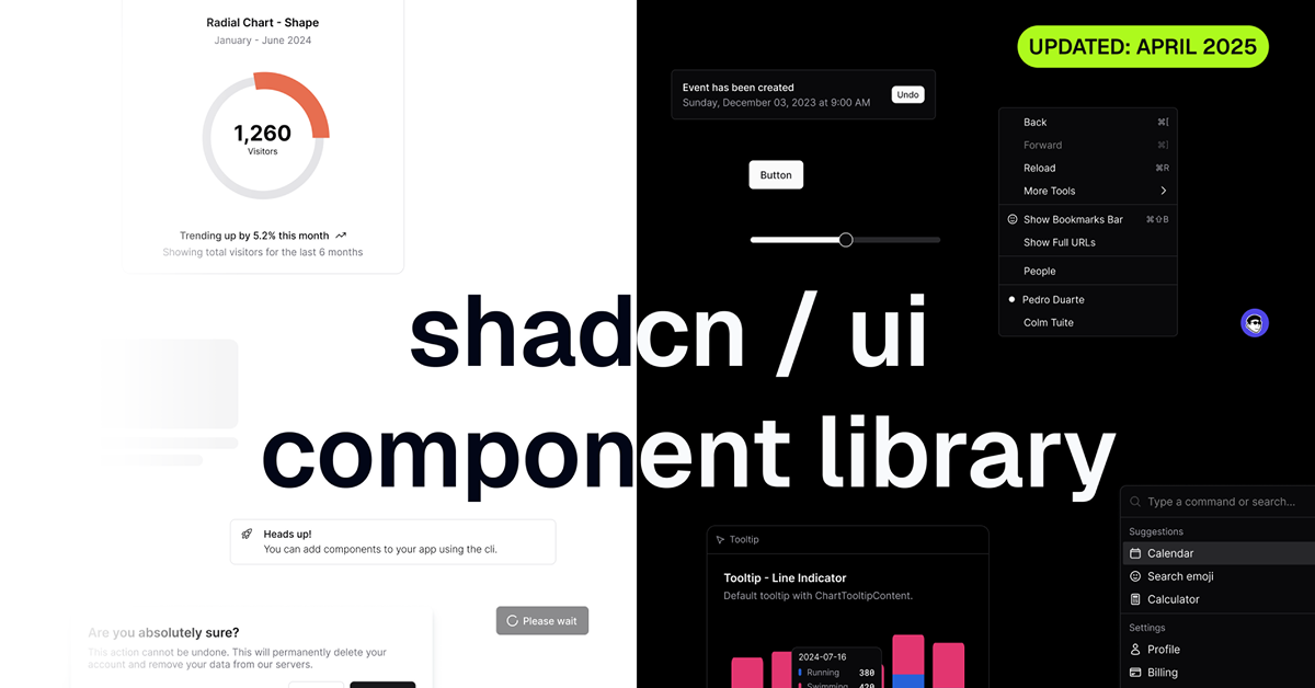
ShadCN UI Components is a versatile and powerful UI component library designed to help developers quickly build modern, responsive web applications. With its rich set of pre-designed components, such as buttons, forms, modals, and navigation elements, ShadCN UI Components empowers teams to create beautiful user interfaces with minimal effort.
The library leverages customizable design variables, making it easy to match your application’s look and feel. Additionally, it includes built-in animations for transitions and interactive elements, ensuring that users enjoy a smooth and dynamic experience while interacting with your app.
As of the April 2025 update, ShadCN UI Components has received numerous improvements, enhancing its flexibility, performance, and ease of use.
#Features ⚡️
Customizable Design Variables: ShadCN UI Components comes with customizable design variables, including colors, spacing, typography, and more. These variables allow you to tailor the components to fit your brand’s style and design system without writing custom CSS.
Built-In Animations: Enhance user interactions with built-in animations, such as smooth transitions, hover effects, and dynamic content displays. These animations are fully customizable, allowing for a seamless and engaging experience.
Pre-Built Components: The library includes a wide range of pre-built components, including buttons, modals, forms, dropdowns, and navigation menus, which can be easily customized and integrated into your project.
Responsive by Default: All components are designed to be fully responsive, ensuring they look great on both mobile and desktop devices, without additional work.
Dark Mode Support: ShadCN UI Components comes with dark mode support, allowing your application to automatically adapt to dark mode preferences, creating a more comfortable experience for users.
Cross-Framework Compatibility: The components are built to work with major frameworks like React, Vue, and Angular, making it easy to integrate into your web development projects.
Easy-to-Use Documentation: The library is accompanied by comprehensive documentation, with clear examples and code snippets to help you integrate the components quickly and effectively.
Updated Regularly: With the latest April 2025 update, new features and improvements have been added to further enhance the flexibility and usability of the library.
#Pros and Cons
#Pros ✅
Quick Development: Pre-designed, customizable components help you get up and running faster, reducing the amount of design and coding work needed to build a modern UI.
Customization Flexibility: With customizable design tokens and variables, you can easily modify the appearance of components to fit your specific project requirements.
Smooth Animations: Built-in animations add a layer of interactivity, improving the overall user experience.
Mobile-Friendly: All components are fully responsive, ensuring a smooth experience on both desktop and mobile devices.
Cross-Platform Support: The library is compatible with popular frameworks such as React and Vue, allowing easy integration into modern web applications.
Regular Updates: ShadCN UI Components is frequently updated, with the latest release in April 2025 bringing new features and enhancements.
#Cons ⚠️
Learning Curve for Beginners: While the components are easy to use, beginners who are not familiar with design systems or component libraries might experience a learning curve.
Dependence on Frameworks: While the library supports multiple frameworks, it is best suited for projects that already use React, Vue, or Angular. Integration into non-framework projects may require additional work.
Overhead for Small Projects: For smaller, simpler applications, using a full-fledged UI component library might feel like overkill, especially if you don’t need all the features.
#Included Components - Templates
ShadCN UI Components comes with a wide range of components to help you quickly build beautiful and responsive user interfaces:
Buttons: Pre-designed buttons with various styles, sizes, and colors, including primary, secondary, and tertiary options.
Forms: Input fields, checkboxes, radio buttons, and dropdown menus, with built-in validation and customization options.
Modals: Stylish modals that can be used for alerts, confirmations, and dialogs.
Navigation: Fully responsive navigation menus, including sidebars and dropdowns, optimized for both mobile and desktop.
Cards: Beautiful, flexible card components for displaying content in grid layouts.
Typography: Pre-defined typography styles, including headers, paragraphs, and links, to ensure consistency across your design.
Tooltips: Interactive tooltips that provide additional information on hover or focus.
#Pricing 💵
ShadCN UI Components is open-source and completely free to use. This makes it an excellent choice for startups, freelancers, and individual developers who need a high-quality UI component library without the added expense of premium tools. As it is open-source, you can also contribute to its development if needed.
#Integrations 🧰
ShadCN UI Components integrates seamlessly with popular web frameworks:
React: Fully compatible with React, allowing you to use the components as React components with hooks and state management.
Vue: Integrates effortlessly with Vue.js for building interactive, component-driven UIs.
Angular: Works with Angular for building robust applications with reusable components.
Tailwind CSS: Tailwind CSS users will love ShadCN UI Components as it follows utility-first design principles, making customization and styling easier.
Design Systems: Perfect for use in building or extending design systems, as it provides reusable, well-documented components that adhere to modern design standards.
Frequently Asked Questions
What is ShadCN UI Components?
ShadCN UI Components is a library of pre-designed, customizable UI elements, including buttons, modals, forms, and more, built to work with modern web frameworks like React and Vue.
Can I customize the design of the components?
Yes, the components are highly customizable. You can adjust colors, typography, spacing, and more using design tokens and variables.
Is ShadCN UI Components free to use?
Yes, ShadCN UI Components is open-source and free to use in both personal and commercial projects.
Does it support dark mode?
Yes, the components have built-in support for dark mode, which automatically adapts to users' system preferences.
Shadcn / ui Components With Variables & Animations
Take your designs up a notch with @shadcn components!
Resource Types:
UI Kits :
Shadcn UITechnology Stack :


Have a product?
Submit your Shadcn product to AllShadcn, get featured, and drive genuine traffic while showcasing your work to the world. Turn your creativity into revenue and begin selling today! 🚀