Details about Shadcn Svelte
UI component library for Svelte inspired by shadcn/ui
Built with Tailwind CSS for utility-first styling
Provides accessible, customizable, and composable UI components
Designed specifically for Svelte framework
Focuses on developer experience and UI consistency
#What is Shadcn Svelte?
Shadcn Svelte is a UI component library tailored for Svelte developers, inspired by the popular shadcn/ui design system. It leverages Tailwind CSS to provide a set of accessible, composable, and customizable components that align with modern frontend design trends. The primary goal is to empower developers to build sleek, consistent user interfaces quickly while fully harnessing Svelte’s reactivity and simplicity. This resource is ideal for startups, designers, and frontend engineers focused on building scalable and maintainable UI in Svelte applications.
#Features ⚡️
Svelte-native components: Designed specifically for the Svelte framework with Svelte syntax and conventions
Tailwind CSS integration: Components use Tailwind’s utility-first styling, allowing easy customization and theme extension
Accessible by default: Built with ARIA standards and best accessibility practices
Composable and modular: Components can be combined or extended easily for complex UI patterns
Dark mode support: Includes built-in support for light/dark themes
Responsive design: Components are responsive out of the box
Well-documented with examples: Clear docs and usage examples to accelerate onboarding
#Pros and Cons
#Pros ✅
Native Svelte components provide a smooth developer experience
Tailwind CSS powers flexible and customizable styling
Accessibility is baked in, reducing extra work for developers
Good documentation and examples for quick adoption
Supports modern UI needs like dark mode and responsiveness
#Cons ⚠️
Still growing — fewer components compared to mature libraries like shadcn/ui for React
Limited ecosystem compared to React; fewer third-party extensions available
Requires Svelte knowledge, so not suitable if you prefer other frameworks
Customization might require familiarity with Tailwind CSS and Svelte reactive patterns
#Included Components - Templates
shadcn-svelte offers a wide range of essential UI components, including:
Buttons and inputs
Dropdown menus and tooltips
Modal dialogs and popovers
Tabs and accordions
Navigation bars and sidebars
Form controls and validation components
The focus is on reusable primitives and common UI building blocks to compose your app interfaces.
#Pricing 💵
Open Source: Free to use, MIT licensed
No paid plans or subscriptions
#Integrations 🧰
Built exclusively for Svelte and SvelteKit
Uses Tailwind CSS for styling, easy to customize or extend with Tailwind plugins
Compatible with standard Svelte tooling and bundlers like Vite
Can be integrated with Svelte stores or third-party state management solutions
No direct support for React, Vue, or other frameworks
Frequently Asked Questions
What is shadcn-svelte?
It’s a Tailwind CSS-based UI component library built specifically for Svelte, inspired by the shadcn/ui design system.
Can I use it with other frontend frameworks?
No, it is designed solely for Svelte and SvelteKit.
Is it accessible?
Yes, components follow ARIA standards and accessibility best practices.
How customizable are the components?
Very customizable via Tailwind CSS utilities and Svelte props.
Is it suitable for production use?
Yes, the library is stable and production-ready but still evolving.
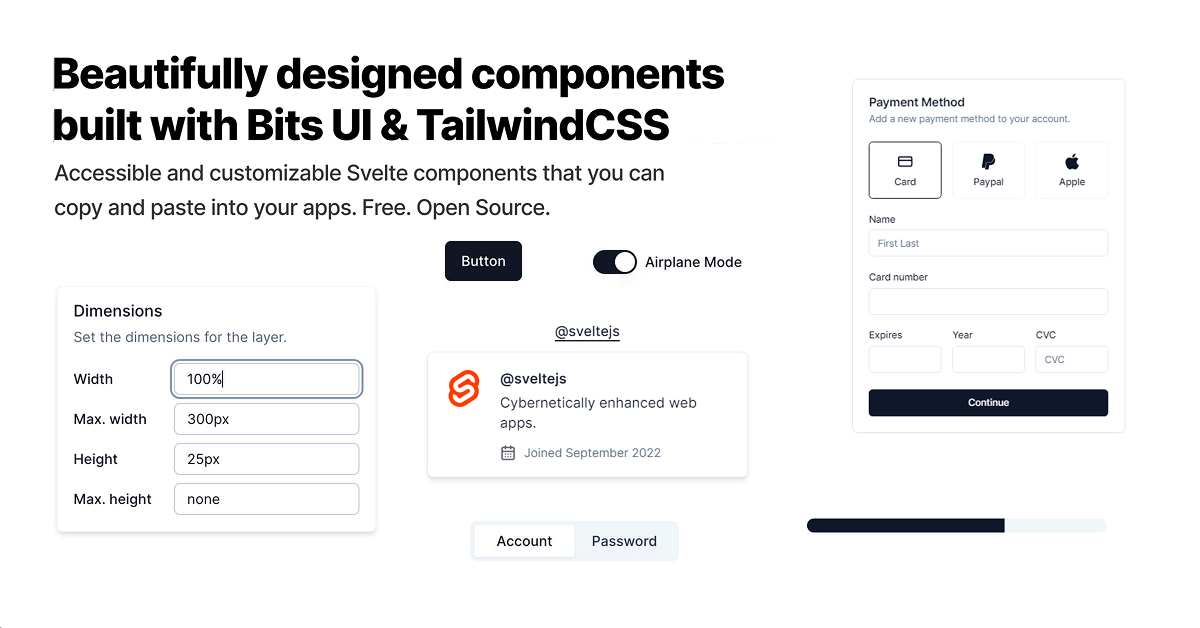
Shadcn Svelte
Beautifully designed components built with Bits UI and Tailwind CSS.
Resource Types:
UI Kits :
Shadcn UITechnology Stack :


Have a product?
Submit your Shadcn product to AllShadcn, get featured, and drive genuine traffic while showcasing your work to the world. Turn your creativity into revenue and begin selling today! 🚀