Details about Shadcnblocks
Built with: Tailwind CSS, React, Next.js, TypeScript
Purpose: Collection of pre-built, customizable UI blocks and components for rapid web development
Features:
Hundreds of ready-made UI blocks covering various categories
Fully responsive and accessible design
Easy copy-paste integration with React/Next.js projects
Tailwind CSS-based for easy styling and customization
#What is Shadcn Blocks?
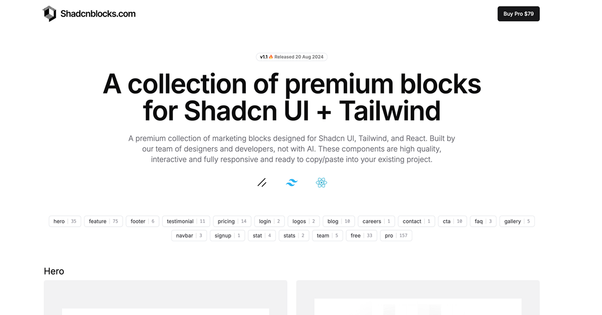
Shadcn Blocks is a curated library of high-quality UI blocks built with Tailwind CSS and React. Its mission is to speed up frontend development by providing developers with ready-to-use, accessible, and customizable components that can be quickly dropped into any React or Next.js project. It’s especially useful for startups, SaaS platforms, and individual developers who want to avoid reinventing the wheel and maintain design consistency without heavy effort.
#Features ⚡️
Wide Variety of UI Blocks: Includes navigation bars, hero sections, pricing tables, testimonials, footers, forms, and more.
Responsive & Accessible: Designed mobile-first with accessibility in mind.
Easy Integration: Copy code snippets directly and paste into React or Next.js projects with no complex setup.
Tailwind CSS Styling: Fully customizable using Tailwind utility classes, making theme adjustments and design tweaks straightforward.
TypeScript Support: Built with TypeScript, offering type safety and better developer experience.
#Pros and Cons
#Pros ✅
Huge variety of ready-made blocks saves significant development time
Built with modern technologies (React, Next.js, Tailwind CSS, TypeScript)
Focus on accessibility and responsiveness out of the box
Easy to customize and extend with Tailwind CSS
Helpful for rapid prototyping and production-ready UI development
#Cons ⚠️
Focused primarily on frontend UI; no backend or full-stack solution included
May require some familiarity with React and Tailwind CSS to fully leverage customization
No official design system or theme management beyond Tailwind utilities
#Included Components - Templates
Navigation: Menus, headers, sidebars
Hero Sections: Landing page intros, call-to-actions
Pricing Tables: Plan comparisons and subscription options
Forms: Login, registration, contact forms
Footers: Site footers with links and social icons
Cards & Grids: Content displays, testimonials, product cards
Modals & Dialogs: Popups for alerts and forms
Blog: Post listings and article layouts
#Pricing 💵
Pro Plan: $149 usd with Lifetime access & updates and 50+ new blocks each month
Premium Plan: $299 usd with Lifetime access & updates, 4+ Premium Templates, Figma Kit, Admin Kit.
#Integrations 🧰
React & Next.js: Designed for seamless integration with React and Next.js projects.
Tailwind CSS: Uses Tailwind’s utility-first CSS for styling and customization.
TypeScript: Offers type-safe components for better code reliability.
Frequently Asked Questions
Can I use Shadcn Blocks in any React project?
Yes, Shadcn Blocks are designed to be framework-agnostic within React and Next.js ecosystems.
How customizable are the components?
Components are fully customizable via Tailwind CSS classes, allowing you to adjust colors, spacing, typography, and layout easily.
Are the blocks accessible?
Yes, accessibility best practices are baked in, including proper ARIA attributes and keyboard navigation.
Do I need to install any dependencies?
Usually, you just need React and Tailwind CSS set up in your project; no additional dependencies are required.s
Shadcnblocks
A premium UI library built with Shadcn UI, React & Tailwind.
Resource Types:
UI Kits :
Shadcn UITechnology Stack :


Have a product?
Submit your Shadcn product to AllShadcn, get featured, and drive genuine traffic while showcasing your work to the world. Turn your creativity into revenue and begin selling today! 🚀