Details about Shaduxe UI – Tailwind CSS Component Library for React
Built on top of shadcn/ui
Tailwind CSS v4 optimized
Additional component variants and templates
CLI integration
Open-source and MIT licensed
#What is Shadeuxe UI?
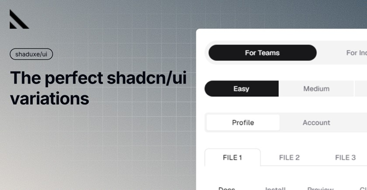
Shaduxe UI extends the functionality of shadcn/ui by offering a broader range of component variants and templates. While shadcn/ui provides a solid foundation of accessible and customizable components, Shaduxe UI adds more options, allowing developers to quickly implement diverse UI elements without extensive customization.
#Features ⚡️
Extended Component Variants: Additional styles for buttons, tabs, and other UI elements.
Tailwind CSS v4 Support: Optimized for the latest version of Tailwind CSS, ensuring modern design capabilities.
CLI Integration: Easily install components using the
shadcnCLI.Open-Source: Free to use and modify under the MIT license.Dribbble+3GitHub+3GitHub+3
#Pros and Cons
#Pros ✅
Enhanced UI Options: Provides more component variants beyond the default shadcn/ui offerings.
Seamless Integration: Designed to work smoothly with existing shadcn/ui setups.
Modern Design: Built with Tailwind CSS v4, ensuring up-to-date styling capabilities.
Open-Source: Free to use and contribute to, fostering community involvement.
#Cons ⚠️
React-Only: Currently tailored for React applications; may require adaptation for other frameworks.
Limited Documentation: May lack extensive documentation compared to more established libraries.
#Included Components & Templates
Shaduxe UI offers a variety of components and templates, including:
Buttons: Default, Secondary, Outline, Destructive, Ghost, Link, and Hover variants.
Tabs: Account, Password, and other tab styles.
These components are designed to be easily customizable and ready for integration into your projects.
#Pricing 💵
Starter: $29/month or $290/year — Single user, basic features, limited usage
Professional: $79/month or $790/year — Multiple users, advanced features, priority updates
Enterprise: Custom pricing — Tailored for teams with dedicated support and premium features
Free trial available to explore features before subscribing.
#Integrations 🧰
Shaduxe UI is compatible with:
Frontend Frameworks: React
Styling: Tailwind CSS v4
Component Library: shadcn/ui
This ensures seamless integration into modern web development workflows.
Frequently Asked Questions
Is Shaduxe UI free to use?
Yes, Shaduxe UI is completely open-source and free to use.
How do I use the components?
You can install components via the shadcn CLI or copy-paste the code directly into your project.
Are the components customizable?
Yes, components are styled using Tailwind CSS v4, allowing for easy customization to fit your project's needs.
Can I integrate Shaduxe UI with other libraries?
Shaduxe UI is designed to complement shadcn/ui components, but it can be integrated with other libraries as needed.
Shaduxe UI – Tailwind CSS Component Library for React
The ultimate extension for your shadcn/ui components.
Resource Types:
UI Kits :
Tailwind UITechnology Stack :


Have a product?
Submit your Shadcn product to AllShadcn, get featured, and drive genuine traffic while showcasing your work to the world. Turn your creativity into revenue and begin selling today! 🚀