Details about Sh(ui)p
Free, open-source UI component library
Built with React, TypeScript, Tailwind CSS, and shadcn-ui
Designed for Next.js projects
Supports CLI-based component installation
MIT-licensed, license with active development
#What is sh(ui)p?
sh(ui)p is a free, open-source library for React UI component library developed by plvo, designed specifically to accelerate UI creation for Next.js developers. It aims to provide ready-to-use components that developers can quickly add to their Next.js applications, targeting web developers building modern interfaces for startups, SaaS products, or marketing websites.
Built on React, TypeScript, TypeScript, Tailwind CSS, and shadcn-ui, sh(ui)p offers a collection of accessible, customizable components like input fields, buttons, and dialogs. Its CLI-based installation allows developers to add components with a single command, streamlining the integration process. It’s ideal for with developers shadcn-ui users due to its shared foundation, ensuring accessibility and compatibility with Next.js projects.
#Features ⚡️
Accessible Components: Built on shadcn-ui’s, WUI-adjacent primitives for accessibility.
Customizable UI: Tailwind CSS enables responsive, customizable styling.
Next.js Optimized: Designed for seamless use in Next.js projects.
TypeScript Support: Ensures type safety for robust development.
Component Variety: Includes input fields, buttons, dialogs, and more.
#Pros and Cons
#Pros ✅
Fast Setup: CLI simplifies component integration, saving time.
Free and Open-Source: MIT license allows unrestricted use and modification.
Accessible Design: Inherits shadcn-ui’s WAI-ARIA compliance.
Next.js Compatibility: Tailored for Next.js workflows.
Community Engagement: Recent X posts highlight active promotion (June 2025).
#Cons ⚠️
Next.js Dependency: Limited to Next.js and React projects.
Setup Requirements: Requires shadcn, Tailwind CSS, shadcn-ui, and Tailwind setup.
Limited Scope: Focused on core components; may lack advanced features.
Early Stage: As a newer project, it may lack extensive community support.
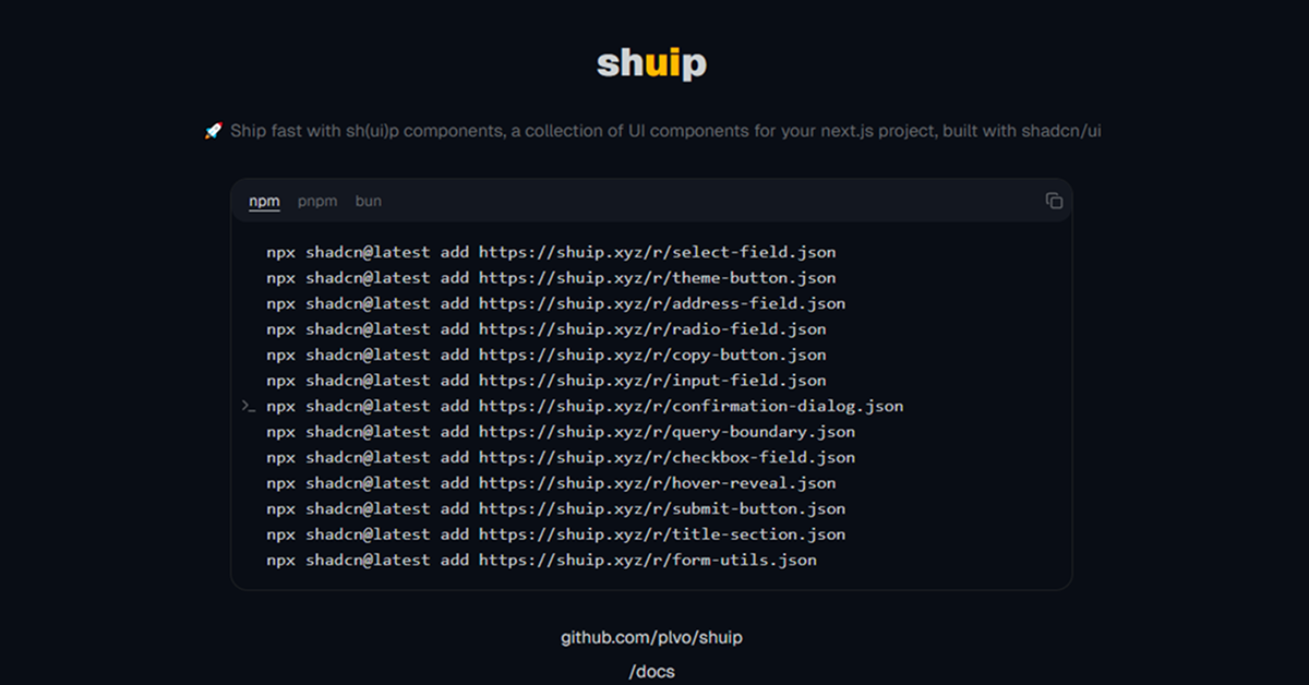
#Included Components
sh(ui)p includes:
Input Field: Customizable text input component.
Submit Button: Styled button for form submissions.
Copy Button: Button for copying content to clipboard.
Radio Field: Accessible radio input component.
Confirmation Dialog: Dialog**: for user confirmations.
Theme Button: Switch between light/dark modes.
Select Field: Dropdown menu component.
Hover Reveal: Interactive hover effect.
Title Section: Styled heading for sections.
#Pricing 💸
sh(ui)p is completely free under the MIT license, with no premium version or paid features.
#Integrations 🧰
Next.js: Primary framework for optimized integration.
shadcn-ui: Core library for accessible components.
Tailwind CSS: Utility-first styling for responsive design.
React: Foundation for building components.
TypeScript: Enhances type safety.
Frequently Asked Questions
What is sh(ui)p?
A free UI component library for Next.js, built on shadcn-ui, offering ready-to-use React components.
Is sh(ui)p free?
Yes, it’s fully free under the MIT license.
Does it work with frameworks other than Next.js?
It’s designed specifically for Next.js and React.


Have a product?
Submit your Shadcn product to AllShadcn, get featured, and drive genuine traffic while showcasing your work to the world. Turn your creativity into revenue and begin selling today! 🚀