Details about Supercharged Shadcn Component
Free, open-source ReactJS component library
Built with shadcn/ui, React, Tailwind CSS, react-hook-form
Features enhanced components with simpler, type-safe forms
Supports shadcn CLI for copy-paste integration
MIT-licensed with GitHub repo
#What is Supercharged Shadcn Components?
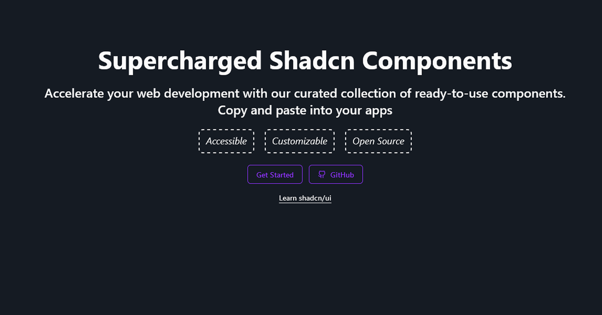
Supercharged Shadcn Components is a free, open-source ReactJS library developed by slickwit, designed to streamline UI development with pre-built, reusable components that extend shadcn/ui’s foundation. Its primary goal is to enhance shadcn/ui’s workflow by offering modern, accessible components with simpler form handling, targeting React developers building apps like dashboards, forms, or landing pages. Built with shadcn/ui, React, Tailwind CSS, Radix UI, and react-hook-form, it includes components like floating buttons, chips, and type-safe form inputs, installable via shadcn CLI (npx shadcn@latest add). Inspired by shadcn/ui, Material-UI, and timepickers from time.openstatus.dev, it emphasizes code-first simplicity, allowing developers to copy-paste components directly into projects. For shadcn/ui fans, Supercharged Shadcn Components is a perfect fit, delivering a cohesive, customizable UI experience with a demo.
#Features ⚡️
Extended Components: Adds floating buttons, chips, ratings, and specialized inputs beyond shadcn/ui.
Type-Safe Forms: Simpler react-hook-form integration with reduced boilerplate.
Shadcn CLI Support: Install components via npx shadcn@latest add <registry-url>.
Accessibility: WAI-ARIA-compliant via shadcn/ui’s Radix UI foundation.
Responsive Design: Tailwind CSS ensures cross-device compatibility.
Modern Aesthetics: Draws from Material-UI and shadcn/ui for cohesive design.
Code-First Philosophy: Copy-paste workflow for direct project integration.
Utility-Focused: Includes utilities for enhanced functionality (e.g., form providers).
#Pros and Cons
#Pros ✅
Enhanced Shadcn/UI: Extends shadcn/ui with more components and simpler forms.
Free and Open-Source: MIT license with no usage restrictions.
Accessible: Radix UI ensures WAI-ARIA compliance for inclusive UIs.
Developer-Friendly: Type-safe forms and shadcn CLI reduce setup time.
Customizable: Tailwind CSS and open code enable easy styling.
Community Potential: Open-source with contribution invites on GitHub.
Material-UI Inspiration: Modern design patterns from established frameworks.
#Cons ⚠️
React-Only: Limited to React/Next.js ecosystems, like shadcn/ui.
Early Stage: New project may lack extensive community or mature features.
Documentation Needs: Guides for advanced customization could be clearer.
Dependency Overhead: Requires shadcn/ui, react-hook-form, and other libraries.
Learning Curve: Needs familiarity with shadcn/ui, Tailwind, and react-hook-form.
CSS Configuration: Requires updates to globals.css and tailwind.config.js.
Limited Component Scope: Fewer components than larger libraries like MUI.
#Included Components - Templates
Supercharged Shadcn Components provides a variety of UI components:
Button: Versatile button with variants and colors.
Floating Button: Interactive floating action button.
Chip: Interactive badge-like component, extending shadcn badge.
Rating: Customizable rating component for user feedback.
Autocomplete: Type-safe form input with react-hook-form.
Floating Input/Textarea: Stylized form inputs with floating labels.
Date/Time Picker: Enhanced pickers inspired by time.openstatus.dev.
Upload: Single/multiple file upload components.
#Pricing 💸
Supercharged Shadcn Components operates on a Free model:
Free Access: Fully open-source under MIT license, available via GitHub.
No Pro Version: No premium features or paid tiers mentioned.
#Integrations 🧰
Supercharged Shadcn Components integrates with:
React: Core framework for component rendering (v18+).
Shadcn UI: Foundation with Radix UI for accessibility.
Tailwind CSS: Utility-first styling for responsive design.
React Hook Form: Type-safe form management.
Radix UI: Accessibility primitives for WAI-ARIA compliance.
Date-fns: Date utilities for date/time pickers.
Next.js: Compatible with Next.js for full-stack apps.
Vercel: Hosting for demo site.
Frequently Asked Questions
What is Supercharged Shadcn Components, and how does it work with shadcn/ui?
It’s a free ReactJS library extending shadcn/ui with enhanced components and type-safe forms, installable via shadcn CLI.
Is Supercharged Shadcn Components free to use?
Yes, fully open-source under MIT license.
Can I use it with other frameworks?
No, designed for React/Next.js, aligned with shadcn/ui’s ecosystem.
How customizable is it?
Highly customizable with Tailwind CSS and open-source code.
Supercharged Shadcn Component
Build faster with ready-to-use React components inspired by shadcn/ui.
Resource Types:
UI Kits :
Shadcn UITechnology Stack :

Featured Shadcn Products
Add Featured Product


Have a product?
Submit your Shadcn product to AllShadcn, get featured, and drive genuine traffic while showcasing your work to the world. Turn your creativity into revenue and begin selling today! 🚀