Details about TimePicker
Lightweight, customizable time picker component
Built using Tailwind CSS for seamless styling
Open-source and easy to integrate
Optimized for React
#What is Time Picker?
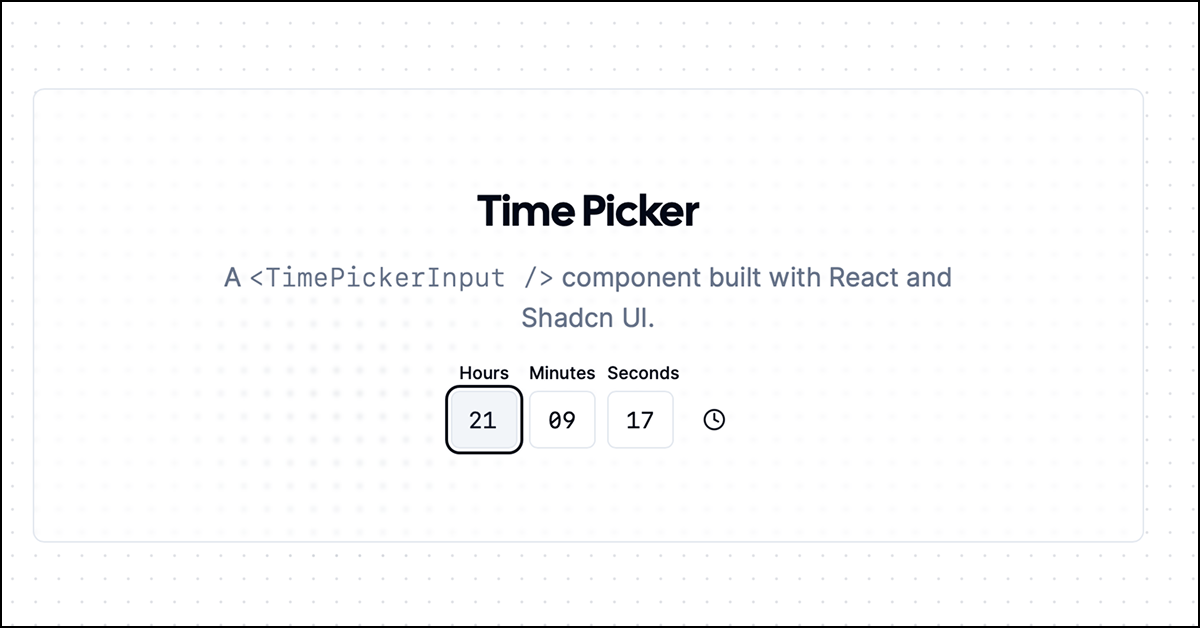
The Time Picker from OpenStatusHQ is an open-source, highly customizable time input component designed to work with modern frontend frameworks like React. Built with Tailwind CSS, this time picker allows developers to quickly implement time selection functionality in their web applications. The goal of this component is to provide a clean, user-friendly interface for picking time, while being flexible enough for various design systems and styles.
#Features ⚡️
Customizable Design: Thanks to Tailwind CSS, the Time Picker is easily customizable to fit your application's design.
Responsive: Works seamlessly across devices and screen sizes.
Focus on Accessibility: Built with accessibility in mind, ensuring that the component is usable by all users.
Time Format Options: Offers various time format options, allowing users to choose between 12-hour and 24-hour time systems.
Keyboard Navigation: Allows keyboard navigation, improving user experience.
#Pros and Cons
#Pros ✅
Open-source: Free to use and modify, making it an excellent choice for projects of all scales.
Customizable and Scalable: Leverages Tailwind CSS for styling, so it can easily match your design system.
React-ready: The component is built to integrate seamlessly with React applications.
Lightweight: It is lightweight, so it doesn’t slow down your application.
#Cons ⚠️
Limited Framework Support: Primarily built for React, so it may require extra work to integrate with other frameworks.
Lack of Advanced Features: The component is simple and may lack advanced features that are found in more complex time picker solutions.
#Included Components - Templates
The Time Picker includes a basic time selection component with minimalistic design. It allows for easy customization, including:
Time input field for entering hours and minutes
Dropdown-style time selector
12-hour/24-hour toggle
These elements can be combined with other Tailwind UI components for complex user interfaces.
#Pricing 💵
The Time Picker is Open Source and available for free. No paid plans or licenses are necessary, making it an excellent choice for personal and commercial projects.
#Integrations 🧰
React: Fully compatible with React applications.
Tailwind CSS: Built with Tailwind CSS, making it easy to integrate into any Tailwind-based project.
Easy Customization: You can customize the component with just a few lines of Tailwind utilities.
Frequently Asked Questions
Can I use this Time Picker in non-React projects?
This component is built for React, but it can be adapted for use in other frameworks with some extra work.
Does the Time Picker support localization for time formats?
Yes, it supports 12-hour and 24-hour time formats, allowing you to choose the system that fits your needs.
Is the component accessible?
Yes, the Time Picker is designed with accessibility in mind, supporting keyboard navigation and screen readers.
Can I customize the design?
Absolutely! Since it uses Tailwind CSS, you can easily tweak the design with utility classes to fit your application's aesthetic.
TimePicker
A time picker component for your shadcn ui app
Resource Types:
UI Kits :
Shadcn UITechnology Stack :


Have a product?
Submit your Shadcn product to AllShadcn, get featured, and drive genuine traffic while showcasing your work to the world. Turn your creativity into revenue and begin selling today! 🚀