Details about 1771 Technologies
Hand-crafted React component library built on Radix UI + Tailwind CSS with obsessive attention to accessibility and polish.
Every component passes strict WCAG 2.1 AA (and often AAA) with zero extra work from you.
Copy-paste or CLI install – full code ownership, no runtime bloat, no black-box magic.
Stunning default dark + light themes that look expensive out of the box.
Made by developers who ship real products – not another abandoned side project.
#What is 1771 Technologies?
1771 Technologies is a premium-feeling, accessibility-first React component library created for serious frontend teams who refuse to compromise on design, performance, or inclusion. It gives you production-ready primitives (buttons, modals, dropdowns, tables, forms, etc.) that are already fully keyboard-navigable, screen-reader friendly, and visually flawless in both light and dark mode. Perfect for SaaS dashboards, internal tools, marketing sites, and any product where “it just works” for every user is non-negotiable. Built on Radix primitives + Tailwind + TypeScript, it installs via CLI or copy-paste and lets you own every line so you never worry about upstream breaking changes.
#Features ⚡
Zero-configuration accessibility – every component already passes real audits.
Gorgeous default themes – dark and light modes that feel like $5k design system.
CLI install or copy-paste – add only what you need in seconds.
Radix + Tailwind foundation – rock-solid primitives with utility-class freedom.
Full TypeScript support – excellent types, generics, and autocompletion.
Responsive + mobile-first – looks perfect on phones without extra tweaks.
Consistent animation system – subtle, performant micro-interactions everywhere.
#Pros ✅
You will never have to fix accessibility issues again – huge time saver.
Looks more expensive than 99% of paid component libraries.
Actually used in production apps – not just demo screenshots.
Extremely fast setup and tiny bundle impact.
#Cons ⚠️
One-time purchase required for full access (no forever-free tier).
Radix-based (great for most, but you must be comfortable with controlled components).
Still growing – not 500+ components yet (but the ones that exist are flawless).
#Included Components - Templates
Buttons (primary, secondary, ghost, destructive, loading states)
Dialogs & Modals (with proper focus trap and escape handling)
Dropdown Menus & Selects
Tabs & Accordions
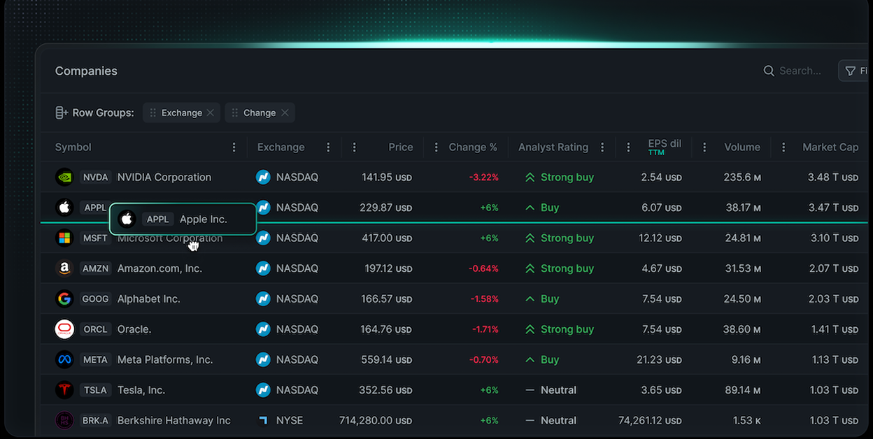
Tables (sortable, filterable, responsive)
Forms (inputs, textareas, checkboxes, radios, switches, validation)
Tooltips & Popovers
Navigation (sidebar, navbar, breadcrumbs)
Cards & Hover Cards
Data Display (badges, avatars, progress, skeleton loaders)
Pre-built blocks: Pricing tables, feature grids, auth forms
#Pricing 💸
• Core (Free)
Open-source core features, unlimited apps, community support.
• Developer PRO ($399 / seat / year)
Core + Pro features, 1 year updates, priority support, faster responses.
• Organization PRO (POA)
Everything in Pro plus enterprise support, SLA, and dedicated manager.
#Integrations 🧰
Next.js (App Router & Pages)
Vite + React
Remix
Tailwind CSS v3 / v4
TypeScript (required and loved)
Storybook-ready exports
Works with Vercel, Netlify, Cloudflare Pages
Frequently Asked Questions
Do I really get accessibility for free?
Yes – every single component is already WCAG 2.1 AA compliant.
Can I customize the look?
Yes – Tailwind classes + CSS variables make it trivial.
Does it work with dark mode?
Built-in and automatic – toggle class and it just works
1771 Technologies
Fast, scalable React data grid with server-side support
Resource Types:
UI Kits :
Shadcn UITechnology Stack :


Have a product?
Submit your Shadcn product to AllShadcn, get featured, and drive genuine traffic while showcasing your work to the world. Turn your creativity into revenue and begin selling today! 🚀