Details about Autocomplete component with Shadcn UI
Tech Stack: Built with Shadcn UI, Fancy Multi Select by Maximilian Kaske, and Tailwind CSS
Features: Customizable autocomplete component with multi-select functionality
Demo: Interactive demo available
Source Code: Accessible on GitHub
#What is Autocomplete?
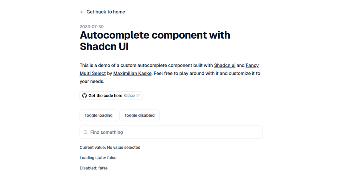
The Autocomplete component developed by Armand Sallé is a custom UI element built using Shadcn UI and Fancy Multi Select by Maximilian Kaske. It offers a flexible and accessible solution for implementing autocomplete and multi-select functionalities in web applications. The component is designed to be easily customizable, allowing developers to tailor it to their specific needs.
#Features ⚡️
Multi-Select Support: Allows users to select multiple options, displayed as pills.
Customizable Styling: Built with Tailwind CSS for easy styling adjustments.
Accessibility: Ensures keyboard navigation and screen reader compatibility.
Responsive Design: Adapts to different screen sizes for optimal user experience.
Integration Ready: Can be integrated into various frameworks like Next.js, SvelteKit, Nuxt.js, and more.
#Pros and Cons
#Pros ✅
Easy Customization: Tailwind CSS integration allows for quick styling changes.
Enhanced User Experience: Multi-select functionality with pill display improves usability.
Framework Agnostic: Compatible with multiple frontend frameworks.
Open Source: Free to use and modify.
Active Development: Regular updates and community contributions.
#Cons ⚠️
Limited Documentation: May require exploration of source code for full understanding.
Framework-Specific Implementations: Some features may be tailored to specific frameworks.
Performance Considerations: Handling large datasets may require optimization.
#Included Components – Templates
The Autocomplete component includes:
Input Field: For user text input.
Dropdown List: Displays filtered options based on user input.
Pill Tags: Shows selected items as pills.
Loading Indicator: Indicates when data is being fetched.
Error Handling: Displays messages when no results are found.
Accessibility Features: Keyboard navigation and screen reader support.
#Pricing 💵
The Autocomplete component is open-source and free to use. There are no licensing fees or subscription costs associated with utilizing this component.
#Integrations 🧰
The component can be integrated into various frontend frameworks:
Next.js: Popular React framework for building server-rendered applications.
SvelteKit: A framework for building fast, optimized web applications with Svelte.
Nuxt.js: A framework for building server-side rendered applications with Vue.js.
Remix: A modern React framework focused on user experience.
Astro: A static site generator that allows you to build fast websites.
WordPress: A content management system for building websites and blogs.
Express.js: A minimal and flexible Node.js web application framework.
Nest.js: A framework for building efficient, reliable, and scalable server-side applications.
Frequently Asked Questions
How do I integrate the Autocomplete component into my project?
You can integrate the component by following the instructions provided in the GitHub repository. Ensure that you have the necessary dependencies installed and follow the setup guide for your specific framework.
Can I customize the styling of the component?
Yes, the component is built with Tailwind CSS, allowing you to easily customize the styling to match your application's design.
Is the component accessible?
Yes, the component includes features like keyboard navigation and screen reader support to ensure accessibility.
Autocomplete component with Shadcn UI
Build a custom auto complete component with Shadcn UI.
Resource Types:
UI Kits :
Shadcn UITechnology Stack :


Have a product?
Submit your Shadcn product to AllShadcn, get featured, and drive genuine traffic while showcasing your work to the world. Turn your creativity into revenue and begin selling today! 🚀