Details about Date Time Range Picker
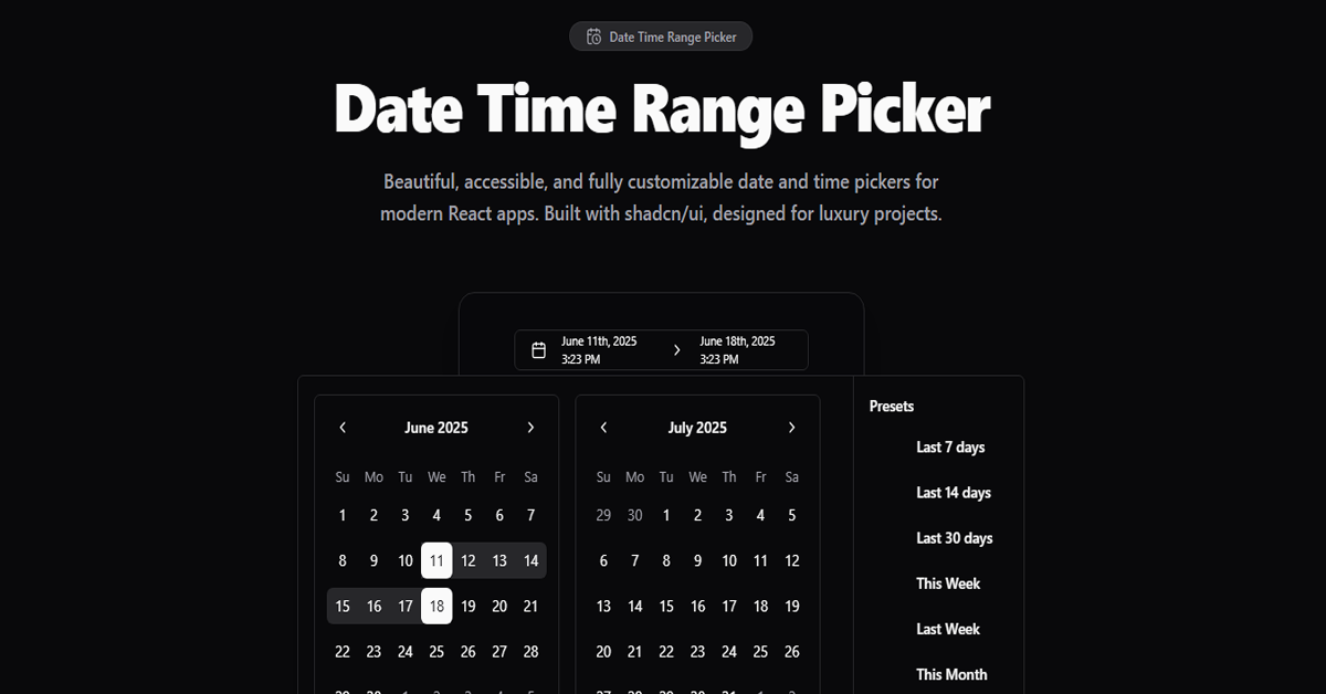
Date and Time Selection: Allows users to select both dates and times within a specified range.
Preset Date Ranges: Offers predefined date ranges for quick selection.
Comparison Mode: Enables side-by-side comparison of two date ranges.
Light and Dark Mode: Supports both light and dark themes for UI flexibility.
Keyboard Navigation: Facilitates navigation through the picker using keyboard shortcuts.
Accessibility: Designed with accessibility in mind, ensuring usability for all users.
Customization: Fully customizable to fit the specific needs of your application.
#What is Date Time Range Picker?
The Date Time Range Picker is a versatile React component that enables users to select a range of dates and times. Built using shadcn/ui components and leveraging date-fns for date operations, this picker offers a user-friendly interface with support for both light and dark themes. It's ideal for applications requiring precise date and time selection, such as booking systems, event scheduling, and analytics dashboards.
#Features ⚡️
Date and Time Range Selection: Select both start and end dates with specific times.
Preset Date Ranges: Quickly choose from common date ranges like "Last 7 Days" or "This Month".
Comparison Mode: View two date ranges side by side for easy comparison.
Light and Dark Mode: Toggle between themes to match your application's design.
Keyboard Navigation: Navigate through the picker using keyboard shortcuts for improved accessibility.
Accessibility: Built with ARIA roles and properties to ensure usability for all users.
Customization: Easily customize the appearance and behavior to fit your application's needs.
#Pros and Cons
#Pros ✅
User-Friendly Interface: Intuitive design enhances user experience.
Flexible Date and Time Selection: Accommodates a wide range of use cases.
Customizable Themes: Supports both light and dark modes.
Keyboard Accessibility: Improves usability for keyboard users.
Open Source: Freely available for use and modification.
#Cons ⚠️
Dependency Management: Requires specific versions of date-fns and react-day-picker for compatibility.
Learning Curve: May require time to fully understand and implement all features.
#Included Components - Templates
The Date Time Range Picker includes several components to facilitate date and time selection:
Calendar: A component for selecting dates.
DateInput: Allows input of dates with separate fields.
TimeInput: Facilitates input of time with hours, minutes, and AM/PM.
DateTimeInput: Combines date and time input into a single component.
DateRangePicker: A component for selecting a range of dates with presets.
DateTimeRangePicker: A component for selecting a range of dates and times.
#Pricing 💵
The Date Time Range Picker is open source and available for free under the MIT license. There are no costs associated with using or modifying the component.
#Integrations 🧰
The Date Time Range Picker integrates seamlessly with the following technologies:
React: Built specifically for React applications.
shadcn/ui: Utilizes components from shadcn/ui for UI elements.
date-fns: Employs date-fns for date operations.
react-day-picker: Leverages react-day-picker for date selection functionality.
Frequently Asked Questions
Can I customize the appearance of the picker?
Yes, the Date Time Range Picker is fully customizable. You can modify the styles using Tailwind CSS classes or override them as needed.
Is the picker accessible?
Absolutely. The component is built with accessibility in mind, incorporating ARIA roles and properties to ensure usability for all users.
Does the picker support time selection?
Yes, the Date Time Range Picker allows users to select both dates and times within the specified range.

Featured Shadcn Products
Add Featured Product


Have a product?
Submit your Shadcn product to AllShadcn, get featured, and drive genuine traffic while showcasing your work to the world. Turn your creativity into revenue and begin selling today! 🚀