Details about Doras UI
Comprehensive collection of over 50 production-ready React components optimized for modern web apps
Seamless integration with Tailwind CSS and shadcn/ui for customizable, responsive designs out of the box
Built-in animations and dark mode support to enhance user experiences without extra configuration
TypeScript-first approach with full prop typing and documentation for developer-friendly workflows
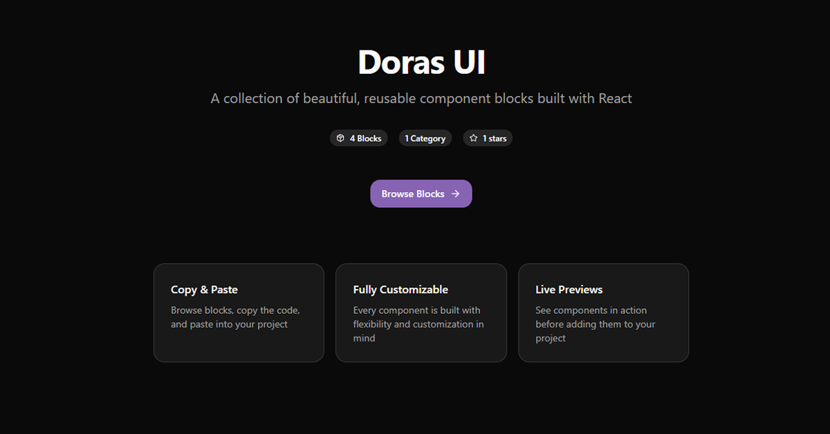
Open-source under MIT license, with 2.5k+ GitHub stars and active community contributions
Focus on accessibility and performance, ensuring WCAG compliance and lightweight bundle sizes
#What is Doras UI?
Doras UI is an exquisite, open-source React component library designed for frontend developers and UI teams building sophisticated web applications who seek to elevate their designs with beautiful, accessible elements while minimizing custom coding efforts. Its core value lies in delivering a harmonious blend of aesthetics and functionality through pre-built, highly customizable components that accelerate prototyping and production, allowing focus on unique features rather than UI boilerplate. Powered by React 18+, Tailwind CSS for styling, Framer Motion for subtle animations, and TypeScript for robust typing, it's ideal for use-cases like developing elegant SaaS dashboards, immersive e-commerce interfaces, content-rich portfolios, or interactive admin panels—anywhere polished, performant UIs can drive engagement and retention.
#Features ⚡
50+ Polished Components: From buttons and cards to modals and charts, each crafted with refined visuals and interaction states for immediate visual impact.
Tailwind & shadcn/ui Synergy: Native support for utility classes and primitive overrides, enabling theme extensions and variant creation with zero friction.
Built-in Animations: Framer Motion-powered transitions like fade-ins and hover effects, configurable via props for nuanced control.
Dark Mode Ready: Automatic theme detection and switching, with CSS variables for seamless light/dark palette adaptations.
Accessibility Core: ARIA attributes, keyboard navigation, and screen reader optimizations embedded in every component for inclusive designs.
TypeScript Excellence: Comprehensive prop interfaces and utility types to catch errors early and streamline autocomplete in your IDE.
Responsive Utilities: Mobile-first breakpoints and flex/grid helpers to ensure fluid layouts across all devices without media query hacks.
#Pros ✅
Stunning out-of-the-box designs save hours on styling, letting devs prioritize logic and innovation
Deep customization without bloat keeps your app lightweight and true to your brand
Strong TypeScript integration boosts productivity and reduces runtime surprises
Vibrant open-source community ensures rapid bug fixes and fresh additions
Accessibility and performance baked in align with modern web standards effortlessly
#Cons ⚠️
Primarily Tailwind-focused, requiring adaptations for other CSS frameworks like CSS Modules
Smaller ecosystem compared to giants like MUI, potentially missing niche enterprise components
Learning curve for advanced theming if new to shadcn/ui primitives
#Included Components - Templates
Doras UI ships with a versatile array of ready-to-use building blocks to streamline your UI development: foundational elements like Button, Input, and Select for forms and controls; layout containers such as Card, Grid, and Stack for structured content; interactive overlays including Modal, Tooltip, and Dropdown for user engagement; data presentation tools like Table, Chart, and Progress for dashboards; navigation components such as Navbar, Tabs, and Breadcrumbs for app flows; plus utility templates for alerts, badges, and skeletons—all fully typed, animated, and customizable via Tailwind classes, with example snippets for Next.js integration.
#Pricing 💸
Doras UI is entirely free and open-source under the MIT license, with no freemium model, subscriptions, or Pro tiers—every component, hook, and template is available via npm at zero cost for unlimited personal, open-source, or commercial use. Community-driven updates keep it evolving without any paywalls.
#Integrations 🧰
Doras UI integrates natively with React ecosystems like Next.js and Remix for app frameworks; Tailwind CSS and shadcn/ui for styling and primitives; Framer Motion for animations; TypeScript for development; plus deployment tools such as Vercel and Netlify—making it a seamless addition to any modern React stack.
Frequently Asked Questions
Is Doras UI free for commercial projects?
Yes—MIT-licensed for unrestricted use in any application. Does it require Tailwind CSS? Recommended for full customization, but components work with any CSS setup via className props.
How do I install it?
Run npm install doras-ui then import components directly in your React files—docs provide setup guides.
Is TypeScript supported?
Fully— all components ship with complete type definitions for a typed dev experience.
Doras UI
Modern, accessible React UI with customizable Tailwind blocks.
Resource Types:
UI Kits :
Shadcn UITechnology Stack :


Have a product?
Submit your Shadcn product to AllShadcn, get featured, and drive genuine traffic while showcasing your work to the world. Turn your creativity into revenue and begin selling today! 🚀