Details about DropDrawer
Responsive Design: Automatically switches between a dropdown menu on desktop and a drawer on mobile devices.
Easy Migration: Drop-in replacement for shadcn/ui's DropdownMenu component.
Nested Submenus: Supports complex navigation structures with nested submenus.
Lightweight: Minimal dependencies for optimal performance.
Open Source: Available under the MIT license.
#What is DropDrawer?
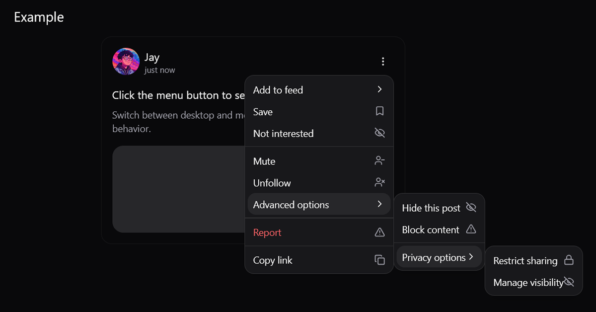
DropDrawer is a responsive component designed to enhance user experience by adapting its interface based on the device's screen size. On desktop, it functions as a traditional dropdown menu, while on mobile devices, it transforms into a drawer for better usability. This component is a drop-in replacement for shadcn/ui's DropdownMenu, making it easy to integrate into existing projects.
#Features ⚡️
Responsive Behavior: Automatically detects screen size and adjusts its layout accordingly.
Nested Submenus: Allows the creation of complex navigation structures with nested items.
Customizable Styling: Easily themeable using Tailwind CSS.
Keyboard Navigation: Supports keyboard interactions for accessibility.
Minimal Dependencies: Built with minimal dependencies to ensure fast load times.
#Pros and Cons
#Pros ✅
Seamless Integration: Easy to replace existing DropdownMenu components with DropDrawer.
Enhanced Mobile Experience: Improves usability on mobile devices by providing a drawer interface.
Customizable: Tailwind CSS integration allows for easy styling adjustments.
Open Source: Free to use and modify under the MIT license.
#Cons ⚠️
Limited Documentation: While the component is well-documented, more examples and use cases could be beneficial.
Advanced Features: Some advanced features from the original DropdownMenu may require additional implementation.
#Included Components - Templates
The DropDrawer package includes several components to facilitate its functionality:
DropDrawer: The main container component that manages the state.
DropDrawerTrigger: The button or element that triggers the dropdown or drawer.
DropDrawerContent: The container for the dropdown or drawer content.
DropDrawerItem: Individual items within the dropdown or drawer.
DropDrawerSub: A container for submenu content.
DropDrawerSubTrigger: The button that triggers the submenu.
DropDrawerSubContent: The content of the submenu.
#Pricing 💵
DropDrawer is open-source and available for free under the MIT license. There are no costs associated with using or modifying the component.
#Integrations 🧰
DropDrawer integrates seamlessly with the following technologies:
React: Built specifically for React applications.
Shadcn/ui: Utilizes components from Shadcn/ui for UI elements.
Tailwind CSS: Styled using Tailwind CSS for easy customization.
Frequently Asked Questions
Can I customize the appearance of DropDrawer?
Yes, DropDrawer is styled using Tailwind CSS, allowing for easy customization to match your application's design.
Does DropDrawer support mobile devices?
Absolutely. On mobile devices, DropDrawer switches to a drawer interface for better usability.
DropDrawer
Responsive component that automatically switches between a dropdown.
Resource Types:
UI Kits :
Shadcn UITechnology Stack :


Have a product?
Submit your Shadcn product to AllShadcn, get featured, and drive genuine traffic while showcasing your work to the world. Turn your creativity into revenue and begin selling today! 🚀