Details about Elements - Full Stack Components
Free, open-source full-stack component library
Built with Next.js, TypeScript, shadcn/ui, Tailwind CSS
Features production-ready auth, payments, AI, and more
Supports copy-paste integration via shadcn CLI
Community-driven with sponsorships and suggestion system
#What is Elements?
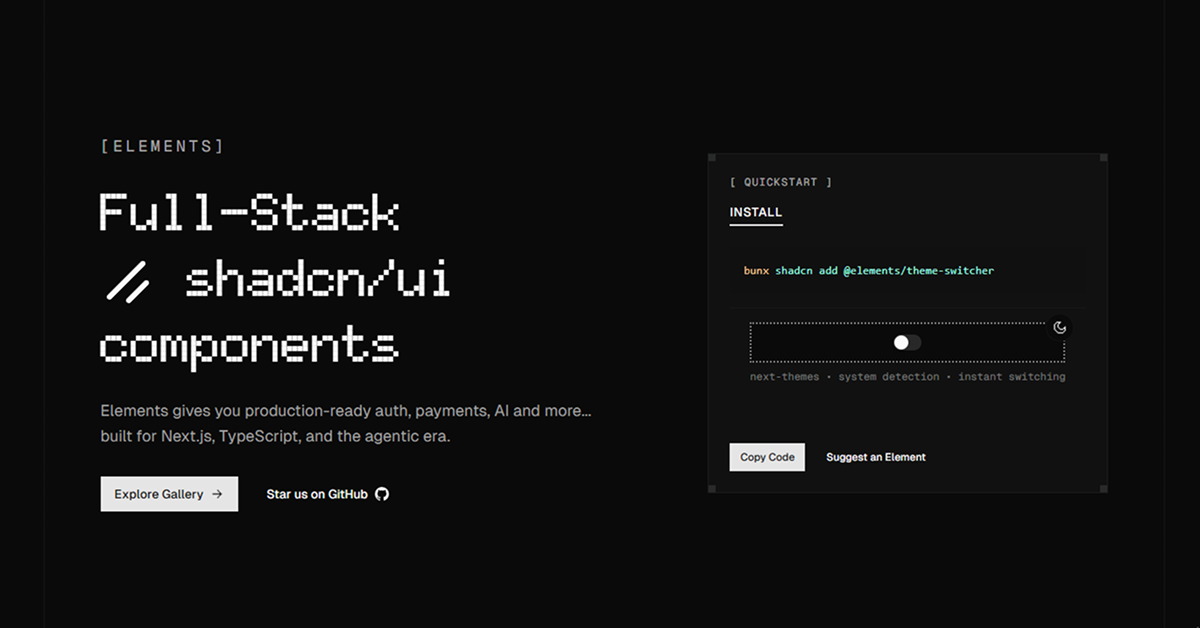
Elements is a free, open-source collection of full-stack components designed to accelerate development of modern web applications. Built for the agentic era, it's made with Next.js, TypeScript, shadcn/ui, and Tailwind CSS, offering production-ready elements like authentication flows, payment integrations, AI tools, and more. Its primary goal is to provide developers with composable, scalable UI that handles both frontend and backend logic, targeting builders of SaaS platforms, dashboards, or AI-driven apps. Elements emphasizes copy-paste simplicity via shadcn CLI (bunx shadcn add @elements/theme-switcher), ensuring components are lightweight and customizable. Sponsored by companies like Crafter Station and Kebo, it's community-driven with a suggestion system for new components. For shadcn/ui users, Elements is a perfect fit, extending shadcn/ui's accessible foundation to deliver full-stack, AI-ready components for Next.js applications.
#Features ⚡️
Full-Stack Components: Production-ready auth, payments, AI, and UI elements.
ShadCN UI Integration: Builds on shadcn UI for accessible, customizable components.
Accessibility: WAI-ARIA compliant with Radix UI primitives.
CLI Support: Install with bunx shadcn add for quick setup.
Responsive Design: Tailwind CSS ensures components adapt to all screen sizes.
Type Safety: TypeScript ensures robust, error-free development.
#Pros ✅
Full-Stack Ready: Handles UI + logic for auth, payments, and AI in one package.
Free and Open-Source: Community-driven with sponsorships for sustainability.
ShadCN UI Fit: Perfect for shadcn UI with React and shadcn UI foundation.
Community Support: Suggestion system and sponsors like Crafter Station.
Easy Integration: Copy-paste model with CLI simplifies adding components.
#Cons ⚠️
React Dependency: Limited to React/Next.js projects, though fitting for shadcn UI.
Setup Complexity: Requires shadcn UI, Tailwind CSS pre-installed.
Early Stage: Limited components compared to larger libraries.
Learning Curve: Familiarity with shadcn UI, React, and TypeScript needed.
#Included Components - Templates
Elements provides a variety of shadcn UI-powered full-stack components:
Theme Switcher: Dark/light mode toggle with system detection.
Auth Components: Login, signup, and profile management.
Payment UI: Billing forms with Stripe integration.
AI Elements: Prompt inputs and response handlers.
#Pricing 💸
Elements operate on a Free model:
Free Access: All components free under MIT license.
No Pro Version: No premium tiers; sponsored for sustainability.
#Integrations 🧰
Elements integrates with:
React: Core framework for building components.
ShadCN UI: Accessible component library for styling and structure.
Tailwind CSS: Utility-first styling for responsive design.
Next.js: Supports server-side rendering and routing.
TypeScript: Ensures type-safe component usage.
Frequently Asked Questions
What is Elements, and how does it work with ShadCN UI?
Elements is a free full-stack component collection for shadcn UI, offering auth, payments, and AI components.
Is Elements free to use?
Yes, all components are free under MIT License
Does Elements support accessibility?
Yes, inherits shadcn UI's WAI-ARIA compliance via Radix UI.
Elements - Full Stack Components
Full-stack React components with TS, Tailwind, and shadcn/ui.
Resource Types:
UI Kits :
Shadcn UITechnology Stack :


Have a product?
Submit your Shadcn product to AllShadcn, get featured, and drive genuine traffic while showcasing your work to the world. Turn your creativity into revenue and begin selling today! 🚀