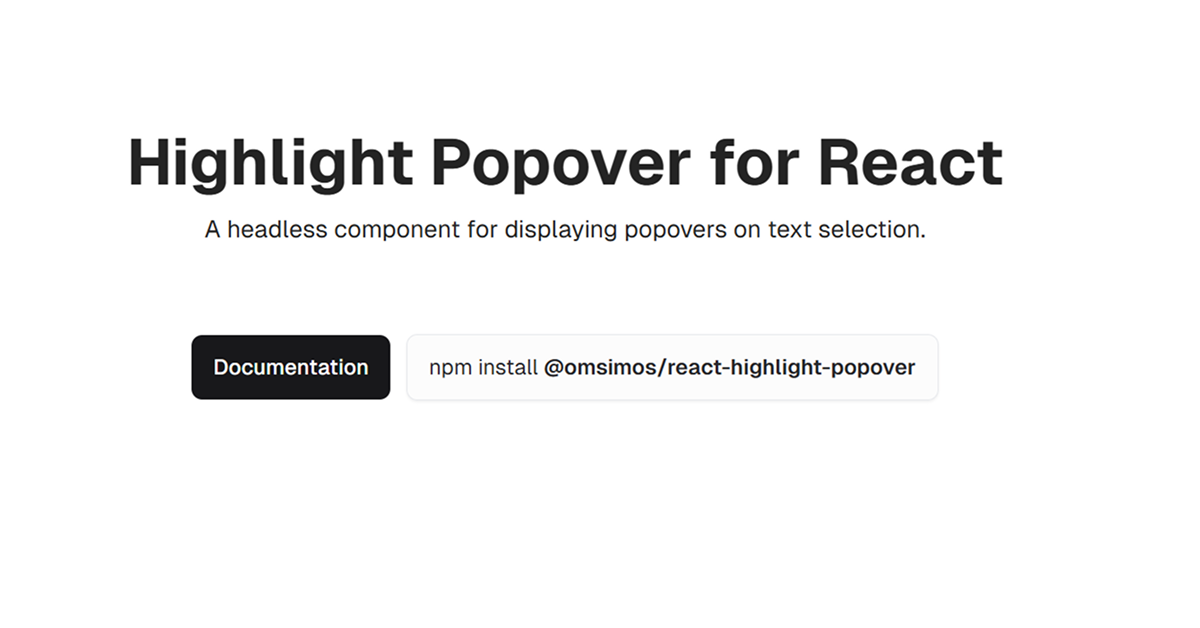
Details about React Highlight Popover
Free, open-source, headless React component for text selection popovers
Built with React, TypeScript, Tailwind CSS, and shadcn-ui
Features customizable popovers triggered by text selection, zero dependencies
Integrates via NPM (@omsimos/react-highlight-popover) with 1.0.0 version (June 2025)
MIT-licensed
#What is React Highlight Popover?
React Highlight Popover is a free, open-source, headless React component by omsimos, designed to create customizable popovers that appear when users select text, compatible with shadcn-ui projects. It’s ideal for developers building interactive features like text annotations, translation tools, or comment systems in Next.js or React applications, such as note-taking apps or content editors.
Built with React, TypeScript, Tailwind CSS, and shadcn-ui, it offers a lightweight, zero-dependency solution for rendering popovers with selected text. The component uses a renderPopover prop for custom UI and a useHighlightPopover hook for state management. It integrates via NPM and supports shadcn-ui’s accessible design.
#Features ⚡️
Text Selection Popover: Displays a popover when text is selected, customizable via renderPopover.
Zero Dependencies: Lightweight, no external libraries required.
useHighlightPopover Hook: Access internal state (showPopover, currentSelection) for custom logic.
Customizable Events: Supports onSelectionStart, onSelectionEnd, onPopoverShow, and onPopoverHide.
Offset Control: Adjust popover position with offset prop (e.g., { x: 0, y: -10 }).
Min Selection Length: Set minimum characters to trigger popover (e.g., minSelectionLength={5}).
Accessible Design: Inherits shadcn-ui’s WAI-ARIA compliance.
Responsive Styling: Tailwind CSS ensures adaptability.
#Pros and Cons
#Pros ✅
shadcn-ui Compatibility: Seamlessly integrates with shadcn-ui’s ecosystem.
Free and Open-Source: MIT license allows unrestricted use.
Lightweight: Zero dependencies reduce bundle size.
Flexible: Headless design and hook enable custom UI and behavior.
#Cons ⚠️
React Dependency: Limited to React/shadcn-ui ecosystems.
Setup Requirements: Needs shadcn-ui and Tailwind CSS installed.
Client-Side Focus: Popover logic is client-side; server-side actions require custom setup.
Basic Styling: Headless nature requires custom Tailwind CSS for polished UI.
Early Stage: Limited community traction compared to shadcn-chat (1.3k stars).
#Included Components
HighlightPopover: Main component wrapping content and rendering the popover.
useHighlightPopover: Hook for accessing popover state and selection data.
#Pricing 💸
React Highlight Popover is completely free under the MIT license, with no premium tiers.
#Integrations 🧰
React: Core framework for the component.
shadcn-ui: Provides accessible UI primitives.
Tailwind CSS: Utility-first styling for custom popover designs.
Next.js: Optimized for Next.js projects (v14.2+).
TypeScript: Ensures type safety.
Frequently Asked Questions
What is react-highlight-popover?
A headless React component for shadcn-ui, creating popovers on text selection with zero dependencies.
Is it free?
Yes, fully free under the MIT license.
Does it work outside shadcn-ui projects?
Yes, via NPM, but shadcn-ui enhances integration; requires Tailwind CSS.
React Highlight Popover
A headless component for displaying popovers on text selection.
Resource Types:
UI Kits :
Shadcn UITechnology Stack :
Have a product?
Submit your Shadcn product to AllShadcn, get featured, and drive genuine traffic while showcasing your work to the world. Turn your creativity into revenue and begin selling today! 🚀


