Details about Shadcn Icon Picker
Free, open-source icon picker component for shadcn-ui
Built with Next.js, TypeScript, Tailwind CSS, shadcn-ui, Lucide-react, and TanStack Virtual
Features infinite scroll, search, tooltips, and customizable triggers
Integrates via shadcn CLI
MIT-licensed
#What is Shadcn Icon Picker?
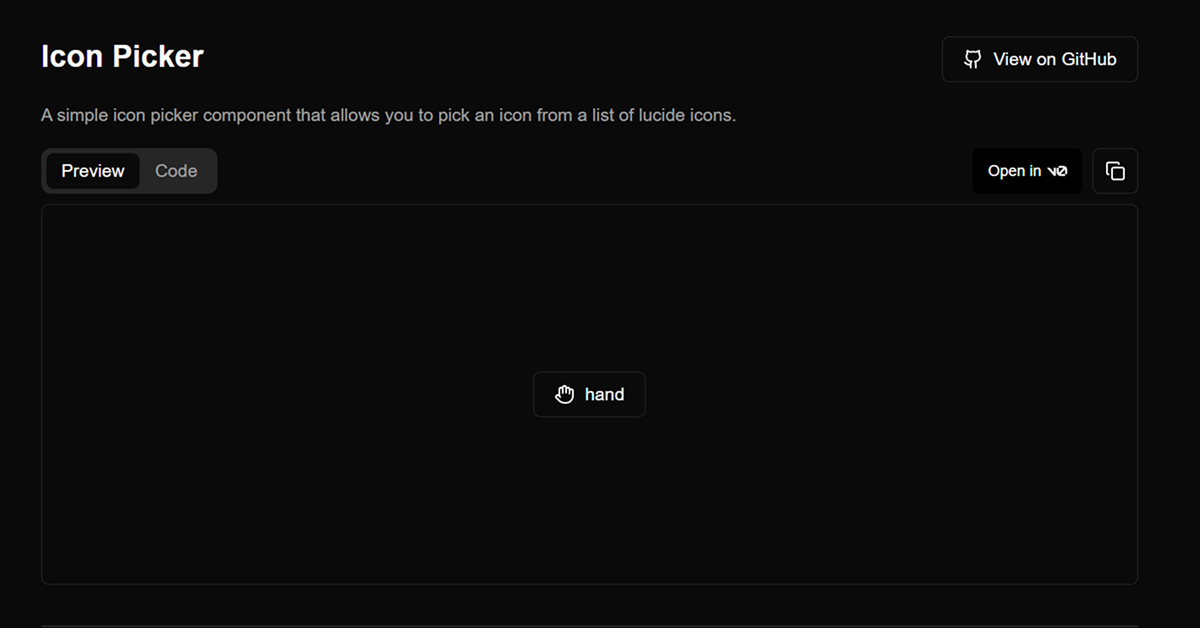
Shadcn Icon Picker is a free, open-source React component by Alan Courtois, designed to extend shadcn-ui with a searchable, customizable icon picker. It’s ideal for developers building dashboards, forms, or toolbars in Next.js or React projects, where selecting icons for actions, statuses, or inputs is needed, such as in CMS or admin panels.
Built with Next.js, TypeScript, Tailwind CSS, shadcn-ui, Lucide-react, and TanStack Virtual, it offers a modern interface with infinite scroll, real-time search, tooltips for icon names, and a customizable trigger button. The component integrates via shadcn CLI, ensuring seamless alignment with shadcn-ui’s accessible, polished design. Its release was shared on X by @AlanCourtois in February 2024, highlighting its performance and ease of use.
#Features ⚡️
Searchable Interface: Filter Lucide icons with real-time search for quick selection.
Infinite Scroll: Loads icons efficiently using TanStack Virtual for large sets.
Tooltips: Displays icon names on hover for better usability.
Customizable Trigger: Use custom elements or buttons to open the picker.
Accessible Design: Inherits shadcn-ui’s WAI-ARIA compliance for accessibility.
Props Control: Supports value, defaultValue, onValueChange, open, and more for flexibility.
#Pros and Cons
#Pros ✅
shadcn-ui Compatibility: Matches shadcn-ui’s aesthetic and accessibility standards.
Free and Open-Source: MIT license allows unrestricted use and customization.
Performant: TanStack Virtual ensures smooth handling of large icon sets.
Developer-Friendly: TypeScript, search, and infinite scroll enhance productivity.
Community Traction: 149 GitHub stars and X buzz show growing interest (February 2025).
#Cons ⚠️
React Dependency: Limited to React/shadcn-ui ecosystems.
Setup Requirements: Needs shadcn-ui, Tailwind CSS, Lucide-react, and TanStack Virtual installed.
Lucide-Only: Restricted to Lucide icons without native support for other libraries.
Client-Side Focus: Relies on client-side rendering for icon loading and search.
Early Documentation: Some props (e.g., searchPlaceholder) may need clearer guides.
#Included Components
IconPicker: Main component for rendering the searchable icon selection interface.
IconRenderer: Displays selected icons with customizable styling.
#Pricing 💸
Shadcn Icon Picker is completely free under the MIT license, with no premium tiers.
#Integrations 🧰
React: Core framework for the component.
shadcn-ui: Provides accessible, styled primitives.
Tailwind CSS: Utility-first styling for responsive design.
Next.js: Optimized for Next.js projects.
TypeScript: Ensures type safety.
Lucide-react: Icon library for the picker’s icon set.
TanStack Virtual: Powers infinite scroll for performance.
react-hook-form (optional): Supports form integration.
Frequently Asked Questions
What is shadcn-iconpicker?
A searchable icon picker for shadcn-ui, built with Lucide-react and TanStack Virtual for selecting icons in React apps.
Is it free?
Yes, it’s fully free under the MIT license.
Does it work outside shadcn-ui projects?
It’s designed for shadcn-ui; non-shadcn-ui use requires replacing dependencies.
Shadcn Icon Picker
Modern, accessible, and customizable icon picker component.
Resource Types:
UI Kits :
Shadcn UITechnology Stack :

Featured Shadcn Products
Add Featured Product


Have a product?
Submit your Shadcn product to AllShadcn, get featured, and drive genuine traffic while showcasing your work to the world. Turn your creativity into revenue and begin selling today! 🚀