Details about Shadcn Linear Combobox
Free, open-source combobox component for shadcn-ui
Built with React, TypeScript, Tailwind CSS, shadcn-ui, and cmdk
Replicates Linear.app’s priority task combobox with smooth UX
Integrates via shadcn CLI
MIT-licensed
#What is Shadcn Linear Combobox?
Shadcn Linear Combobox is a free, open-source React component by Damian Ricobelli, designed to extend shadcn-ui with a combobox inspired by Linear.app’s task priority selector. It’s ideal for developers building task management apps, dashboards, or forms in Next.js or React projects, offering a polished, user-friendly dropdown for selecting options like task priorities or statuses.
Built with React, TypeScript, Tailwind CSS, shadcn-ui, and cmdk, it features a searchable, keyboard-navigable dropdown with a sleek design. The component integrates via shadcn CLI, ensuring seamless alignment with shadcn-ui’s accessible and customizable UI. Its release was shared on X, highlighting its Linear-inspired aesthetic.
#Features ⚡️
Searchable Dropdown: Filter options with a cmdk-powered search input.
Keyboard Navigation: Supports arrow keys and Enter for selection.
Linear-Inspired UX: Mimics Linear.app’s smooth, minimalistic combobox for task priorities.
Accessible Design: Inherits shadcn-ui’s WAI-ARIA compliance for accessibility.
CLI Integration: Install via shadcn CLI for quick setup in shadcn-ui projects.
Responsive Styling: Tailwind CSS ensures adaptability across devices.
Customizable: Adjust styling and behavior via props and Tailwind classes.
#Pros and Cons
#Pros ✅
shadcn-ui Compatibility: Perfectly aligns with shadcn-ui’s design and accessibility.
Free and Open-Source: MIT license allows unrestricted use and customization.
Polished UX: Linear-inspired design enhances user experience for task selectors.
Easy Integration: CLI simplifies setup in Next.js/shadcn-ui projects.
Community Interest: 149 GitHub stars and X buzz show traction (June 2025).
#Cons ⚠️
React Dependency: Limited to React/shadcn-ui ecosystems.
Setup Requirements: Needs shadcn-ui, Tailwind CSS, cmdk, and dependencies like lucide-react.
Single Purpose: Focused on a Linear-style combobox; lacks broader functionality.
No Nested Menus: Doesn’t support nested dropdowns, a feature requested in shadcn-ui issues.
Client-Side Focus: Built on cmdk, requiring additional setup for server-side interactions.
#Included Components
LinearCombobox: Main component for rendering a searchable, Linear-inspired dropdown.
Command Components: Uses shadcn-ui’s Command, CommandInput, and CommandItem for interaction.
#Pricing 💸
Shadcn Linear Combobox is completely free under the MIT license, with no premium tiers.
#Integrations 🧰
React: Core framework for the component.
shadcn-ui: Provides accessible, styled primitives.
Tailwind CSS: Utility-first styling for responsive design.
Next.js: Optimized for Next.js projects (v14.2.2).
TypeScript: Ensures type safety.
cmdk: Powers command palette-style search and navigation.
lucide-react: Icon library for dropdown visuals.
Radix UI: Dependencies like Popover and Command for UI composition.
Frequently Asked Questions
What is Shadcn Linear Combobox?
A Linear.app-inspired combobox for shadcn-ui, offering a searchable, accessible dropdown for task priorities or statuses.
Is it free?
Yes, it’s fully free under the MIT license.
Does it work outside shadcn-ui projects?
It’s designed for shadcn-ui; non-shadcn-ui use requires replacing dependencies.
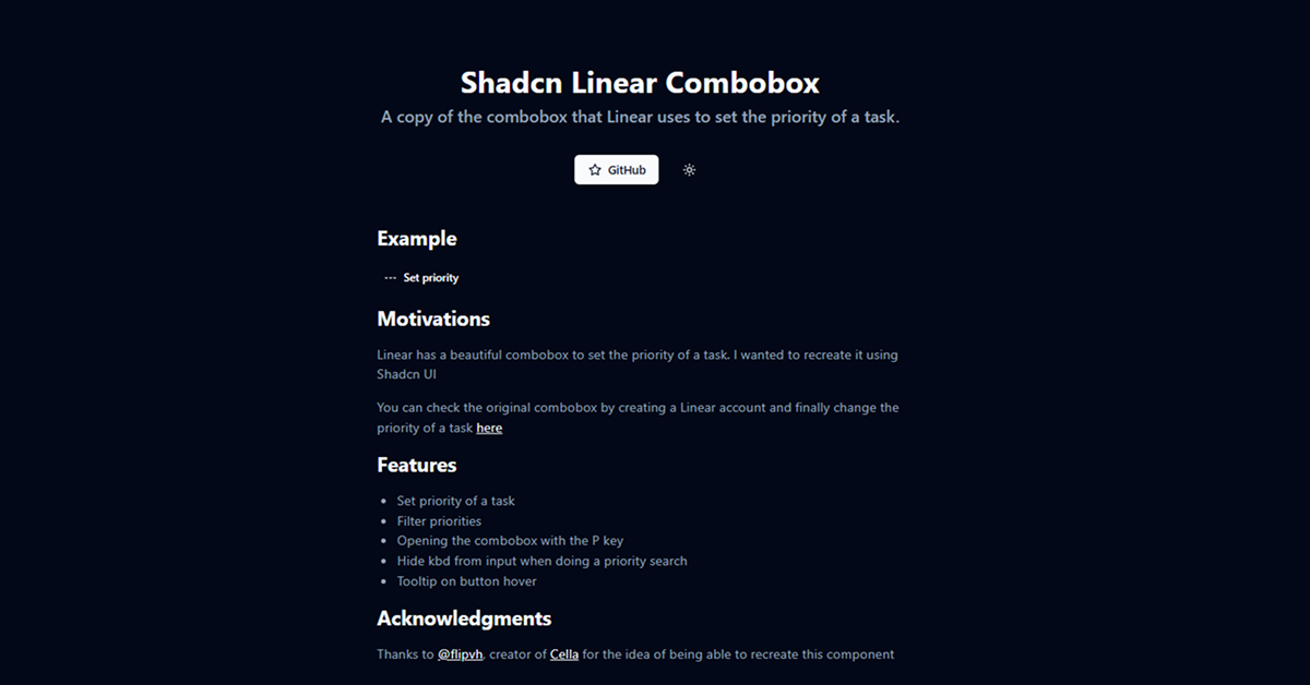
Shadcn Linear Combobox
A copy of the combobox that Linear uses to set the priority of a task.
Resource Types:
UI Kits :
Shadcn UITechnology Stack :


Have a product?
Submit your Shadcn product to AllShadcn, get featured, and drive genuine traffic while showcasing your work to the world. Turn your creativity into revenue and begin selling today! 🚀