Details about Shadcn/ui + Downshift Combobox
Combines Shadcn/ui and Downshift: Utilizes Shadcn/ui's styling and Downshift's accessibility-focused logic.
Accessible and Keyboard-Navigable: Ensures a seamless experience for all users.
Customizable and Themeable: Built with Tailwind CSS for easy styling adjustments.
Lightweight and Performant: Minimal dependencies for optimal performance.
Open Source: Available under the MIT license.
#What is Shadcn/ui + Downshift Combobox?
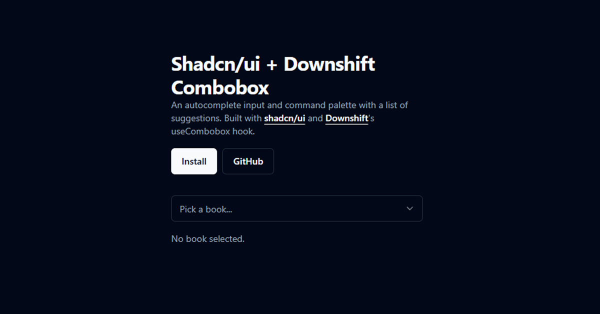
The Shadcn/ui + Downshift Combobox is a versatile React component designed to enhance user input experiences. It combines the visual appeal and accessibility of Shadcn/ui with the state management and behavior control of Downshift's useCombobox hook. This component supports autocomplete functionality, allowing users to filter and select options efficiently. It's ideal for applications requiring intuitive selection inputs, such as search bars, form fields, and command palettes.
#Features ⚡️
Autocomplete Input: Provides real-time suggestions as the user types.
Command Palette: Enables users to execute commands or select options from a list.
Keyboard Navigation: Supports arrow keys and Enter/Tab for selection.
ARIA Accessibility: Built with screen reader support in mind.
Customizable Styling: Easily themeable using Tailwind CSS.
Minimal Dependencies: Built with React, Downshift, and Shadcn/ui.
#Pros and Cons
#Pros ✅
Enhanced User Experience: Provides a responsive and interactive input field.
Accessibility Focused: Ensures usability for all users, including those relying on assistive technologies.
Easy Integration: Seamlessly integrates into React applications.
Customizable: Tailwind CSS integration allows for easy styling adjustments.
#Cons ⚠️
Learning Curve: Requires familiarity with Downshift's
useComboboxhook.Limited Documentation: May need additional resources to fully understand and implement.
#Included Components - Templates
The Shadcn/ui + Downshift Combobox includes several components to facilitate autocomplete functionality:
Combobox: The main container component.
ComboboxInput: The input field where users type their query.
ComboboxContent: The dropdown list displaying suggestions.
ComboboxItem: Individual items within the dropdown list.
ComboboxEmpty: Message displayed when no results are found
#Pricing 💵
The Shadcn/ui + Downshift Combobox is open-source and available for free under the MIT license. There are no costs associated with using or modifying the component.
#Integrations 🧰
The Shadcn/ui + Downshift Combobox integrates seamlessly with the following technologies:
React: Built specifically for React applications.
Shadcn/ui: Utilizes components from Shadcn/ui for UI elements.
Downshift: Employs Downshift's
useComboboxhook for state management and behavior control.Tailwind CSS: Styled using Tailwind CSS for easy customization.
Frequently Asked Questions
Can I customize the appearance of the combobox?
Yes, the combobox is styled using Tailwind CSS, allowing for easy customization to match your application's design.
Is the combobox accessible?
Absolutely. The component is built with accessibility in mind, incorporating ARIA roles and properties to ensure usability for all users.
Does the combobox support keyboard navigation?
Yes, the combobox supports keyboard navigation, allowing users to select options using the arrow keys and Enter/Tab for selection.


Have a product?
Submit your Shadcn product to AllShadcn, get featured, and drive genuine traffic while showcasing your work to the world. Turn your creativity into revenue and begin selling today! 🚀