Details about 21st.dev
Curated collection of free, community-contributed React UI components for Shadcn/UI, Radix, and Tailwind enthusiasts
Instant copy-paste integration with live previews, Figma designs, and TypeScript-ready code snippets
Focus on accessible, customizable building blocks like buttons, modals, charts, and advanced overlays
No login required—browse, copy, and ship components directly into your projects
Active GitHub repo with 2k+ stars, fostering contributions from devs worldwide
Perfect for accelerating prototyping without reinventing common UI patterns
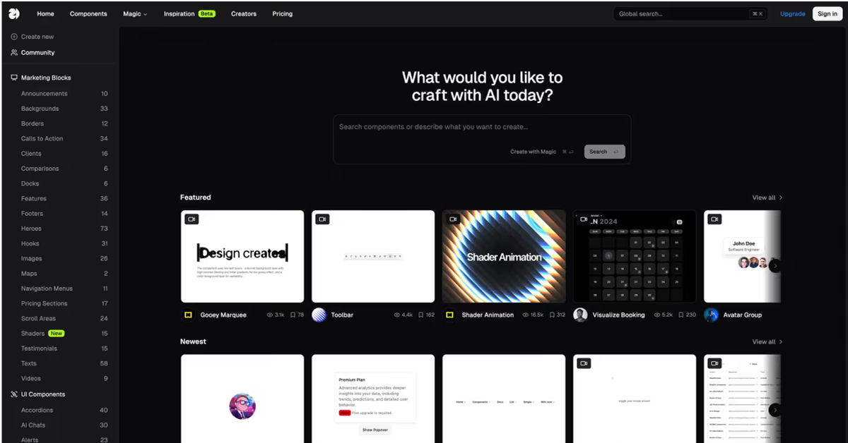
#What is 21st.dev?
21st.dev is a vibrant, open-source hub tailored for React developers and UI builders who want to supercharge their workflows with high-quality, community-vetted components, skipping the tedium of from-scratch designs. Its core value is democratizing premium UI assets by offering free, production-grade elements that blend seamlessly into modern stacks, ensuring accessibility and responsiveness from the get-go. Powered by React, Tailwind CSS, and primitives like Radix UI, it's ideal for use-cases such as rapidly assembling dashboards for SaaS apps, enhancing e-commerce interfaces, prototyping mobile-responsive sites, or contributing back to a collaborative ecosystem—anywhere you need polished, extensible UI without the design debt.
#Features ⚡
Live Component Previews: Interactive demos for each UI element, letting you tweak styles and behaviors in real-time before copying code.
Copy-Paste Code Snippets: One-click exports of full TypeScript/JSX implementations, complete with props, variants, and Tailwind classes for immediate use.
Figma Design Files: Downloadable source files for every component, bridging dev and design teams with pixel-perfect handoffs.
Search and Filtering: Intuitive discovery by category (e.g., forms, navigation, data display) or tags like "dark mode" and "mobile-first."
Customization Guides: Inline docs explaining prop overrides, theming with CSS variables, and a11y best practices for seamless adaptation.
Contribution Workflow: Easy GitHub-based PRs for adding new components, with templates and review processes to maintain quality.
#Pros ✅
Speeds up development by 5x with battle-tested, accessible components that reduce bugs and QA time
Truly free and open-source, empowering indie devs and agencies alike without licensing hurdles
Community-driven evolution keeps the library fresh and aligned with React ecosystem trends
Excellent docs and examples make it newbie-friendly while satisfying power users
Strong emphasis on performance and inclusivity, fitting modern web standards effortlessly
#Cons ⚠️
Limited to React/Tailwind stacks; Vue or vanilla JS users will need adaptations
Collection is growing but may lack niche or highly specialized components compared to paid libraries
Relies on community contributions, so update cadence depends on maintainer activity
#Included Components - Templates
Foundational Elements: Button, Input, Card for basic layouts and styling
Interactive Controls: Modal, Tooltip, DropdownMenu for dynamic user engagement
Data Visualization: Chart (bar/line/pie), Table with sorting and filtering
Form Components: Select, CheckboxGroup, DatePicker for robust input handling
Navigation Aids: Sidebar, Breadcrumbs, Tabs for seamless app flows
Advanced Overlays: Progress, Skeleton, Avatar with variants and dark mode support
Figma Counterparts: Design files for all components to align dev and design teams
#Pricing 💸
Free Tier ($0): 100% open-source under MIT license, with full access to all components, previews, and resources for unlimited personal or commercial use
No Paid Tiers: No subscriptions, premium plans, or upsells—everything is available via the website and GitHub repo
Community Support: Optional contributions or engagement through GitHub issues and discussions at no cost
#Integrations 🧰
Frameworks: React 18+, Next.js, Remix for modern app development
Styling: Tailwind CSS, Emotion, or other CSS-in-JS libraries
UI Primitives: Radix UI, Headless UI for unstyled, accessible foundations
Design Tools: Figma for direct import of component design files
Deployment: Vercel, Netlify for hosting and previews of React apps
Tooling: TypeScript, Vite, or Webpack for build pipelines
Frequently Asked Questions
Is 21st.dev free for commercial use?
Yes—MIT-licensed for unlimited personal or business applications. What tech stack is required? React 18+, Tailwind CSS, and optionally Radix UI for full compatibility.
How do I add a component to my project?
Copy the snippet, paste into your JSX, and install any peer deps like @radix-ui/react-dialog.
Are components accessible?
Absolutely—built with ARIA roles, keyboard nav, and WCAG guidelines in mind.
21st.dev
Explore, copy, and remix thousands of high-quality React components
Resource Types:
- Modals & Dialogs
- Tables
- Cards
- Tooltip
- Forms & Inputs
- Navigation
- Charts & Graphs
- Checkbox
- Buttons
- Accordion
- Sidebar
UI Kits :
Shadcn UITechnology Stack :


Have a product?
Submit your Shadcn product to AllShadcn, get featured, and drive genuine traffic while showcasing your work to the world. Turn your creativity into revenue and begin selling today! 🚀