Details about ShadCN DateTime Picker
Elegant and customizable DateTime picker component
Built with ShadCN and optimized for Tailwind CSS
Fully responsive design for mobile and desktop applications
Easy integration with React-based applications
Provides intuitive date and time selection interfaces
#What is ShadCN DateTime Picker?
The ShadCN DateTime Picker is a powerful and flexible solution designed for React developers who need a reliable way to handle date and time inputs in their web applications. Whether you’re building a booking system, event scheduling, or any other feature that requires date and time selection, this component offers a simple yet robust interface. Built with ShadCN and styled with Tailwind CSS, the DateTime Picker ensures a smooth and visually appealing user experience while maintaining a high level of customization and integration flexibility.
#Features ⚡️
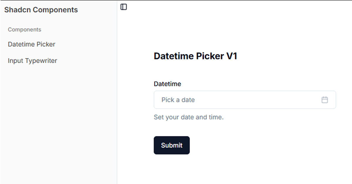
Date and Time Selection
The component allows users to pick both dates and times with ease. Whether selecting just a date, time, or both, the ShadCN DateTime Picker gives a clean interface for accurate input.Customizable UI
Fully designed with Tailwind CSS, the component is highly customizable. Developers can tweak the look and feel of the picker to match their app's design system.Responsive Design
The DateTime Picker adapts seamlessly to different screen sizes, ensuring a user-friendly experience on mobile, tablet, and desktop devices.Keyboard and Mouse Support
The component is designed to be accessible, with full support for keyboard navigation and mouse interactions. This ensures that it’s usable for all types of users.Time Zone Handling
You can integrate time zone support, making it ideal for global applications where users across different time zones need to schedule events or appointments.Locale Support
Multiple locales are supported, allowing the DateTime Picker to display date and time formats appropriate for different regions, improving accessibility and usability for a global audience.
#Pros and Cons
Pros ✅
Simple Integration with React
The DateTime Picker integrates seamlessly with React, making it easy to add to any existing React-based project.Customizable and Extensible
Thanks to its Tailwind CSS foundation, the component is highly customizable. You can adjust everything from colors to spacing without writing custom CSS.Mobile-Friendly
With full responsiveness, the component looks great on any device, making it perfect for mobile-first or mobile-optimized applications.
Cons ⚠️
React-Only
The ShadCN DateTime Picker is built specifically for React applications. Developers using other frameworks like Vue or Angular will need to find alternatives or port the component.Limited Advanced Features Out-of-the-Box
While the component provides great basic functionality, advanced features like recurring events or time zone conversions might require additional customization.
#Included Components - Templates
The ShadCN DateTime Picker comes with various templates and elements that can be used in your projects:
Basic Date Picker
A simple, no-frills calendar date picker for easy date selection.Time Picker
A clean and intuitive interface for selecting times, with support for 12-hour and 24-hour formats.Date and Time Range Picker
Allows users to select a range of dates and times, ideal for booking systems or event scheduling.Custom Date and Time Formatting
The picker allows developers to customize how dates and times are displayed, including locale-specific formatting.
#Pricing 💵
The ShadCN DateTime Picker is open-source and free to use. This makes it an excellent choice for developers who need a reliable, cost-effective solution for handling date and time inputs in their applications.
#Integrations 🧰
React
The ShadCN DateTime Picker is designed specifically for React, so it integrates seamlessly with React projects.Tailwind CSS
Since it uses Tailwind CSS for styling, developers can easily adapt the picker to fit their project's design without needing to deal with custom CSS.Custom Backends
The component is designed to be flexible, so you can easily integrate it with APIs or backend services that handle events, bookings, or any other date-related tasks.
Frequently Asked Questions
What is the ShadCN DateTime Picker?
The ShadCN DateTime Picker is a React component that allows users to select both dates and times with an elegant and customizable interface, built with ShadCN and styled using Tailwind CSS.
How do I customize the appearance of the DateTime Picker?
Since the picker is built with Tailwind CSS, you can easily customize its appearance by modifying the Tailwind classes or adding your own utility classes to adjust spacing, colors, and typography.
Does the DateTime Picker support mobile devices?
Yes, the component is fully responsive, ensuring it looks great and functions well on mobile phones, tablets, and desktops.
Can I integrate time zone support?
Yes, the component supports time zone handling, which is ideal for applications that need to schedule events across different time zones.
Is the ShadCN DateTime Picker free to use?
Yes, the ShadCN DateTime Picker is an open-source project, so you can freely integrate it into your projects without any licensing costs.


Have a product?
Submit your Shadcn product to AllShadcn, get featured, and drive genuine traffic while showcasing your work to the world. Turn your creativity into revenue and begin selling today! 🚀